
Skate Poster
In this tutorial I will walk you through several techniques. When I’m creating wallpaper or design production I often use these techniques. I will use an application I really like to work with. It is called Alchemy; you can find it on the web if you need. I use alchemy to create shapes and then dropping to Photoshop and my main work area. Moreover I will use a stock photo for this wallpaper so the first step will be the photo work.
Here is the Photo link: http://www.flickr.com/photos/standardissue/161437046/
Step 1: Photo work.
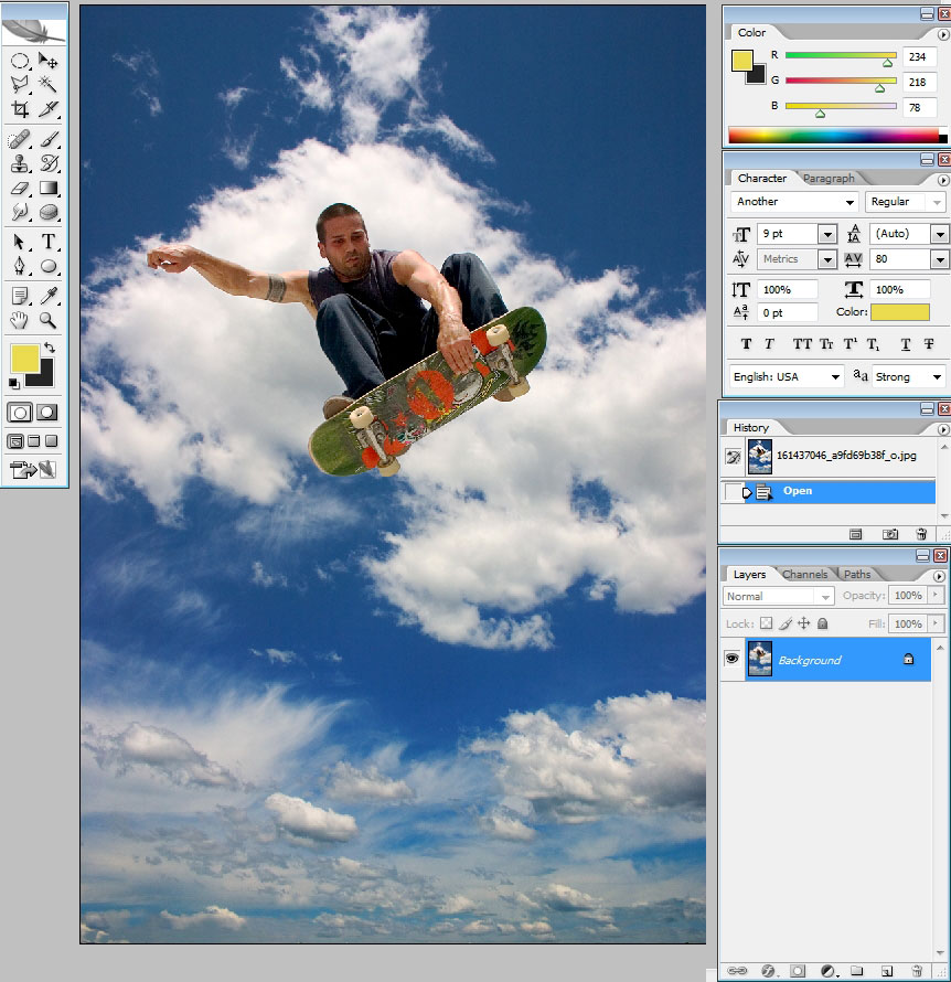
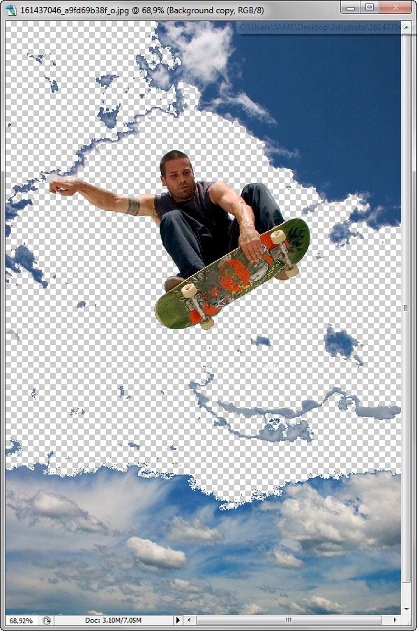
Here is my stock photo. The thing we need to do here is to eliminate all the background except the figure of skater.
First select Magic Wand Tool, set it’s parameters like so.


Begin to select areas around the skater. Of course you will not be able to make a clean selection from one click so take some time and make a clean selection around the skater.
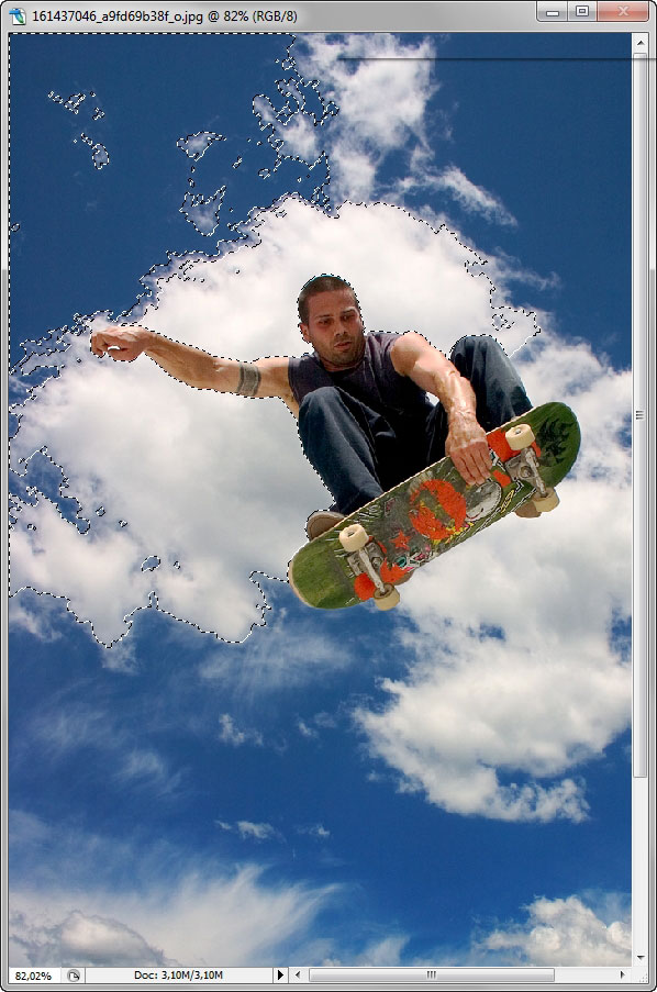
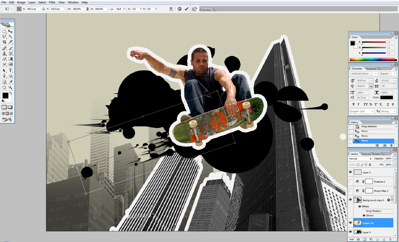
Our basic scope is the skater, so there is no big need so select all the objects like clouds. When the selection is ready tap delete. Look and the top layer in the layer box.
Here is what we have now. Eliminate all the other parts of background using plain eraser.
After you done create a new layer next to the background (1st) and fill it with this color.
Step 2: Shape shifting
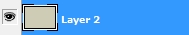
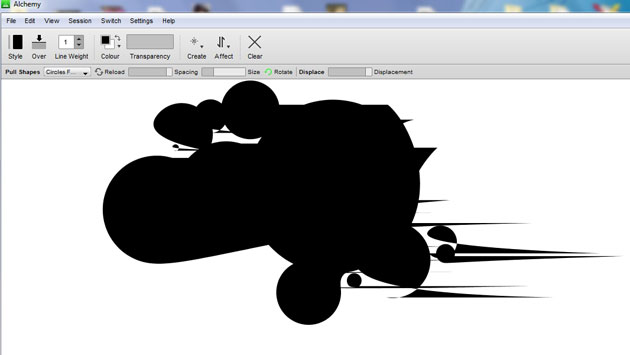
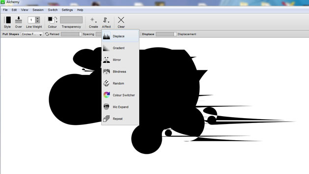
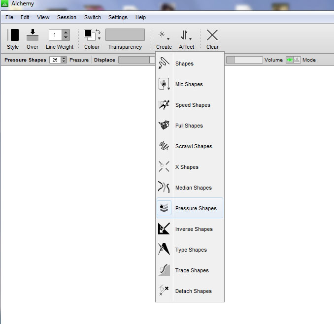
I’m now dropping in alchemy to create some shapes. So here are the main type of shapes we are going to use.
Pull shapes:
With Displace Affect:
Pressure shapes:
So here are some shapes I’ve created. You will have all the shapes, so check the Workshop files folder.
I’ve used only cycles so choose cycle’s folder. Note to see the settings attached to the shape types in the status bar on the top of the screen.
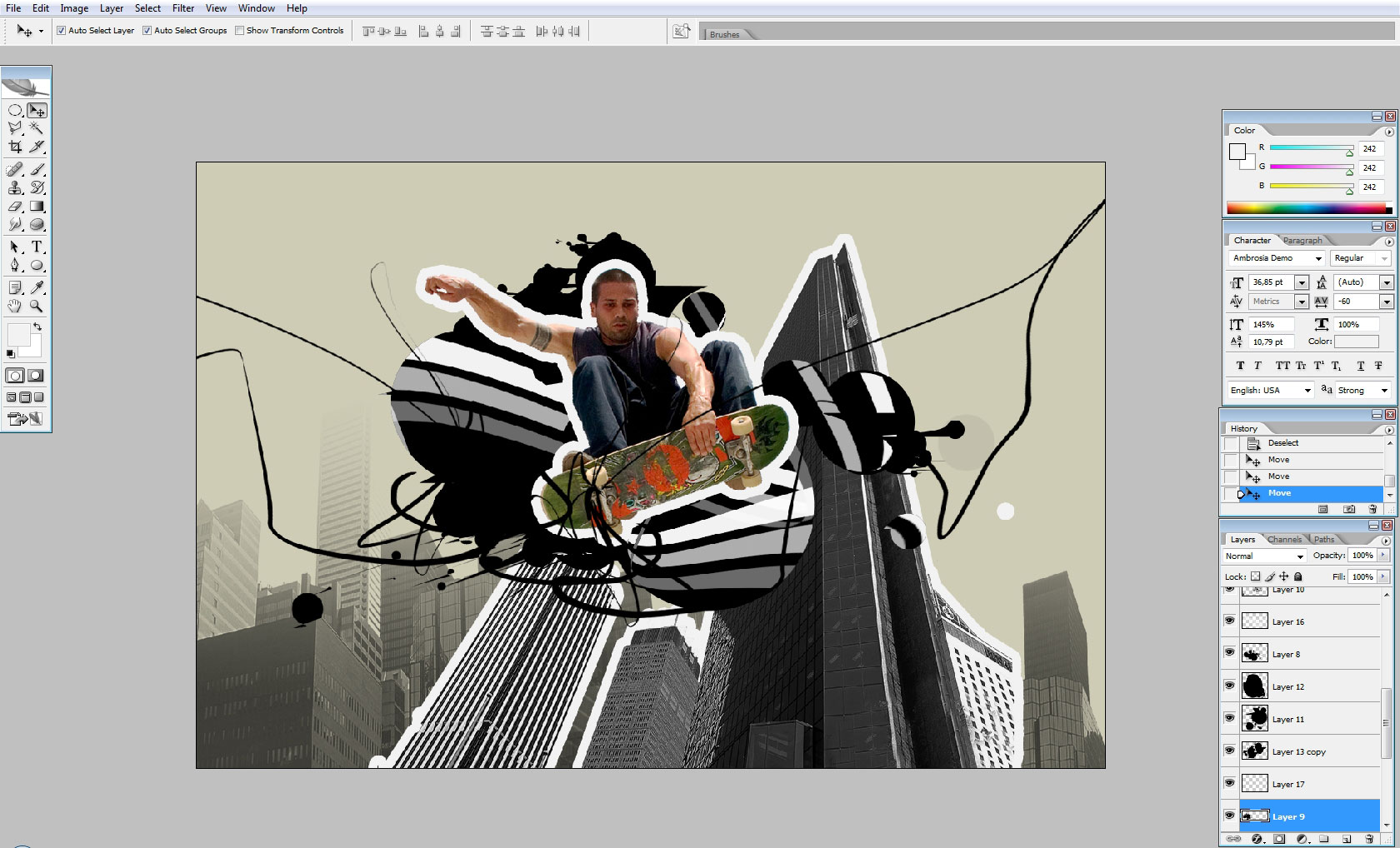
Step 3: Back to Photoshop.
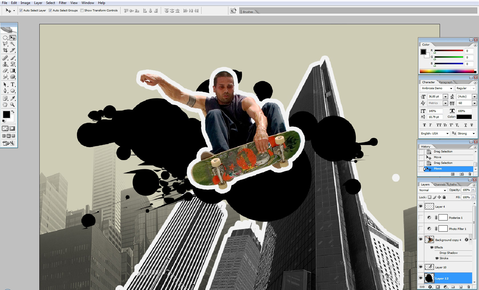
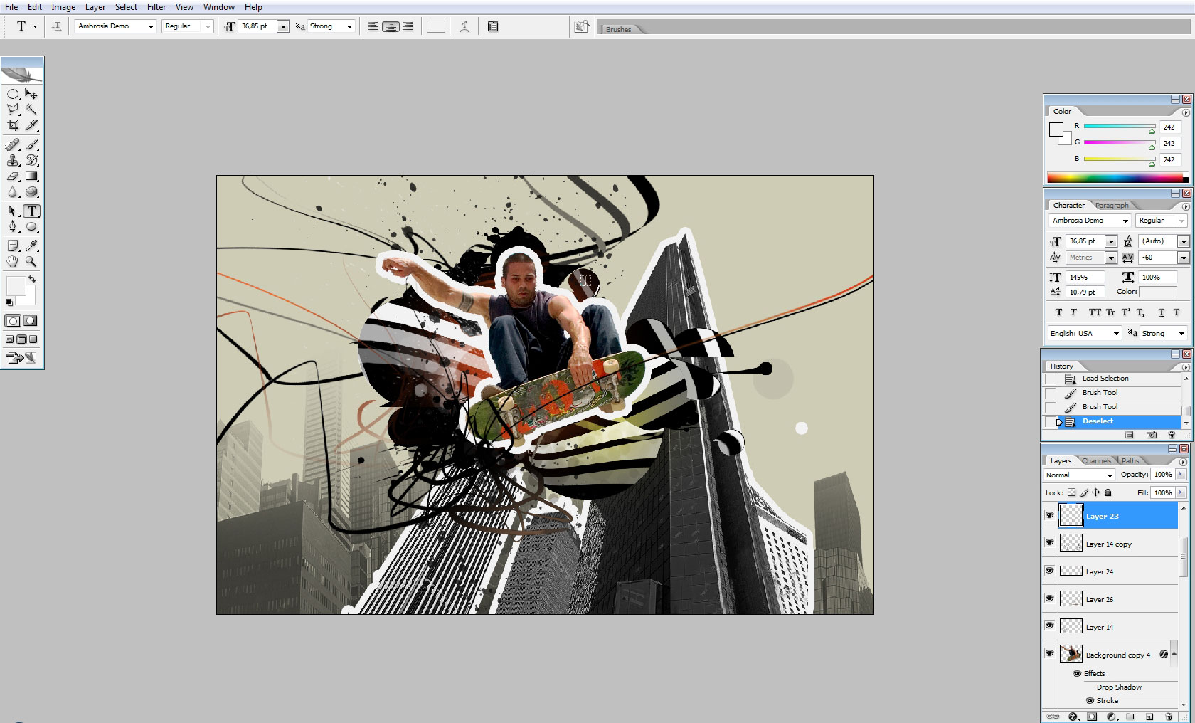
So we are now backing to Photoshop to create some effects and adjust some colors. The first thing that I did was: to create a stroke outline around the skater – I did it using layer styles.
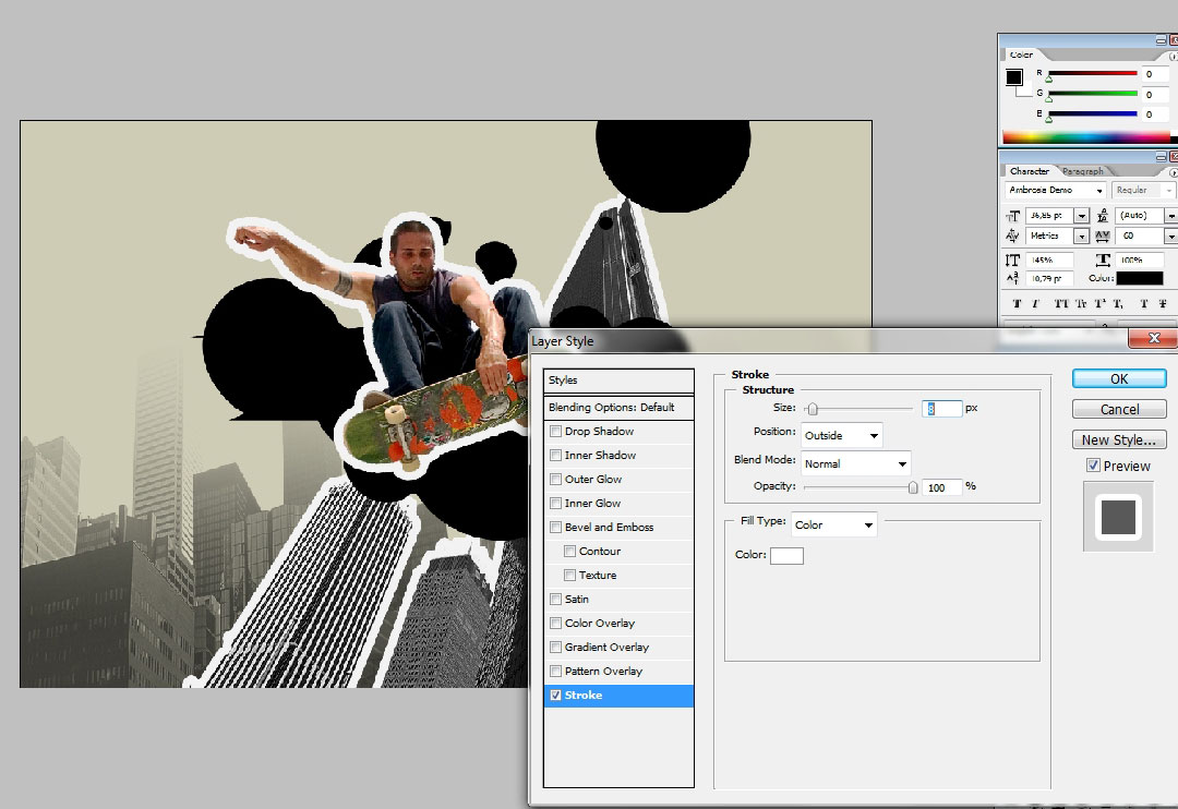
You can see the part of the cityscape that has the same outline. This is actually temporary, I’ve did it copying layer style from skater to this thing. Of course these objects are on separate layers. So I’m beginning to paste the shapes to my main document… one by one. I will use all the shapes I have.
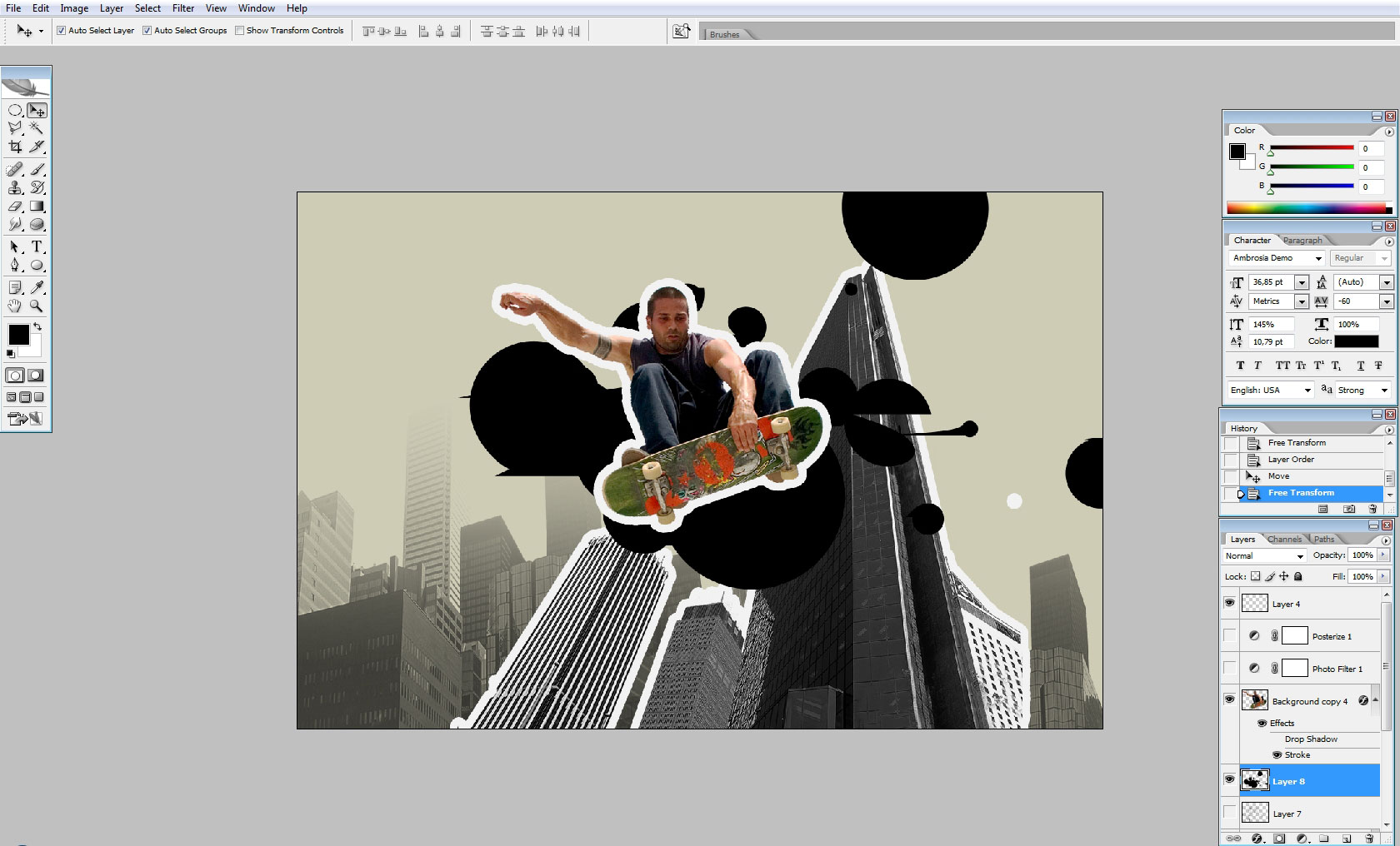
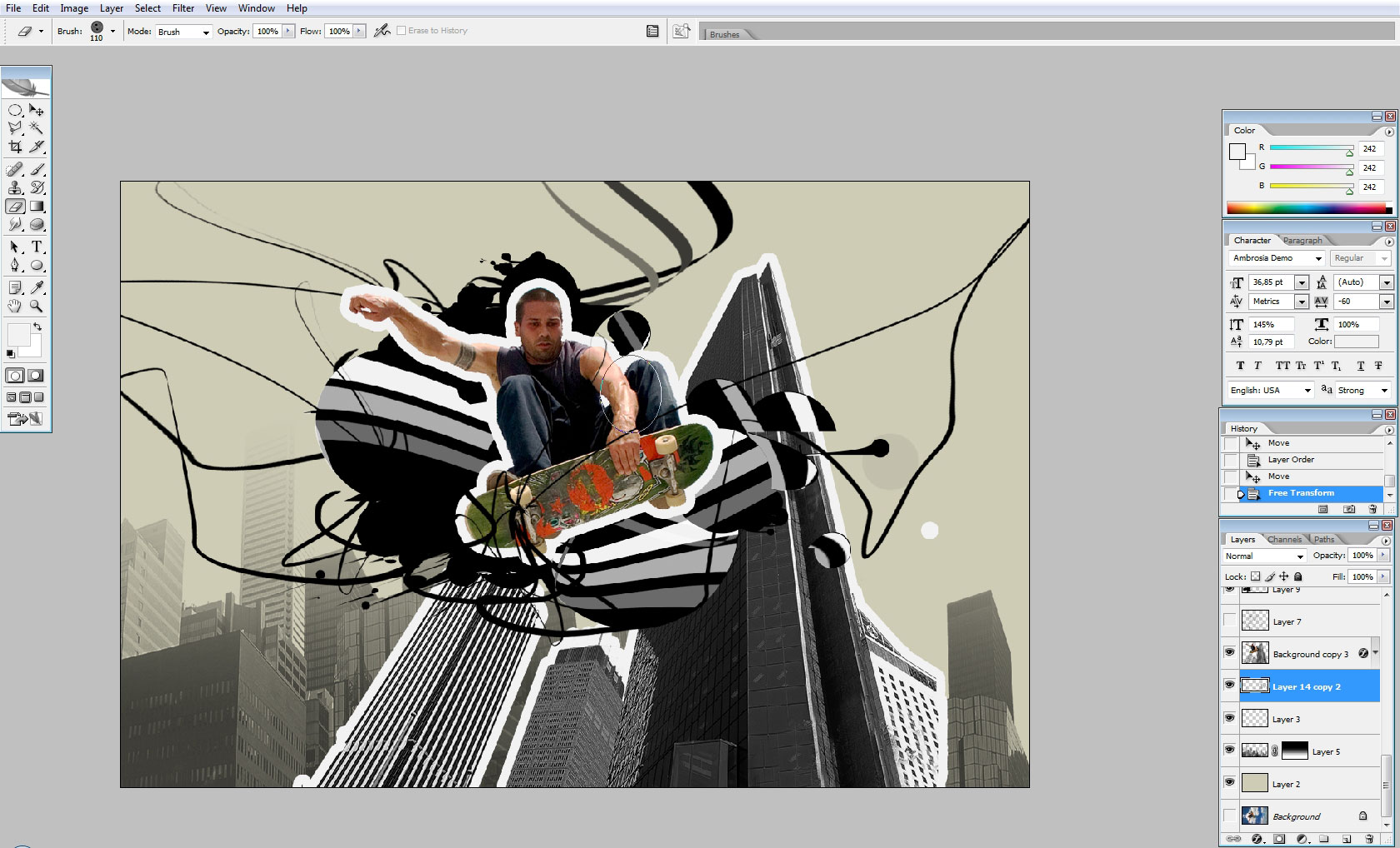
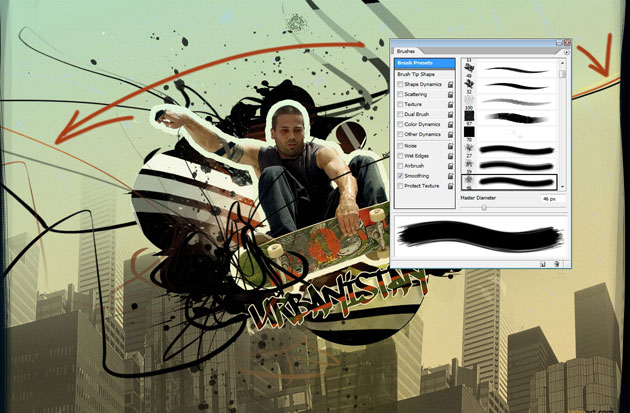
As you can also see there are some buildings on the background – this is a brush and you will have this brush to use.
Here you can see all the shapes, even that funky curve – this is a shape too – a pull shape.
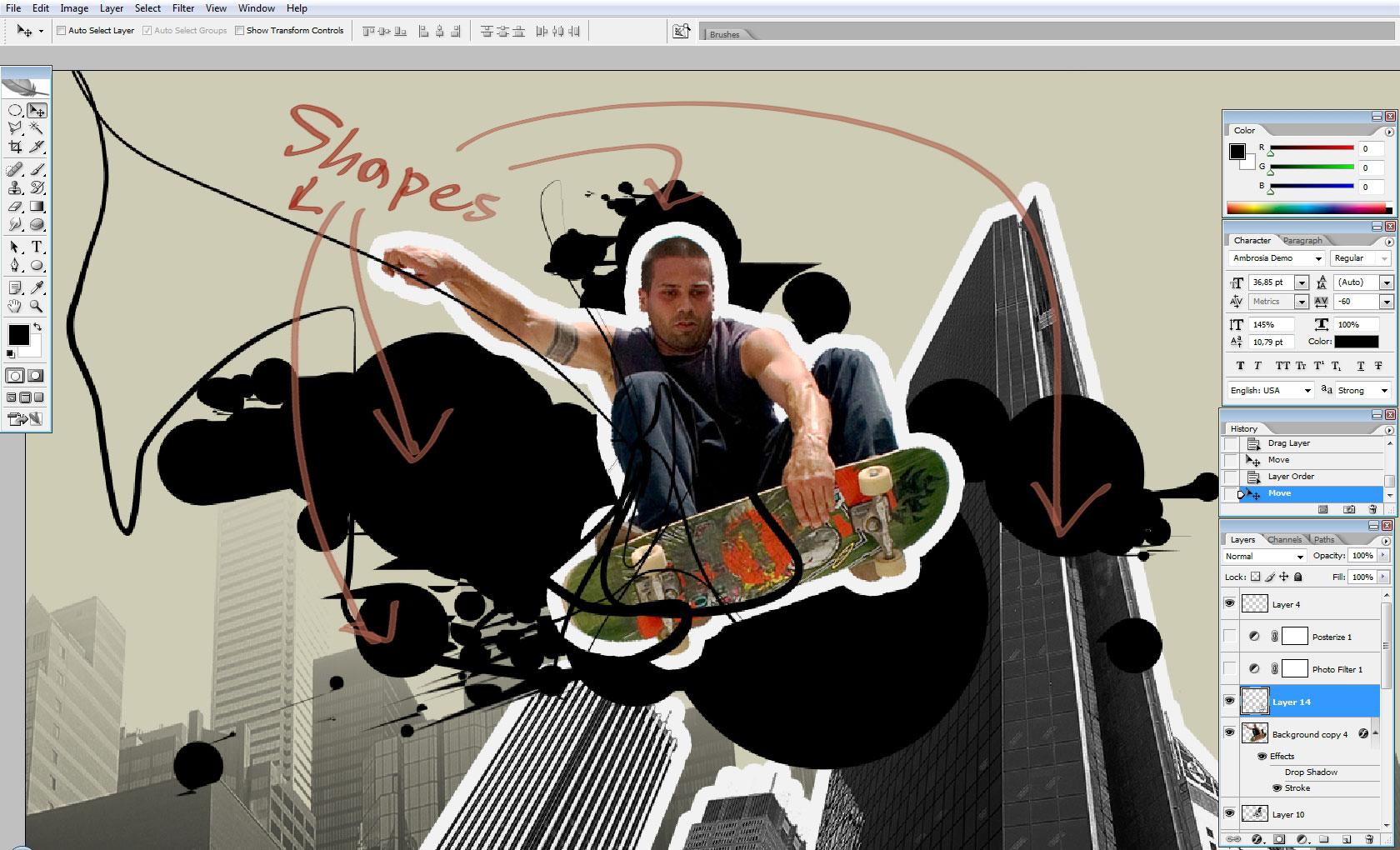
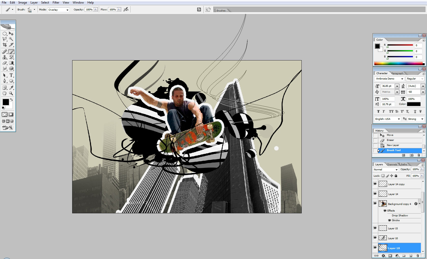
Another technique we are going to use is a technique I call Fill up. Select the shape (Ctrl +click on the layer) I recommend you to start from the biggest shape you have.
Select a curve brush, create a new layer and just make one touch of the tablet or single mouse click. The brush stroke will stay inside the selected area.
This is how I did white curves inside the cycle areas and some additional shapes and curves.
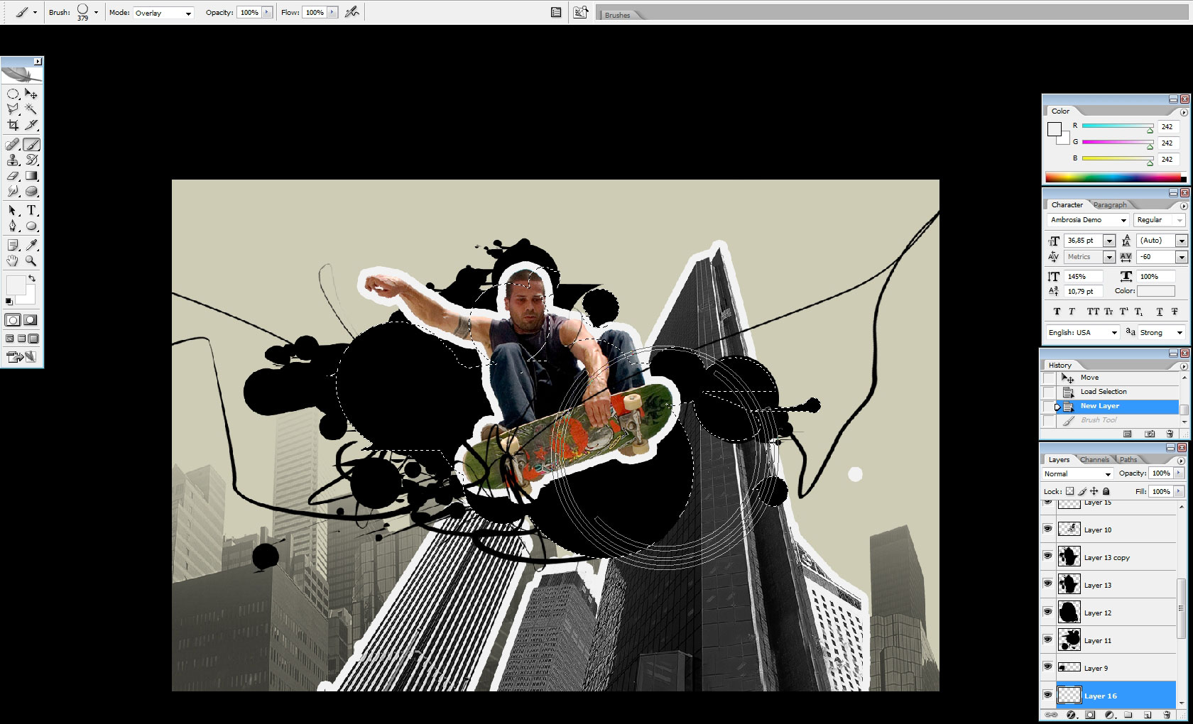
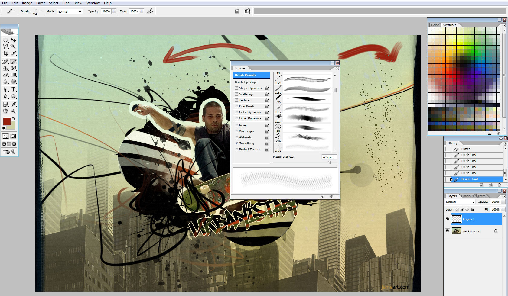
Step 4: Color adjustments
Our final step will be to create some color exposures and adjustments of the background, and objects. So create a layer next to the background or color fill. The layer should be under the skater layer – this is the main thing you should remember.
Set the layer’s Blending mode > Overlay
Select the Soft edged brush and set its flow parameter to about 5 %.
Do a little bit of painting if you call it painting, it is actually some paint dubs and that is all.
…Yellow on the bottom and Green at the top.
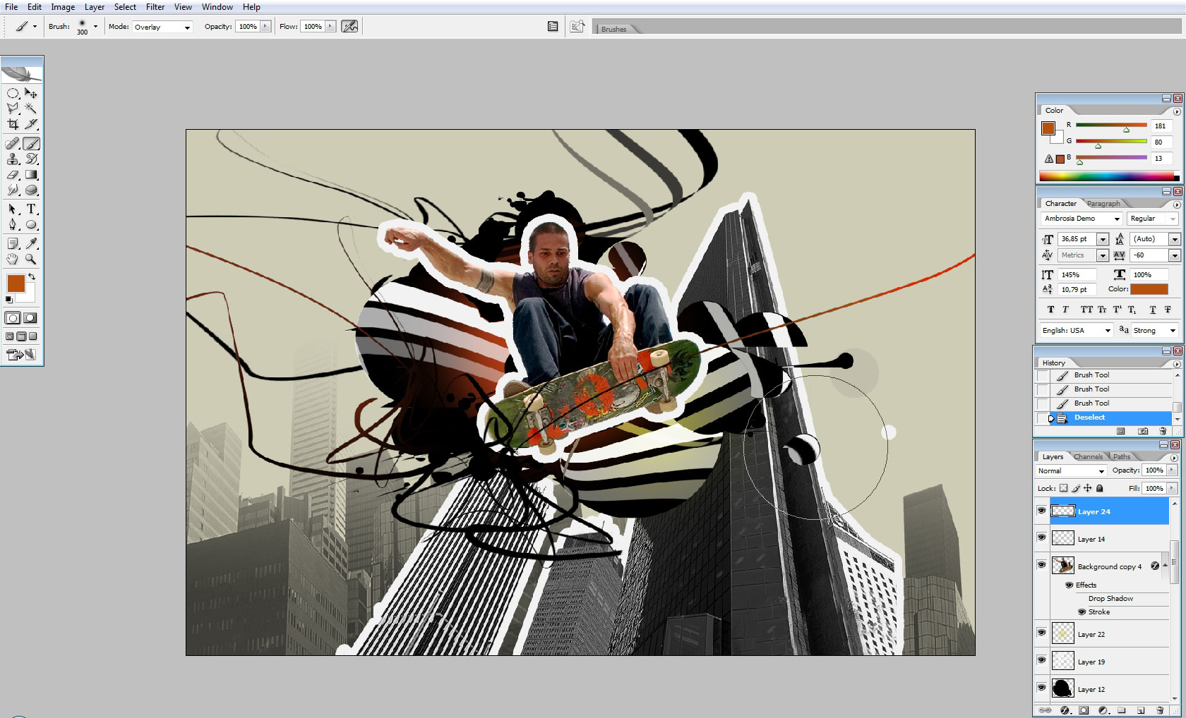
Do some details with Blood Scatter brush.
You will have this brush too. Here is the look of the brush. On the right you can see the mini look of the brush tip.
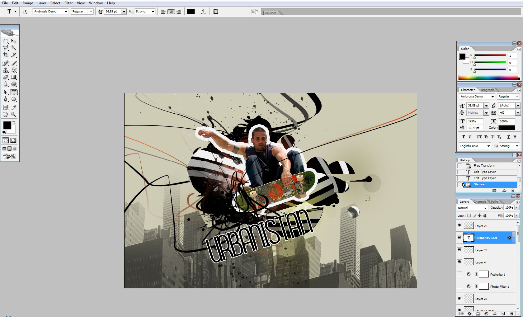
The other thing that should be here – is some text. So this is my text line – is says URBANISTAN
It has an outline created with layer style.
I’ve entered Dafont.com – in search of graffiti fonts and I found quite a lot, some of them are in the Support Files folder.

Some adjustments to the text – select the whole text layer and use the same curve brushes you used on the shapes.
In conclusion:
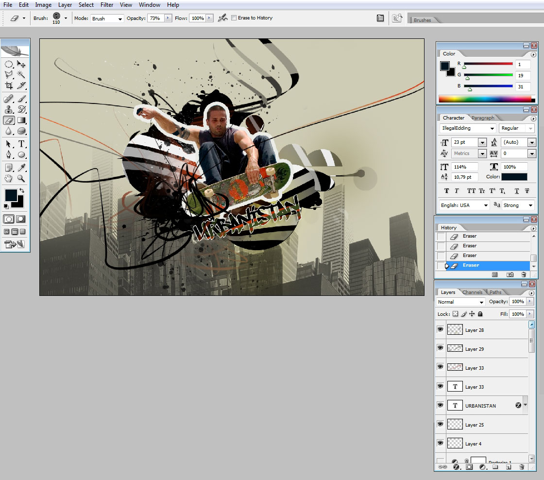
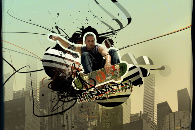
In the end of tutorial I’ve created a new layer set it’s blending mode to Overlay and created two gradients (Color to transparency). You can see the color of the gradients on the screen shots. As for the edges – I’ve done the edges with basic Photoshop hard media brush.
And this concludes my last tutorial.
I hope you found some useful techniques from all my work. I really hope that it helped you in some way. So practices a lot, think while you painting or producing a design. Thanks.
Hope you enjoyed this tutorial and see you on our next tutorial.
Vie Full Size: Skate Poster
Download: Support files
Download: PSD file
Comments