
Design techniques based on coloring
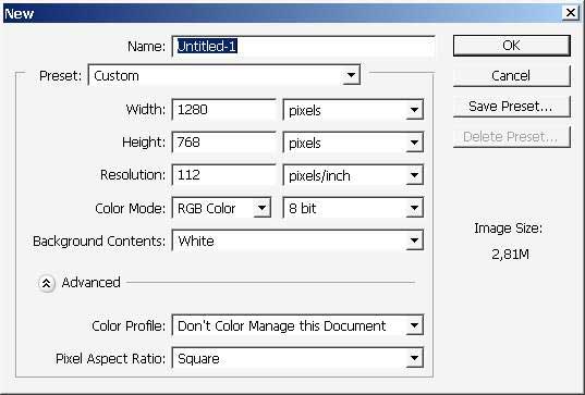
Hello. Today we are going to practice some design techniques based on coloring. So follow me and let’s begin with creating a new document and a new layer.
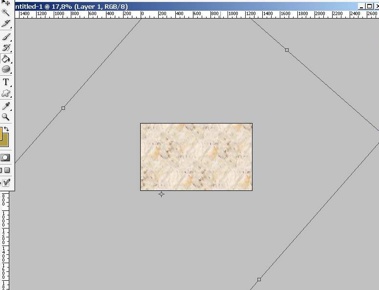
Overlay the layer with pattern I will choose this one.
Transform the patters a little bit.

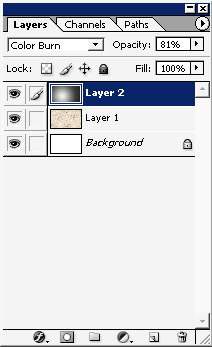
Then, as in most of the cases, overlay the layer with gradient.
The gradient is rounded and black and white.
Pattern settings:

The gradient should stay on the separate layer.
The mode of the layers is Color Burn and the opacity is set to about 70-80%.

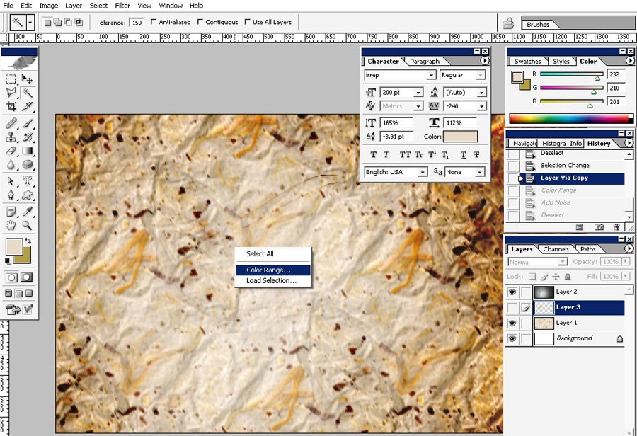
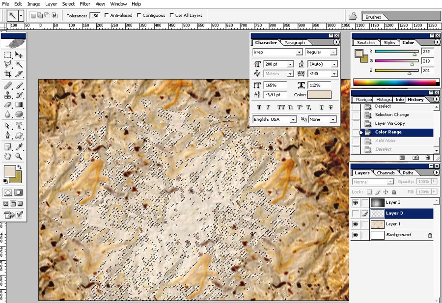
To create even more texture I will select the light yellows using color range selection tool.
One of the easiest ways to gain texture is to add simple noise to it.
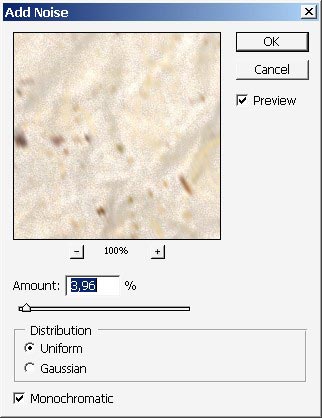
Hard to see the difference but believe me it gives a certain effect to the whole image.
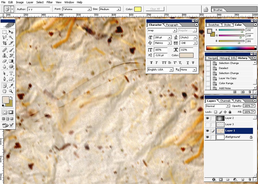
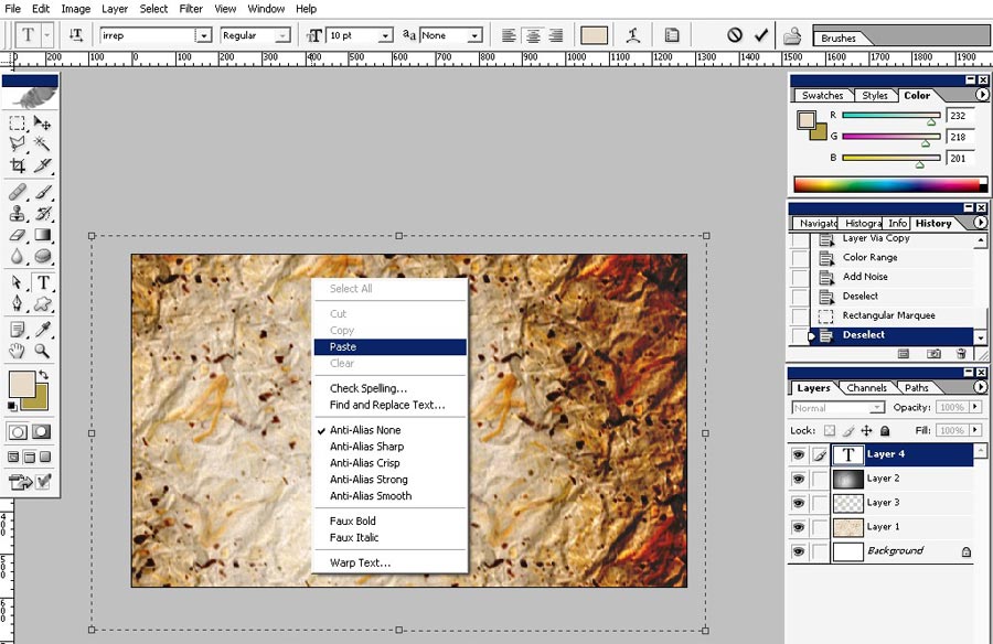
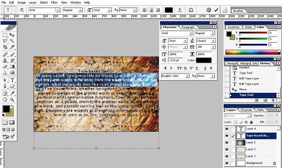
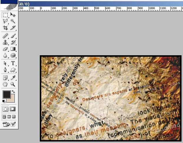
Now as for the foreground I will paste some text.
I just wrote the phrase: what is graphic design in my Google bar. Nothing beyond for this one.

Use type tool and just past the site text to your document.
Here we have It our text on 1 separate layer.
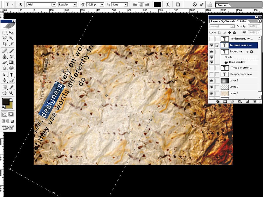
I will do some type layout fixing.
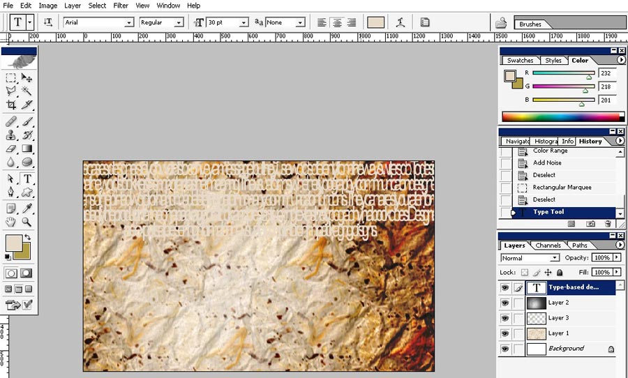
Something like this. You can see the settings in the top left corner.
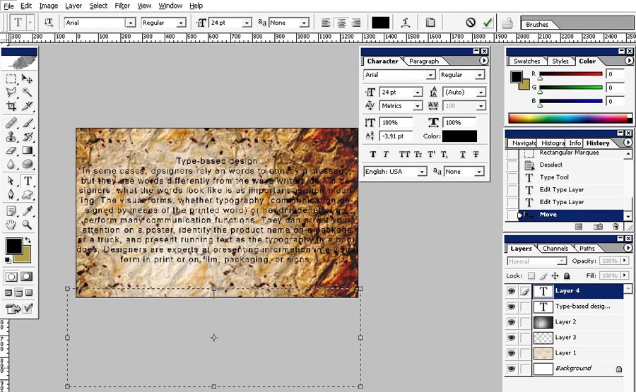
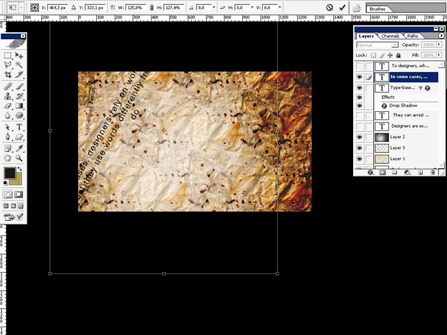
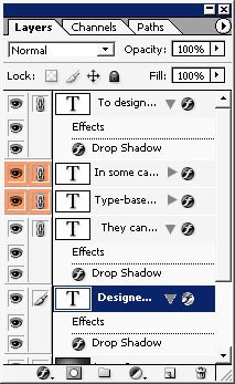
A little design trick. I will separate the parts of phrases and paste them to 4 or 5 separate layers.
Plus to that I will change the font size o each of the layers. .
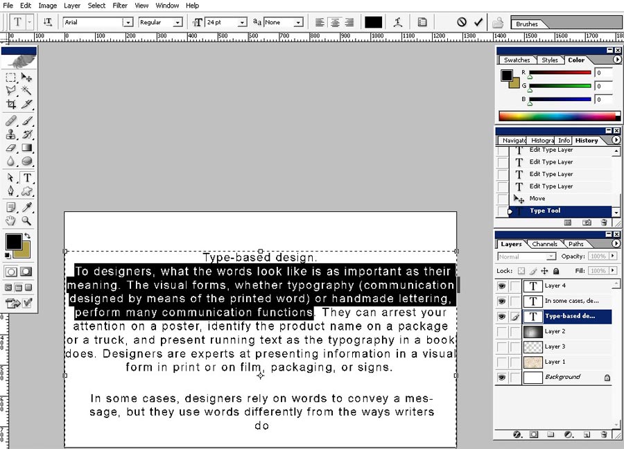
Here we have It about 5 text layers with the whole text only on 5 different layers.
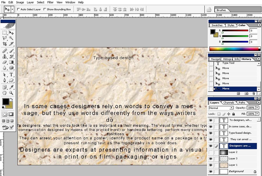
Now
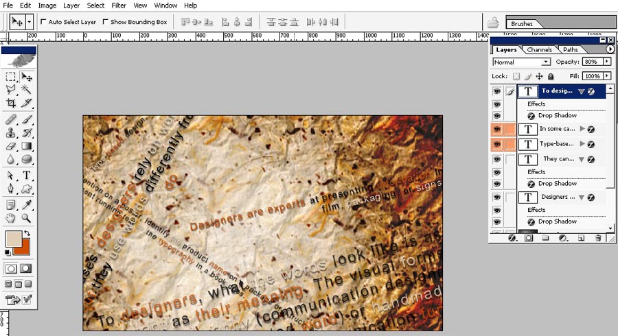
I will transform each text layers. Moreover I will change the font
color of each of the layers. Try to steak the colors to our background;
so my font colors will be: background light yellow, orange, and black.
Do it like so!
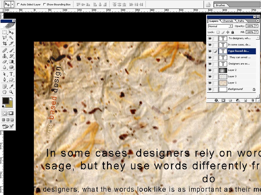
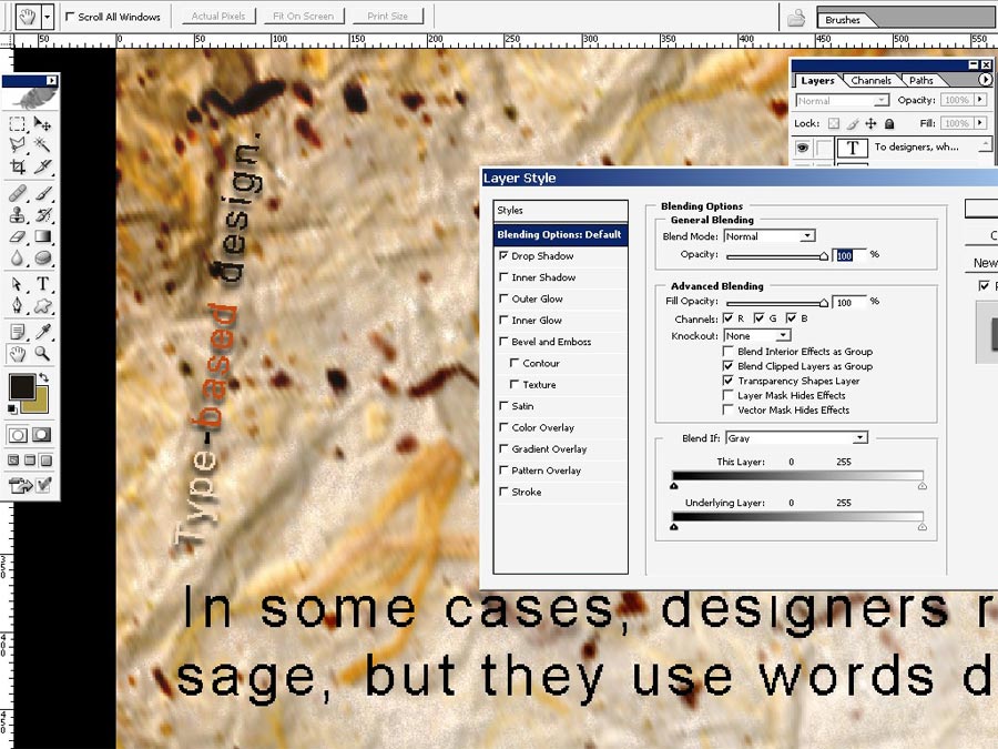
I would like to drop a shadow; only 1 layer style for now.
And here are our fast results. All the layers were colored in the same colors and have the same styles.
When you are done you can just link all the text layers and merge them.
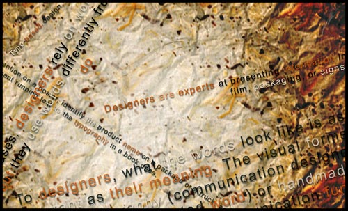
Final result!
To Create frame just go to Image>Canvas Size.
So we are done here.
Comments