
Amazing brush usage and antique color gamma
We got a very fast tutorial witch some amazing brush usage and antique color gamma.
So let’s start this one fast.
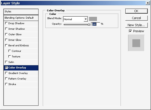
Select an area, you will see this recently, and apply some layer styles to in immediately. For better start:

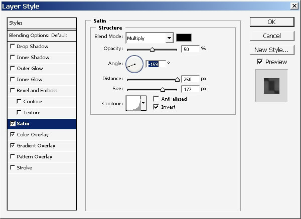
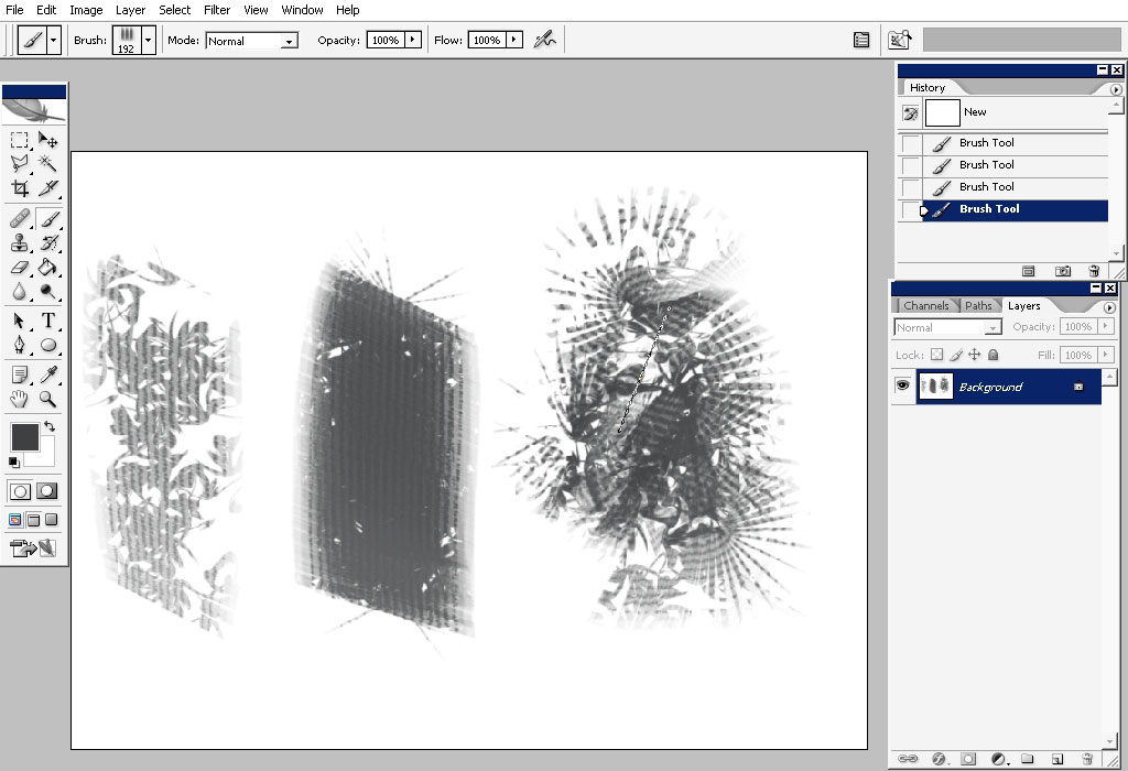
As you can see I’m beginning this one as a grayscale color model.
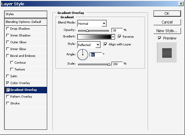
Now as my second step will be the creation of the color palette that I will use to color my grayscale model:
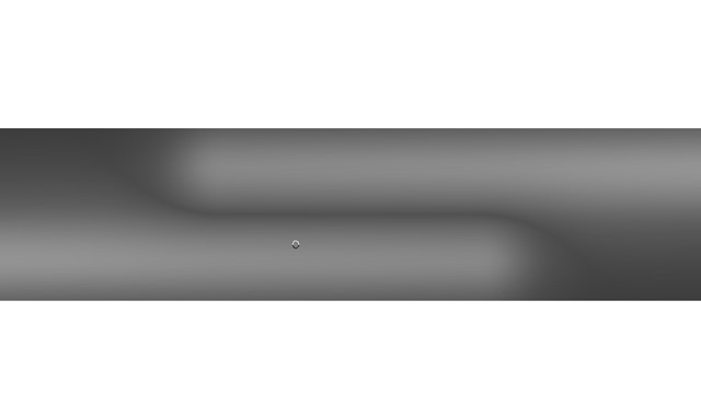
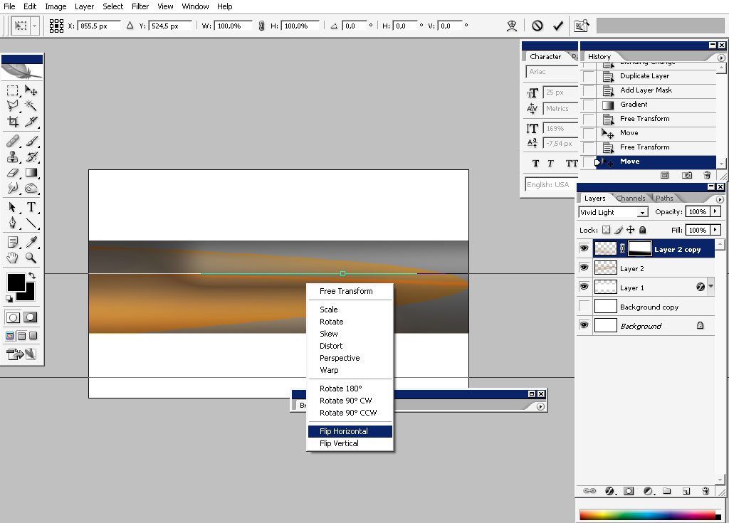
I’ve created an oval shape and overplayed it with a gradient.
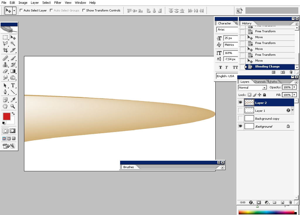
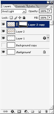
I quite often create several copies of the color layer and set one or every of them to some node bud normal: it can give you some beautiful effect when they cross each other:
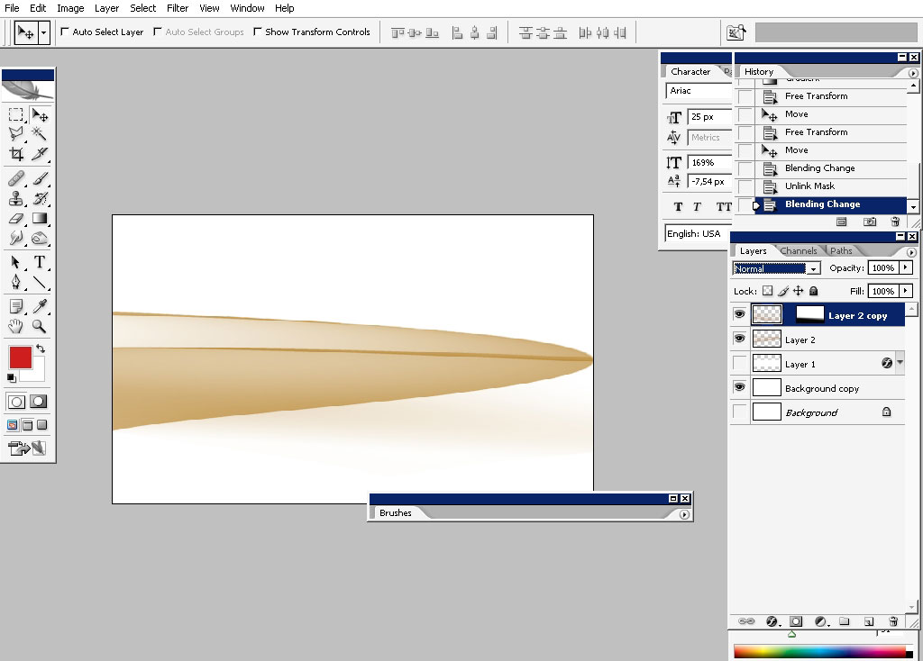
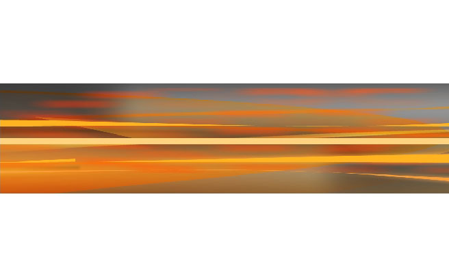
For example here we have a very saturated orange border right in the middle
Here is the shape on the white background.
Now it’s time to deal with some foreground elements: we’ll have a deal with abstract shapes this time:
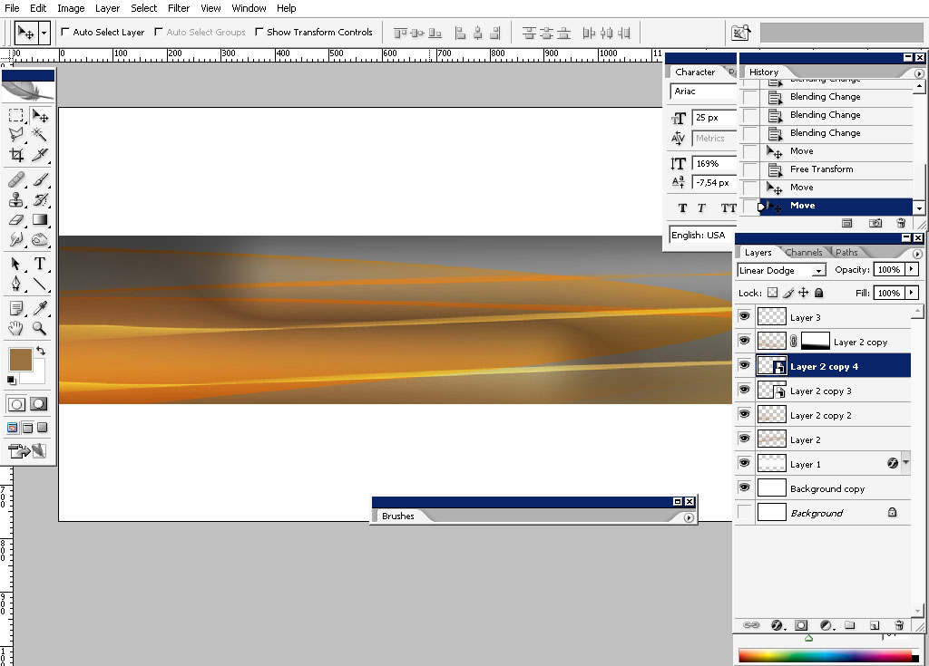
Actually this is the same shape we’ve just used only transformed and squeezed:
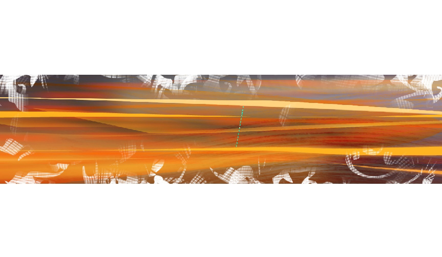
So we now have some lines as foreground elements: I also recommend you to change the colors just a little bit to stick to different tone values.
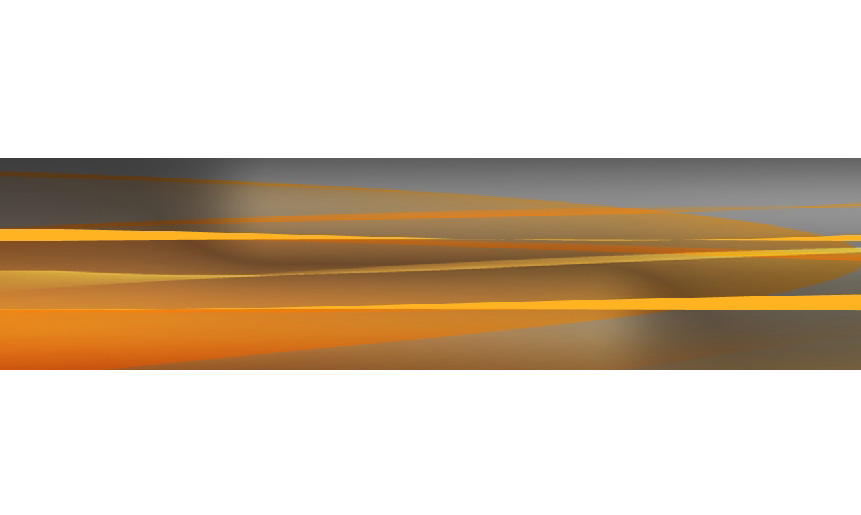
I really think that it needs even more orange tones:
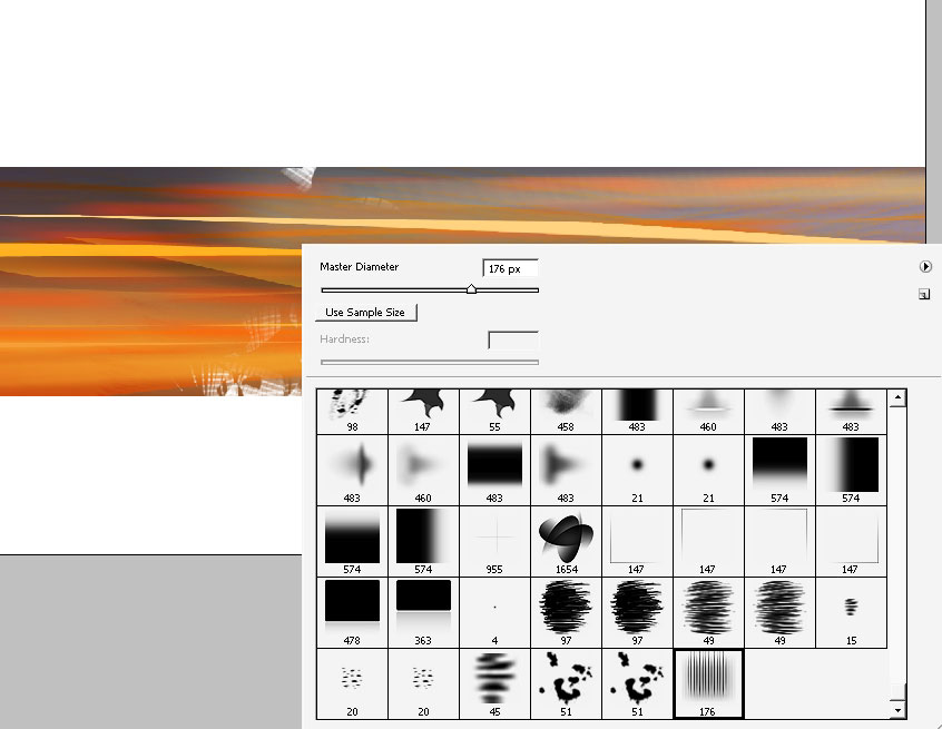
With even more elements: I’ve tried the dot brush first:
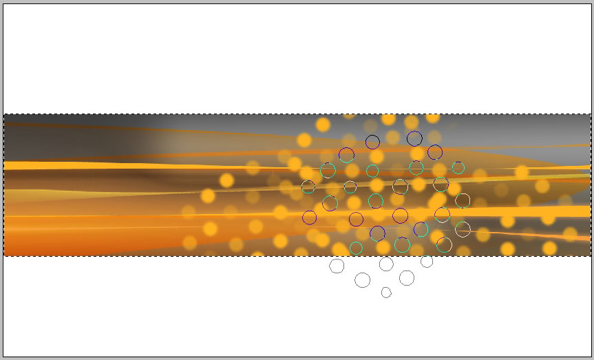
But I really didn’t like the look of it and just applied one of my downloaded brushes: it’s called CITRIC_INK.abr brush. Apply it on a new layer with blending mode set to Color: and the color is orange.
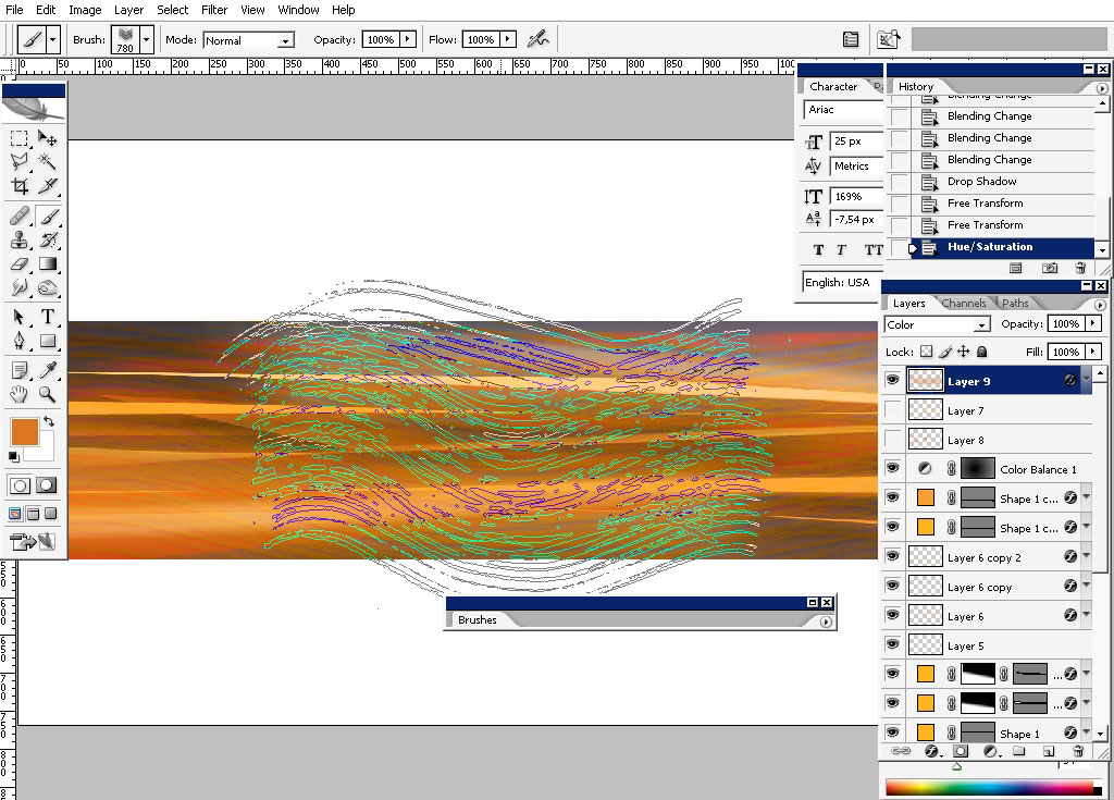
Now turn off all the layers with color leaving only the very first one:
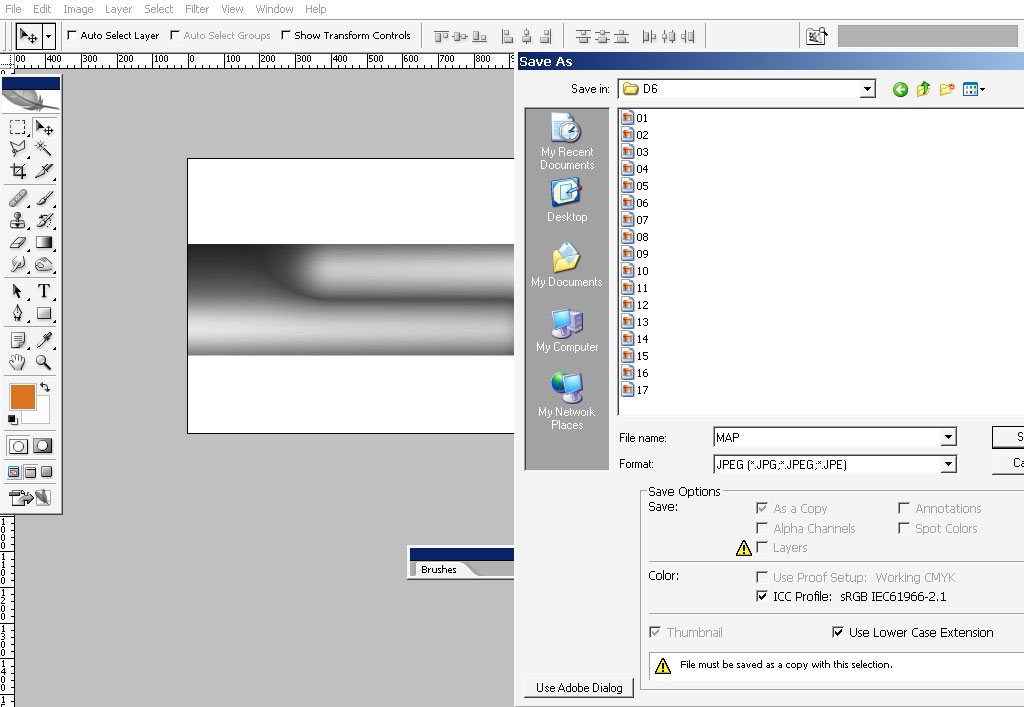
Save it as PSD file – we will need it to create a displacement map.
Now
it is time to draw something. I think I just use the effects of the
brushes: and for that I have a special trick): I will now create a dual
brush.
First
I will take one of my old created brushes – it something like flat
brush and I often use it to draw fabrics: PATTEBRUSH.abr
Here it is in action:
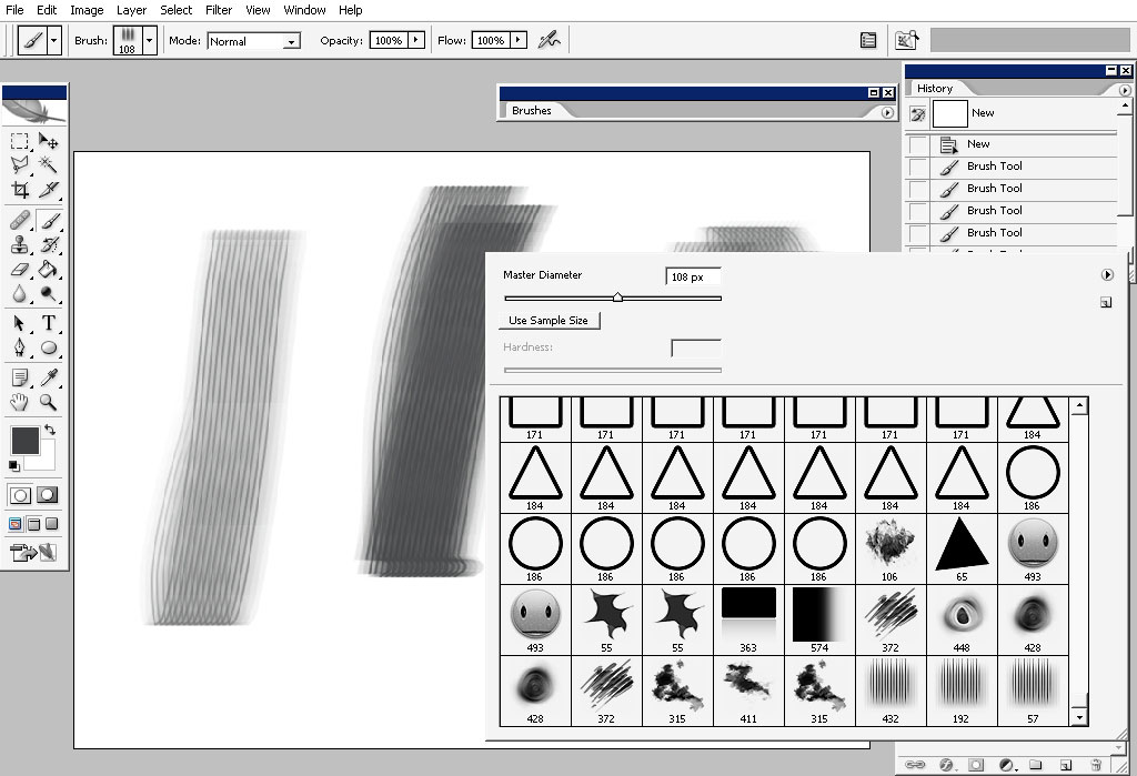
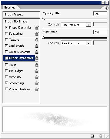
Settings:
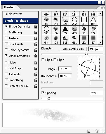
Use this for dual: pattern brush tips can create amazing effects as a dual preset:
Dual brush in action:
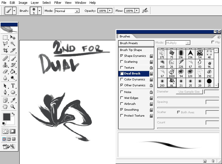
So
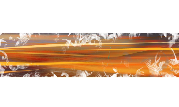
now that we have that brush we can use it. I would really like to break
that border – it seems to me that it is just too solid:
Test for heavy usage – denied! So just keep it just on the edge of transparency (I love wacom).
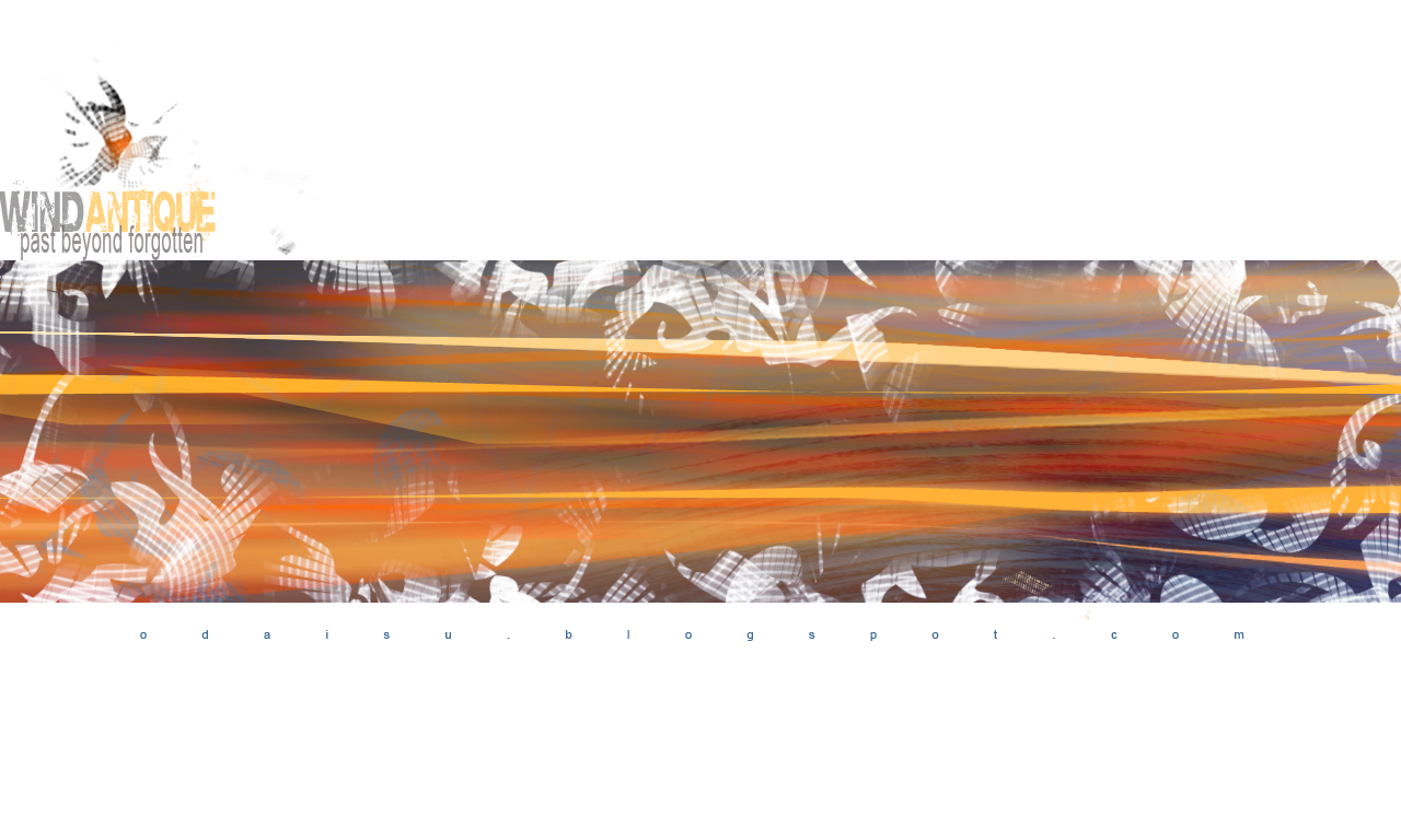
And the finishing touch will be the logo or something – dome with the same brush and color gamma.
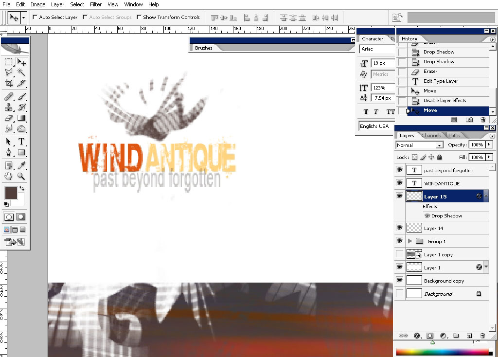
And this is it – we now have handmade wallpaper. That you for reading and see you next time.
Comments