
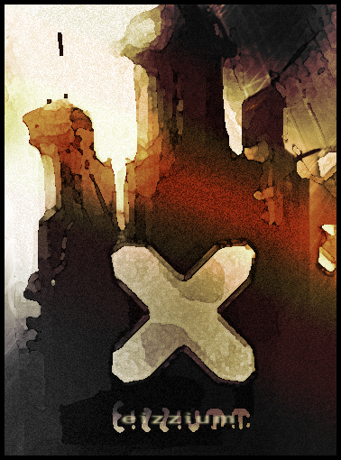
Eizzium – interesting looking illustration
Learn how to make halloween pumpkin from one the best sources of illustrator tutorials.
In this tutorial we will make a very interesting looking illustration. I especially like the colors. We will practice some painting techniques along with PS CS 2 filters.
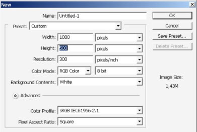
So let’s begin. Create new document 1000x500px.
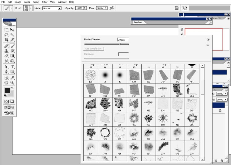
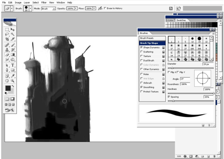
Then select the brush. I’m using this brush because it has a little bit of texture. You will have this for download if you like. #292, or something vertical like this.

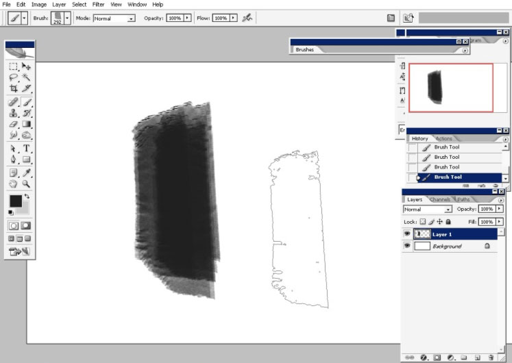
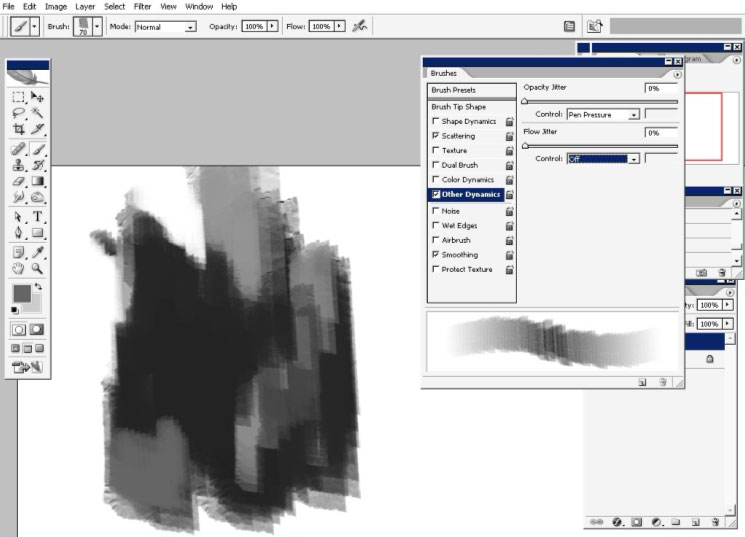
Here is my brush effect.
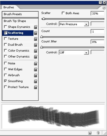
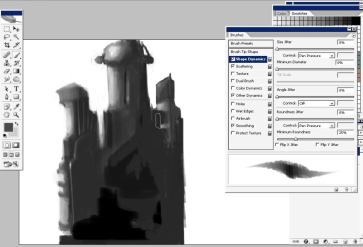
I will make some settings to my brush: scattering and opacity set to pen pressure. I will turn on my opacity jitter set to pen pressure when I will get closer to shading.
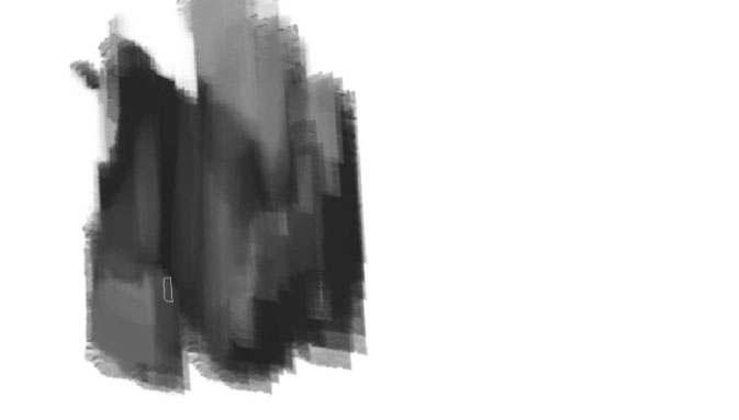
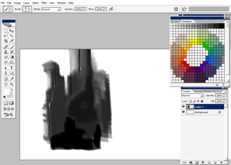
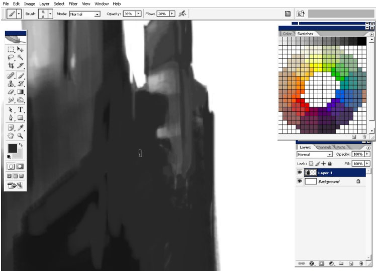
Let’s begin to build shapes.
Moreover I’m searching some value, by painting less black areas.
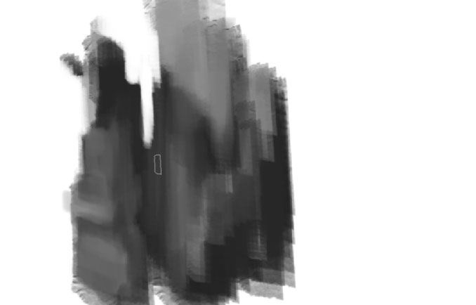
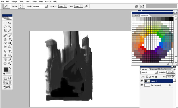
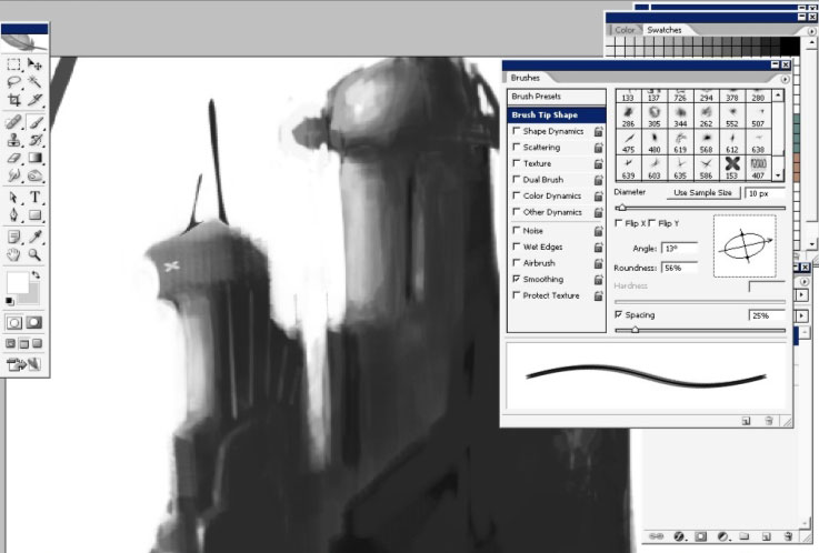
I will put more details to the left tower.
Oh yea, I’d like it to be a structure.
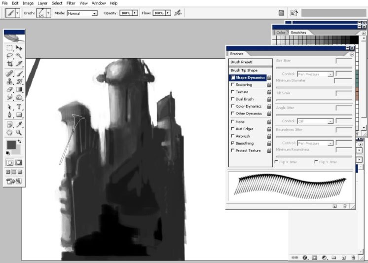
So now I’m just painting more details to the left one, keep your eyes on screenshots.
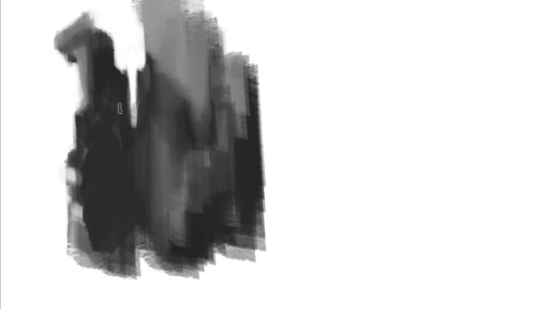
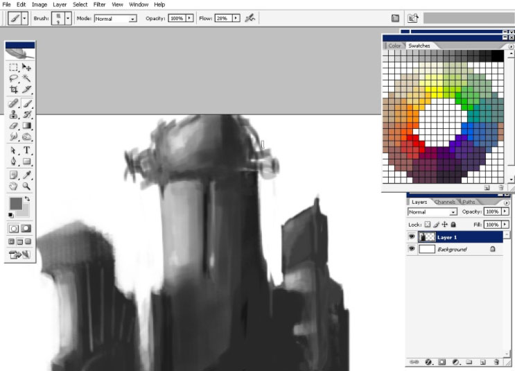
Ok, the left one seems to have some details for now. Let’s
take care about the center and the left one. I’m using only
that brush, we’ve started with.
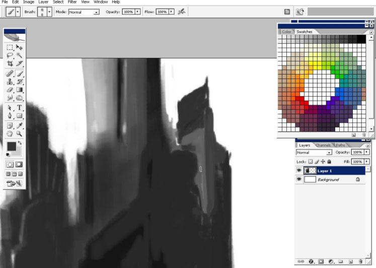
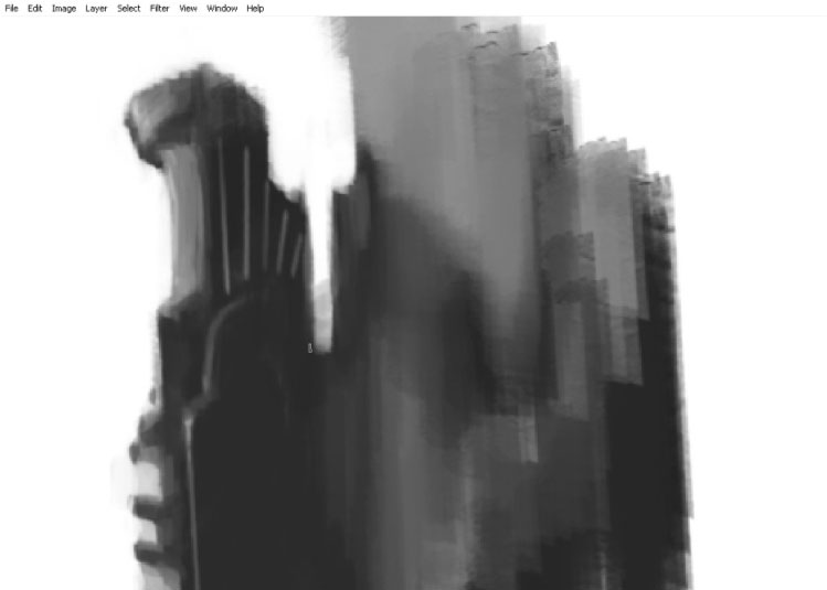
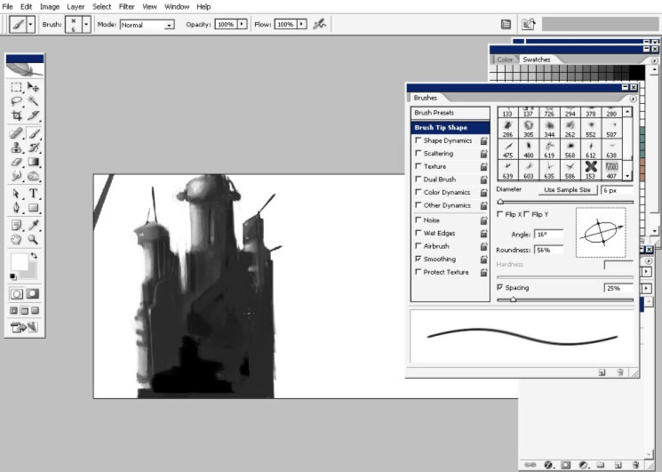
Shadows can be done with any king of brush with opacity or Flow set to 1% – 4 %.
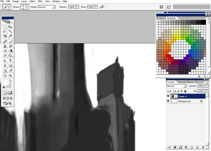
I’ve
painted all this on a separate layer so now I can move, transform and
do whatever I want and it will affect only my building. So I will drag
it a little bit to the bottom and pain a roof or something to my center
tower.
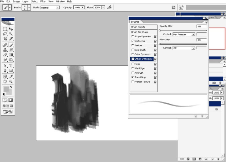
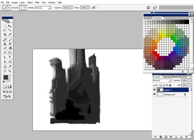
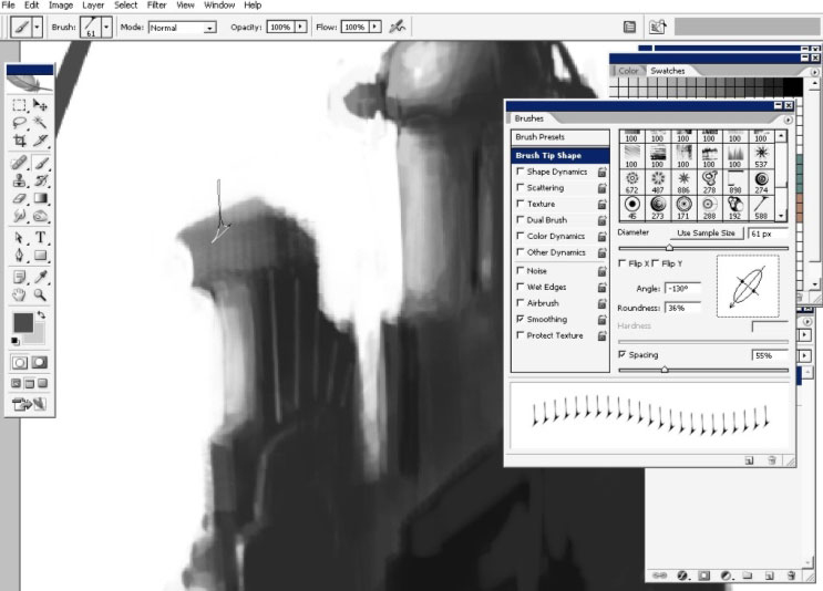
Now I will change my brush to one of #100. And do some shading.
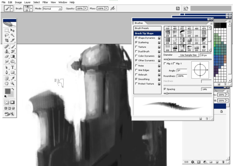
I like my brush 125 too. So this we will use to set some details to our building.
As you can see, I’ve changed the angle and roundness of the brush.
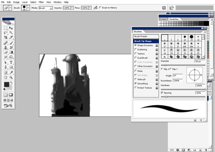
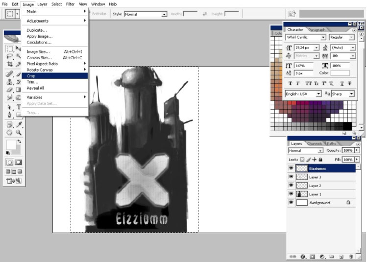
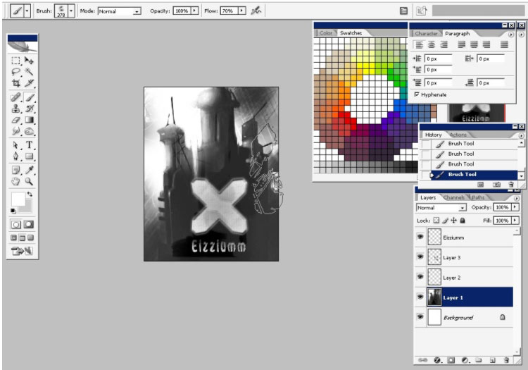
Some X markings done with my, self made (you have a tutorial of making of this very brush)
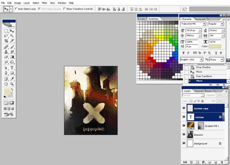
I also like to paint a big X mark right in the center (for design) and some text.

The text says – Eizzium – even don’t know what it means ), and I will also crop my image.
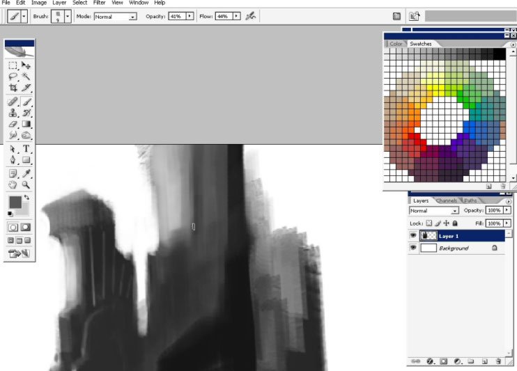
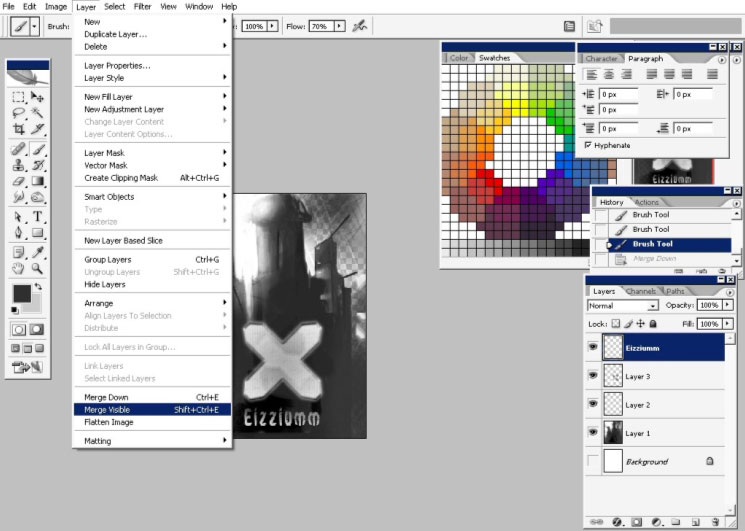
Now, some details to my background using one of my abstract brushes.
When you are done with that you can merge all the layers together leaving only your layer and background.
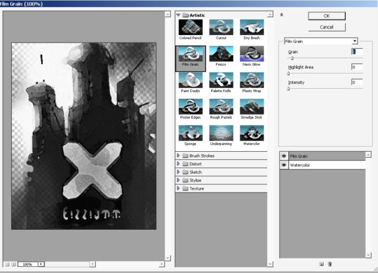
I will do some filtering; I really like these rough edges. I will combine 2 filters: Watercolor and Film gain.
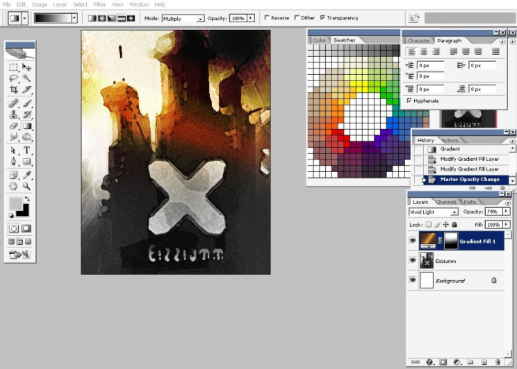
I’ve also decided to put some color there. For this I’m going to use gradient overlay.
So here you see my gradient (the one that is golden yellow).
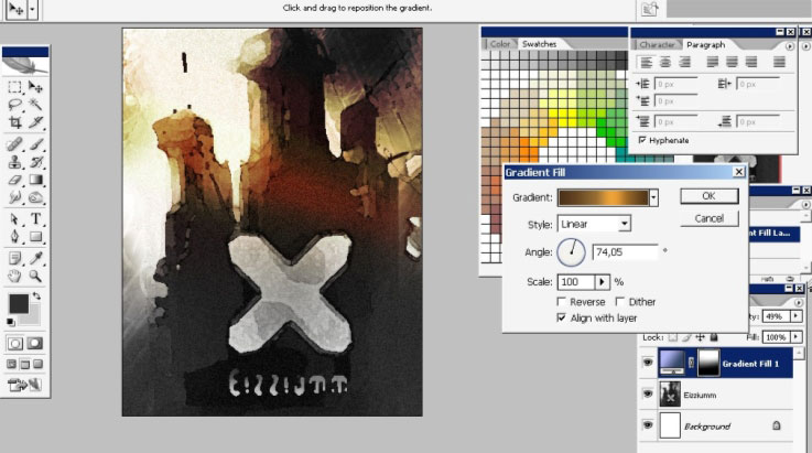
The
whole layer: blending mode- Vivid Light, Opacity is set to 74 %. You
can also see the mask right there in the corner. It hides lower parts
of the effects.
And we are done with this creepy illustration, enjoy.
My antiscale Brush set Download link:
http://designstacks.net/Jeka/MyAntiscaleBrushSet.abr
Comments