
Web page design education
In this tutorial we are going to build a site template in adobe Photoshop. I really like this corporative style for the sites so our site will consist of fewer details that it could have been.
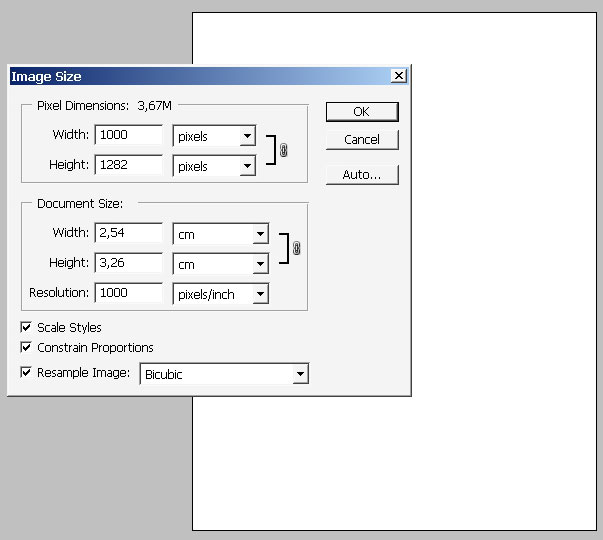
Start by creating such dimensions document.
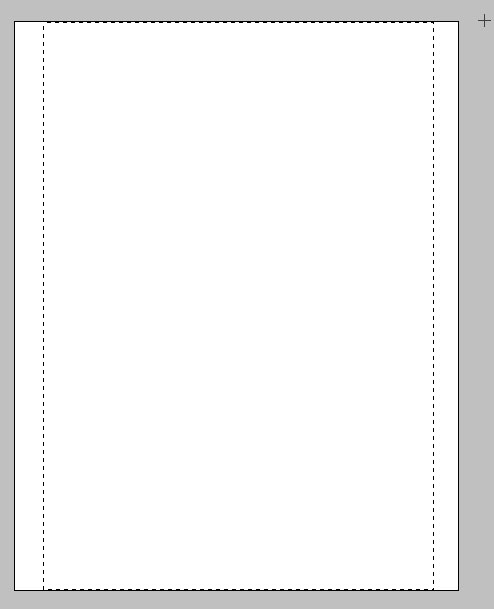
Make a selection for our working are and copy it to a separate layer.
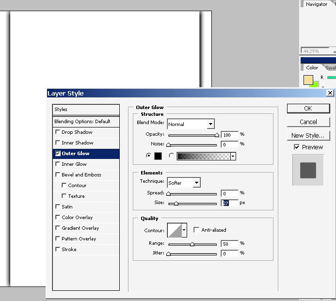
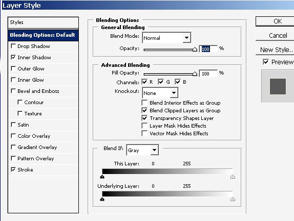
I will apply the layers style – so the area could be better sent and maybe we’ll just leave this shadow effect in the future, we’ll see.

Now you area is still selected? If not select the area and apply a gradient to it.
Here a re my gradient settings with the result itself.

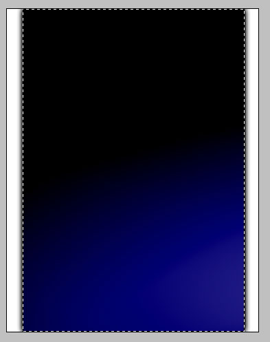
Oh, and I will also flip my image vertically because I would like this blue to be on the top part of the image.
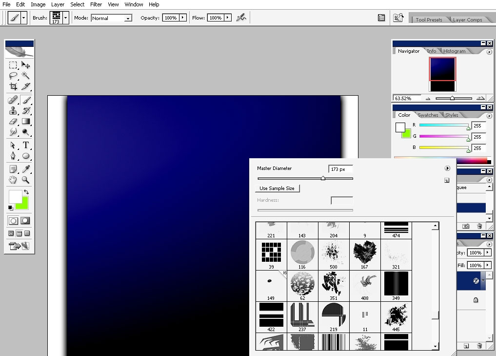
Now let’s see what we have in brush menu. I will pick this very brush, create a new document and tap just once (full flow/opacity)
Now this brush can easily be made, and maybe I have it in my big brush set:
http://designstacks.net/Jeka/MyAntiscaleBrushSet.abr
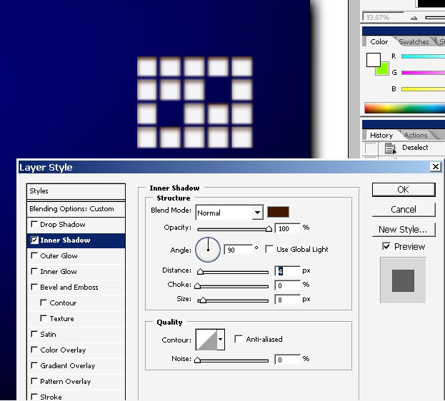
I’m immediately applying an inner shadow to create some kind of effect.
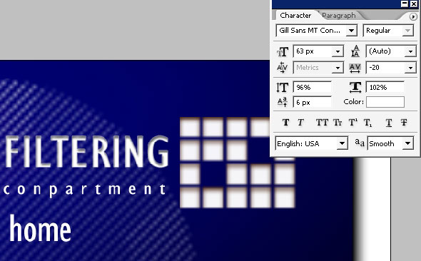
Now comes text. I’m planning to use this brush tap as a logo of a company. Now let’s give a name tour company.
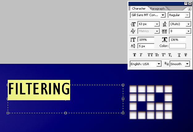
The Filtering compartment – this is the name of a company. I really don’t spend much time to give all this names, because it can be any name there if you like.
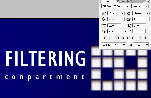
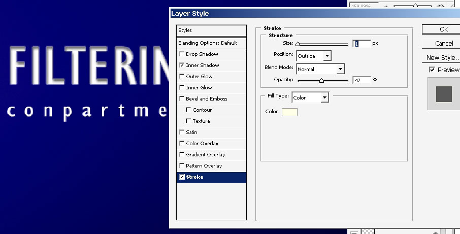
A few effects to my text, to the top one, the Compartment is too thin and little to have some effects.
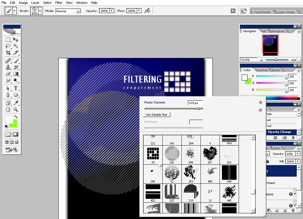
Now we will grab this kind of brush – N 116 in my application, make a big diameter in the settings menu and just tap once to make the header of the site more detailed.
Just tap once. (On a new layer)
Make a mask to this layer and slide wit h gradient from bottom upwards.
Now we will begin to fill our site menu. I will do it in no ordinary
way. As we have this big logo like something, so I will try to stick to
that for now.
Make a work and transform it like I did.
And more….

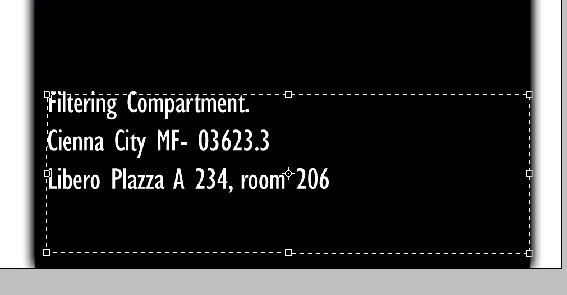
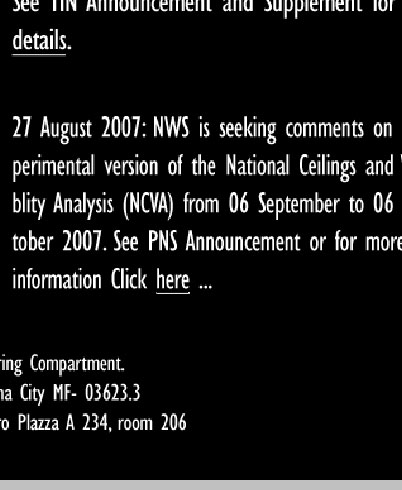
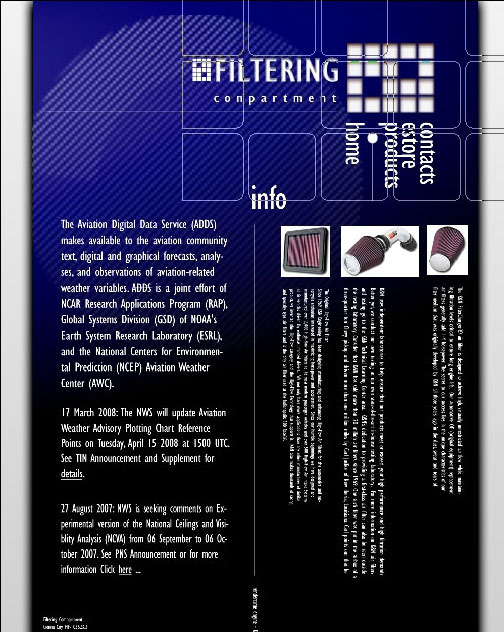
Now some information, definitely some phrases to fill the site areas and to make our site template look like one.
Bottom.
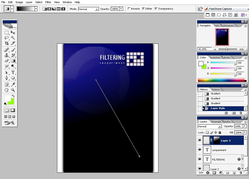
Some to the left. I will also make a line right in the center of the site.
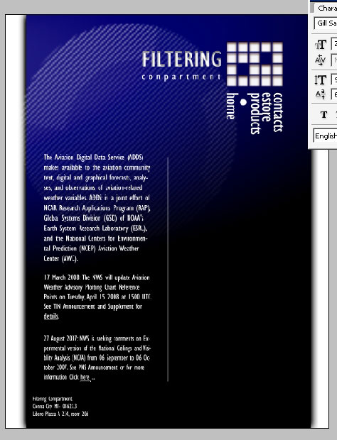
I’m also making lines like if they are links to something.
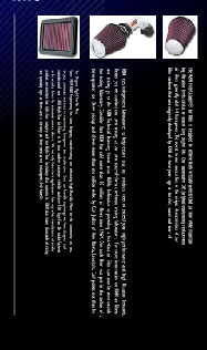
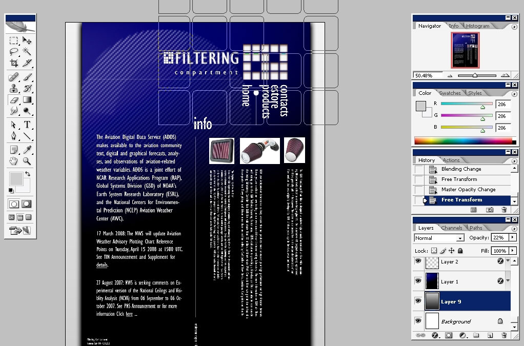
I’ve also downloaded some Photos from K&N filters site and filed my free spaces with it.
Moreover I’ve pasted some text and rotated it. Maybe this is not so easy way to read but as a design it can be possibly be.
Some
of this: a word- info – with 2 lines connecting it. If it would have
been flash powered, the motion would have been awesome.

Now I will make some last elements to the site.
A logo in front.

And a line:

I’ve filled background with black to white gradient and changed the opacity to about 10 %, but this is not so necessary to do.
So here you’ve seen how a site template design can be done in less than an hour.
I hope you found something useful here, annnddd enjoy.
Comments