Making the ATI LOGO photoshop tutorial
Hallo and welcome in making the ATI LOGO tutorial. For this one we will use Photoshop and a mere mouse. We will use basic PS techniques and a little bit of layer styling.
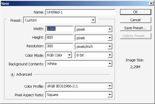
Create a document.
I will take a peak at the logo first.
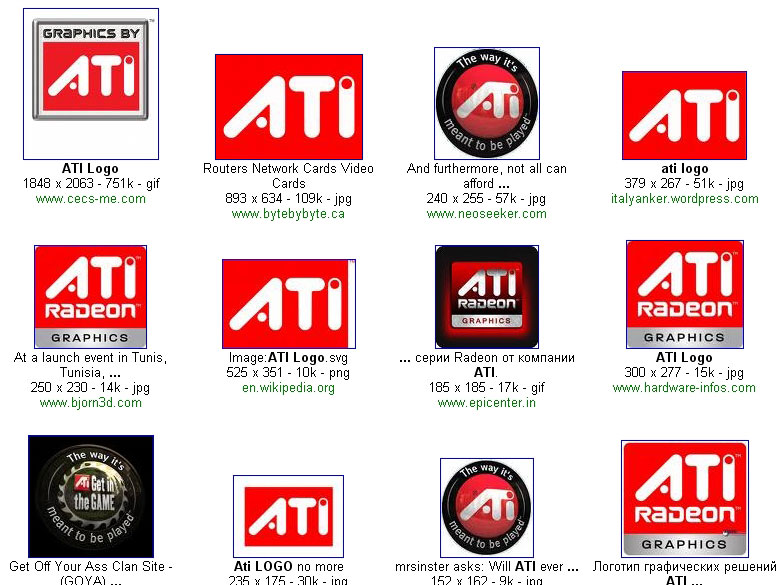
This part is the most important. The areas between the letters matters the most, so my logo will be just like ATI’s.

Now let’s get to painting. As you can see the borders of the logo had rounded edges. This gives me a good idea.
Create a new layer.
Choose basic round rough brush.
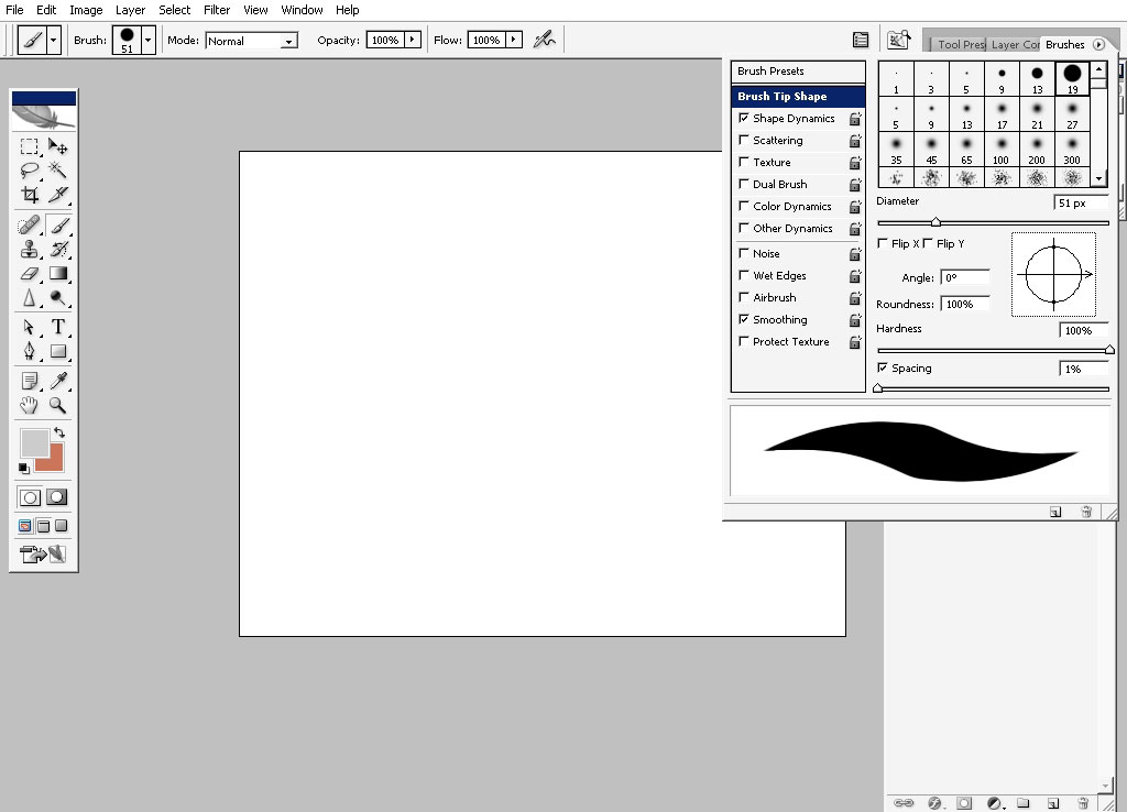
And make a line holding the shift key to make it perfect straight.
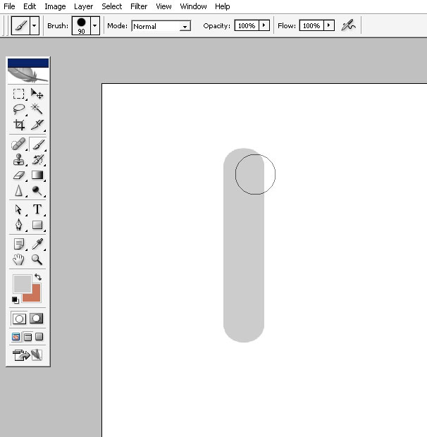
Make several copies of this layer. Let’s make it 4.

Let’s now build our logo out of these lines.
First comes letter A – this just out line on 15 degrees and make it a little bit longer than the original.
Letter T – make the line horizontal and make it a little bit smaller then the original.
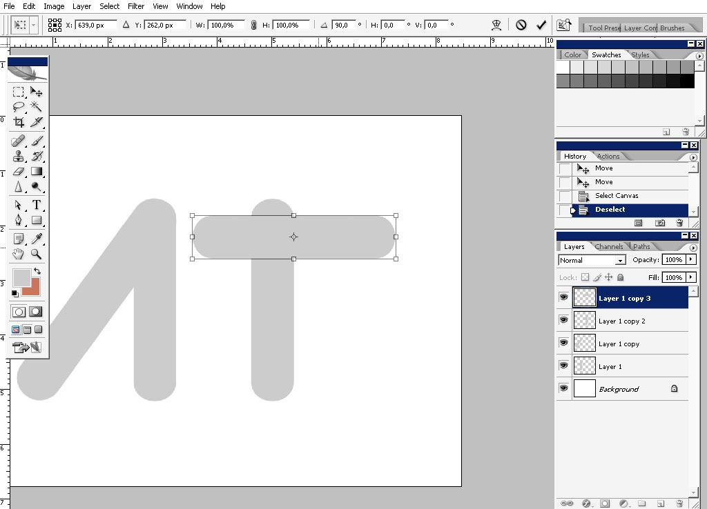
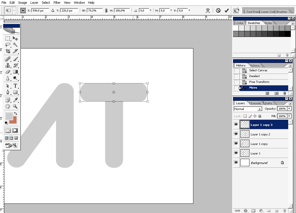
Letter I – and the I stays just like it stood there, no changes for I
And there we have it the basic shape of the logo, but we must also put some dots there as you can see on the original logo.
Create a new layer.
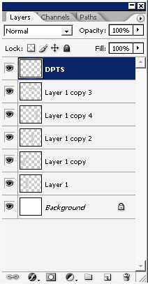
Use the same brush. I’m using different colors, grey and white so I can see better what is going on there. In the next few steps this will be changed.

So that is it for the logo I think, let’s make the background. Of course it’s going to be red.
So create a new layer underneath all the text.
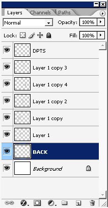
Fill the layer with red.
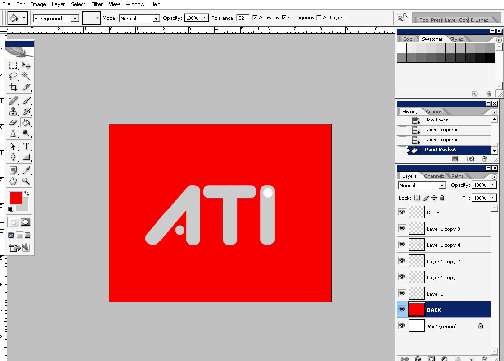
Next what I did, I’ve created a new layer and filled it with black to transparency gradient.
I’ve also transformed and warped it.
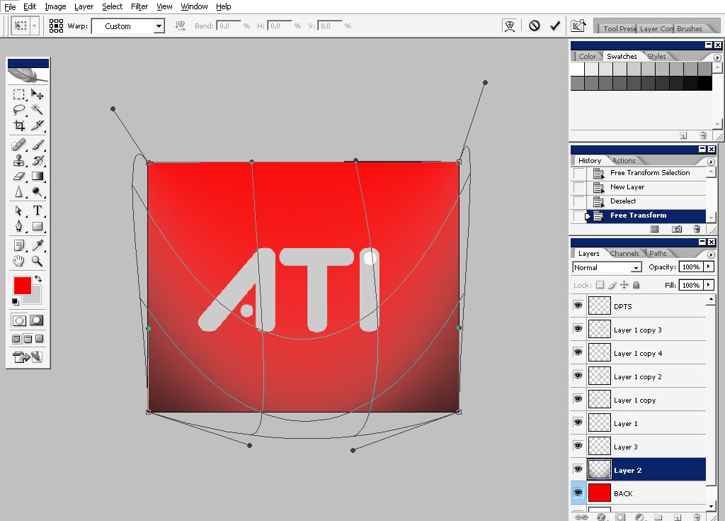
Next step:
Make a selection about so.
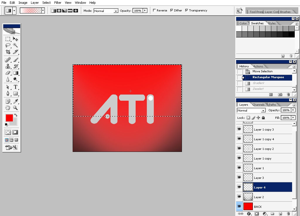
You can transform and warp the selection too, not only layers.
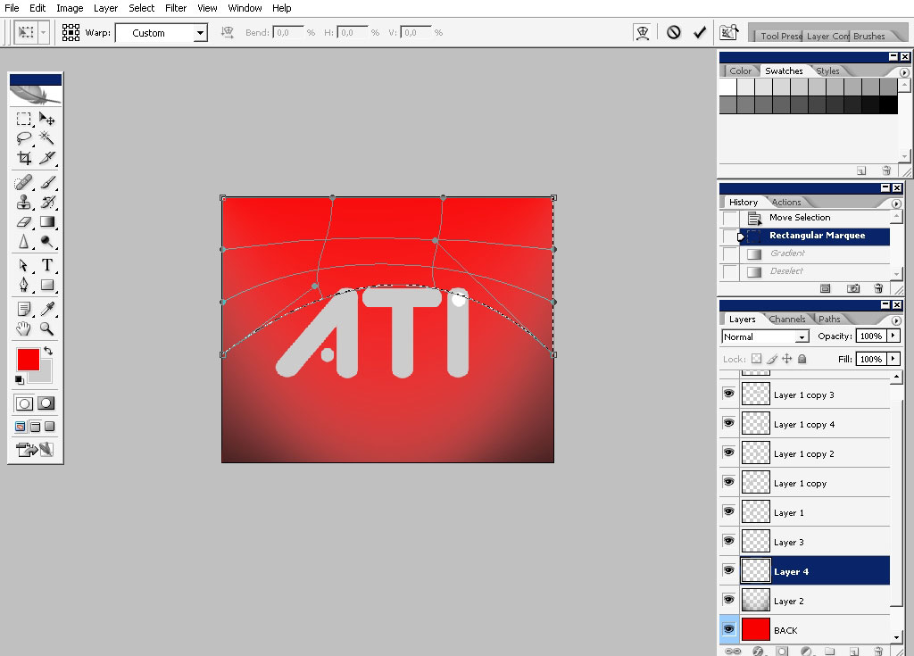
Crete a new layer and fill the selection with white to transparency layer.
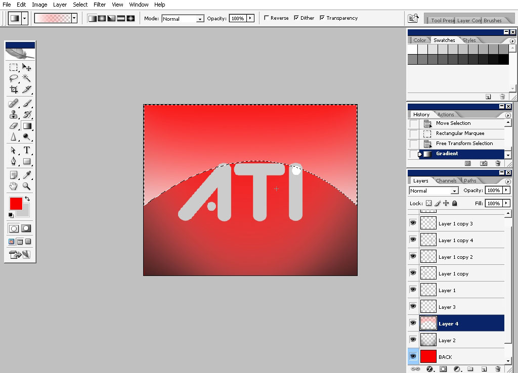
I’ve also want to warp the (now) layer a little bit.
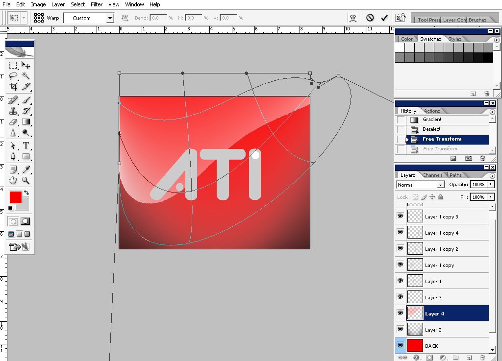
Yeap; something like this. And do merge the text layers together.
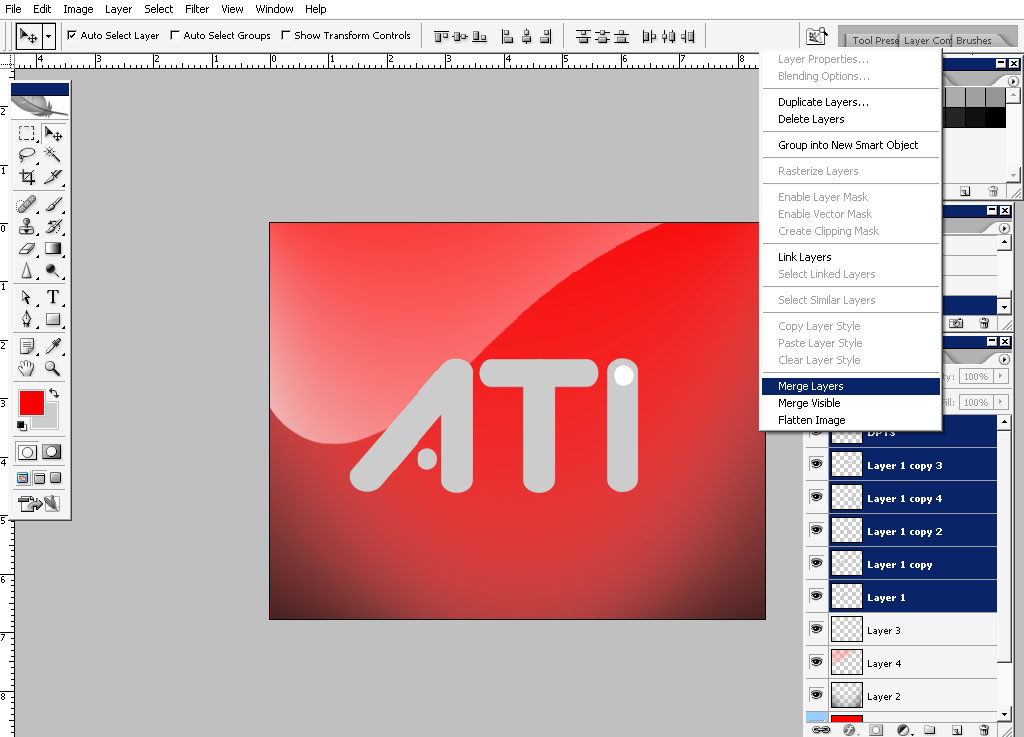
Now apply some layer styles to the text.
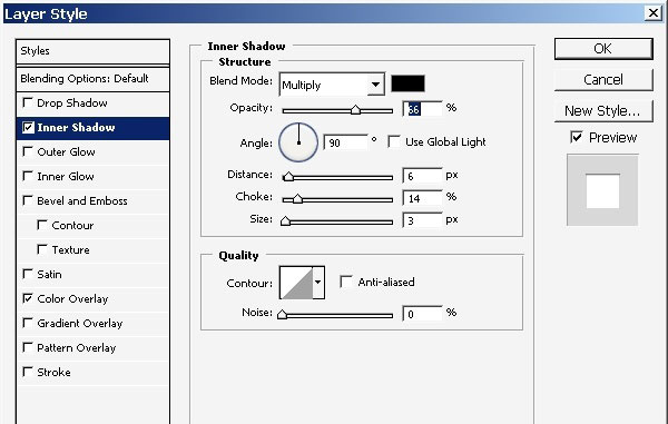
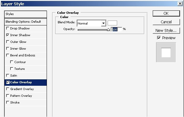
The result looks quite OK.
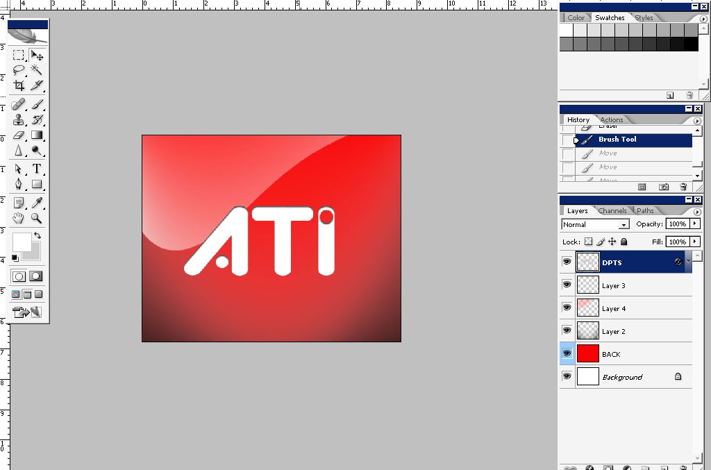
But I want to fill the background with something because even if this is the logo the background is still very poor.
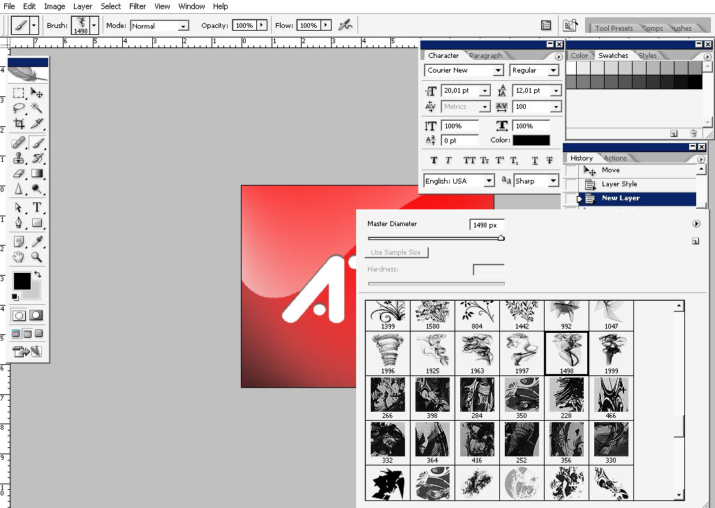
Just grab one of my smoke brushes and tap once (on the separate layer).
Download Smoker_ Fx.abr.
Vuala: it’s done and looks good.
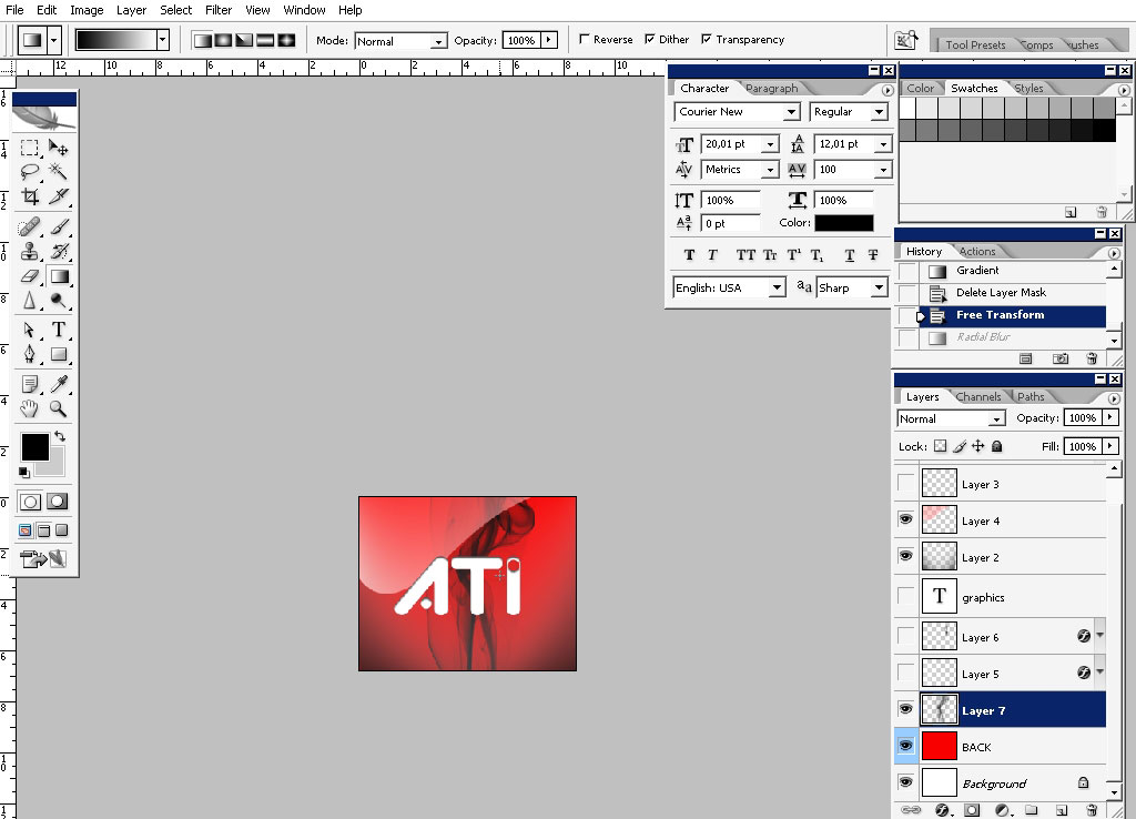
And of course this is a trademark, and we do respect laws, ya?


Comments