Sony Ericsson Logo
In this tutorial we will make Sony Ericsson logo in about 20 minutes. Besides this you will understand how to save your time, changing layer styles and using the copies of your initial effect or form. So let’s go.
I will use a reference first, because the goal of this tutorial isn’t the creating of analyzing the creating idea.
You all probably remember the logo, but here is some reference to memorize the elements of the logo.
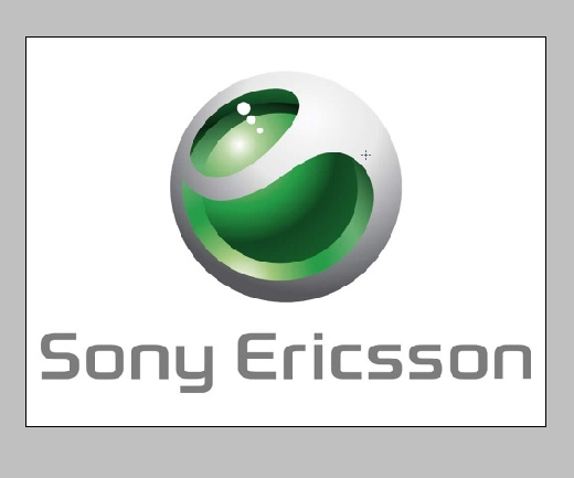
Now what they probably did if they use PS when the idea came out.
The idea is what really counts.
I’ve created a circle using the shape tool, I’ve made it green. This circle will be the middle round element of the logo.
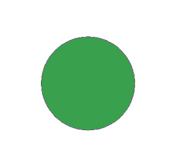
I’ve used only one layer style of this one.
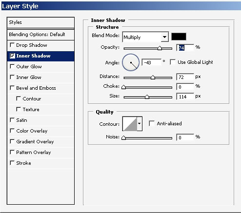
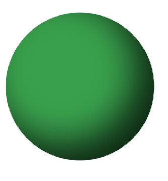
This will be our shadow for now.
The reflection was done my soft brush. It is way more easier than to create shapes an blur them, especially when you have one of Wacom‘s products.
So, just 1 stroke with soft white brush and there we have it.
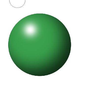
But I will still BLUR my reflection with any Blur Tool or filter.
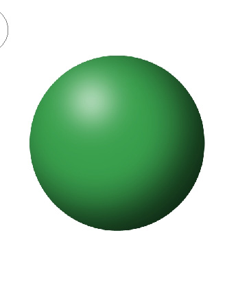
While looking carefully of the logo back then I’ve actually saw that the reflection has some Yellowish green color. You will probably see it too.
So here we go. I’ve used color Overlay in my layer styles.
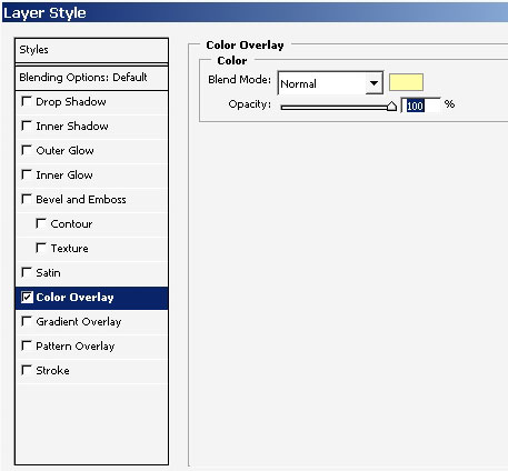
To make the reelection less cartoony and more real like I’ve made 2 copies of my reflection layer, but turning off the style, thaw the color overlay.
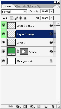
I’ve also transformed it making the reflection a little bit smaller for some color gradation.
So here we have it. It actually some yellow there. If you done with it, you can merge the layer (3 reflection layers)
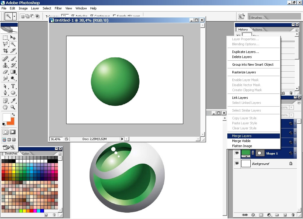
The next step is to create the Gray one, the one that has holes. So the middle one, the on that we’ve created can be used for this. A little color change and style change does the thing.
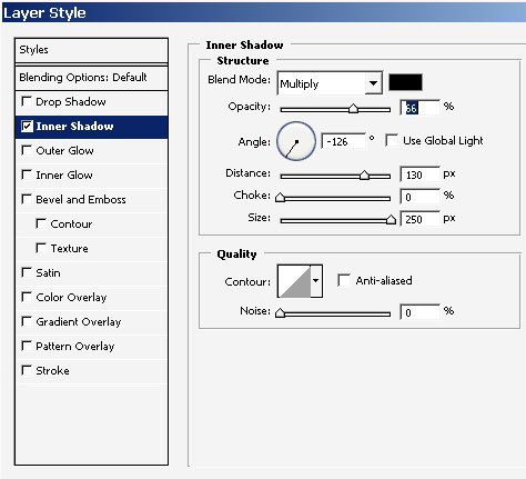
The initial color of the circle is white or just a little bit gray there, something like my Windows color scheme.
Now maybe that most difficult part of all this is to create wholes. I will use shape tool to create oval form. Use Warp Transformation to create more like egg form.
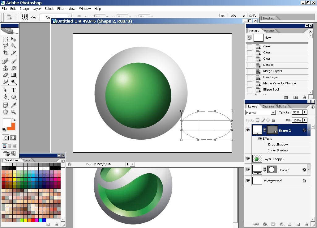
The second one needs a little bit more effort to make. Use Pen Tool to make this. Try to match the shape of the original one.
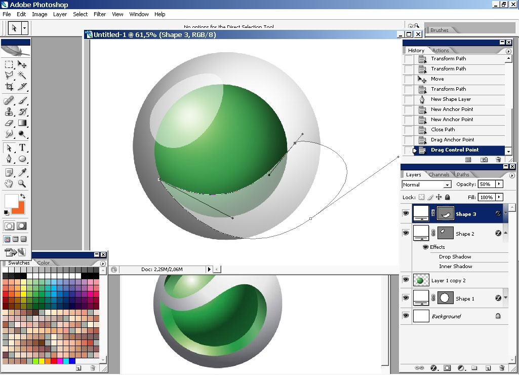
Well something like this.

Rasterize shapes:
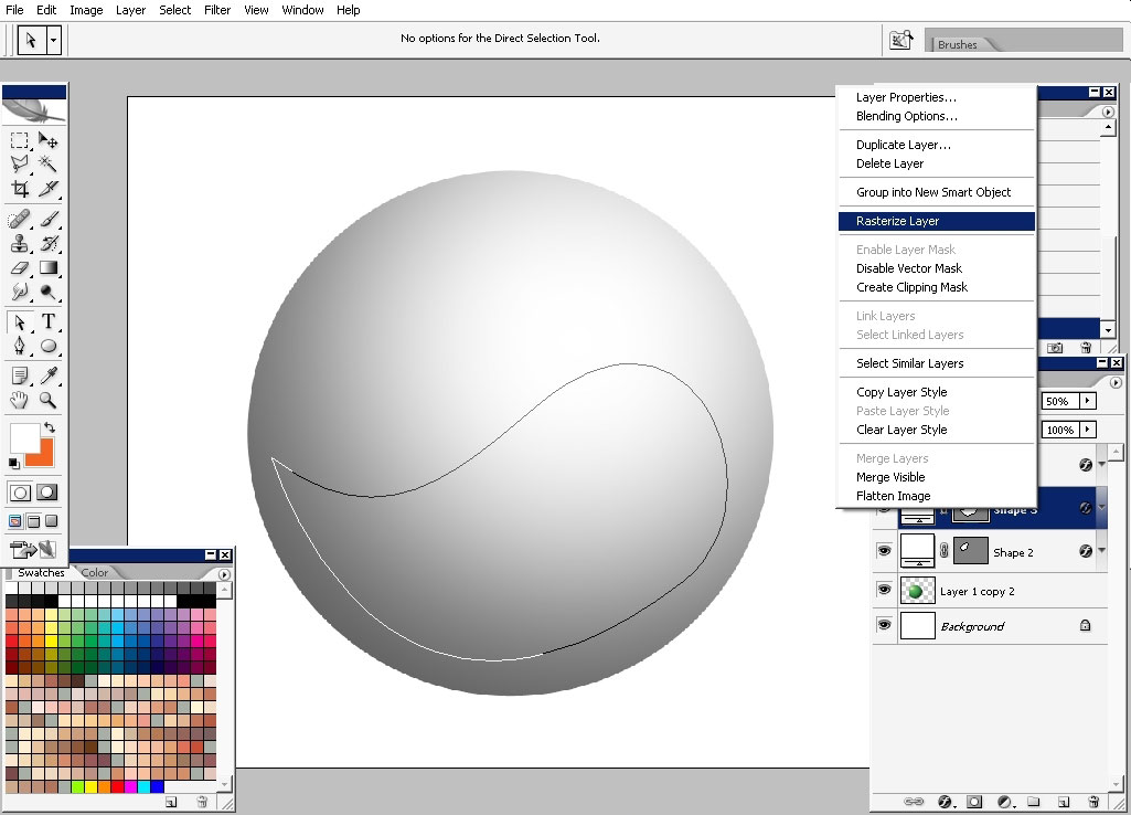
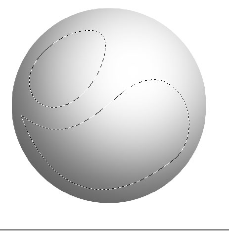
Make the selection, you can make 1 selection and then the other one or hold the shift key to select both.
Tap delete when staying on the Gray Circle layer.

Create another copy of the Green middle circle.
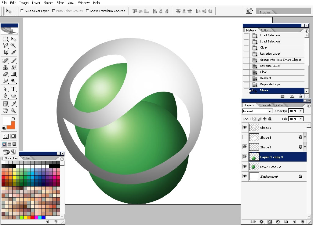
Oh yea and do fix that mistake i did, haven’t even noticed.
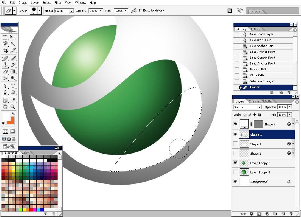
Just make that circle bigger and rotate it.
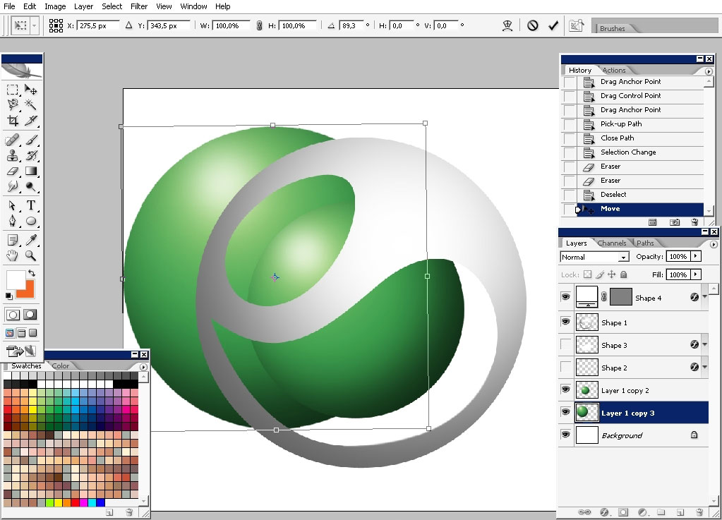
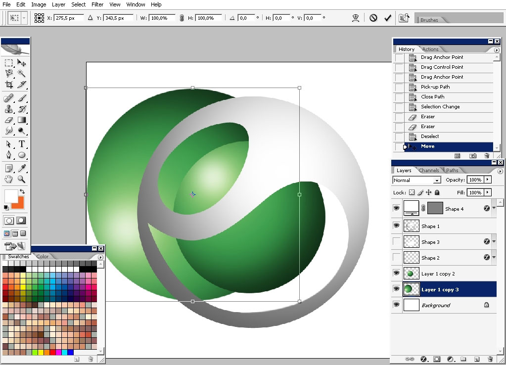
Lay out everything. Watch the proportions.
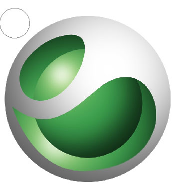
Make these 3 blinks. Shapes or mere brush can be used for this.



Fix the color a little bit and we are ready with this.
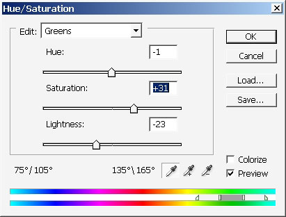
The background was made with the same layer.
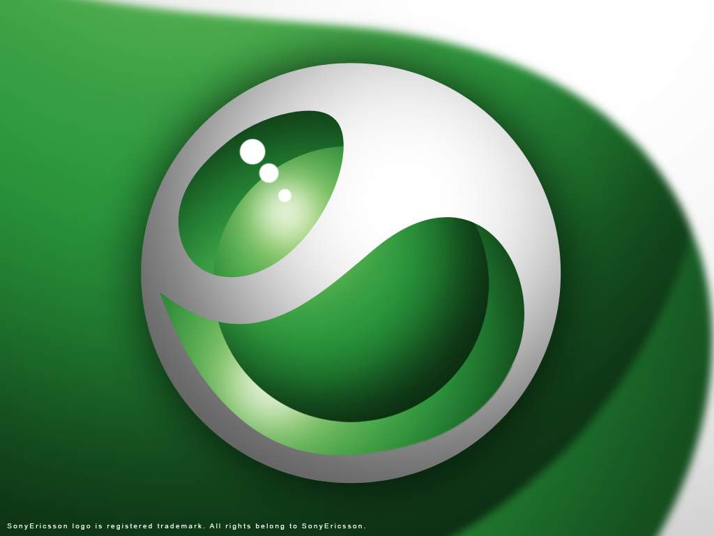
Hope you enjoyed this one, and learned to save your time using the Application possibilities.

Comments