
Photorealistic Vinyl Design
Hallo, my name is Jenya; friends call me Jeka (not a Joke) and welcome in making Photorealistic Vinyl design wallpaper. In this tutorial I want to combine Stylish Photorealistic illustration with design elements such as text, logo and color variations.
So let’s get started with making a document with these dimensions.
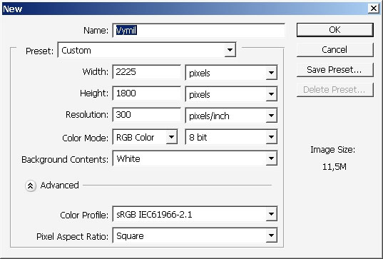
Quite big I think and the print parameters are 300 DPI. I recommend you to have at least 2 Gb or Ram to work fast with such large documents.
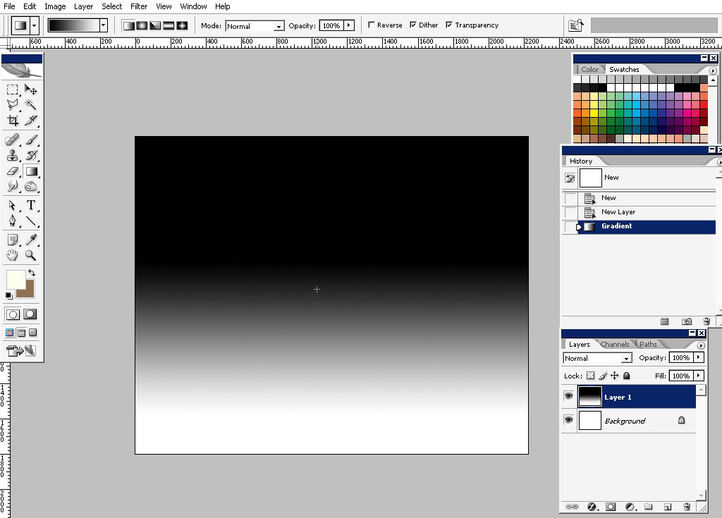
Create a new layer and overlay it with simple liner style black to white gradient.

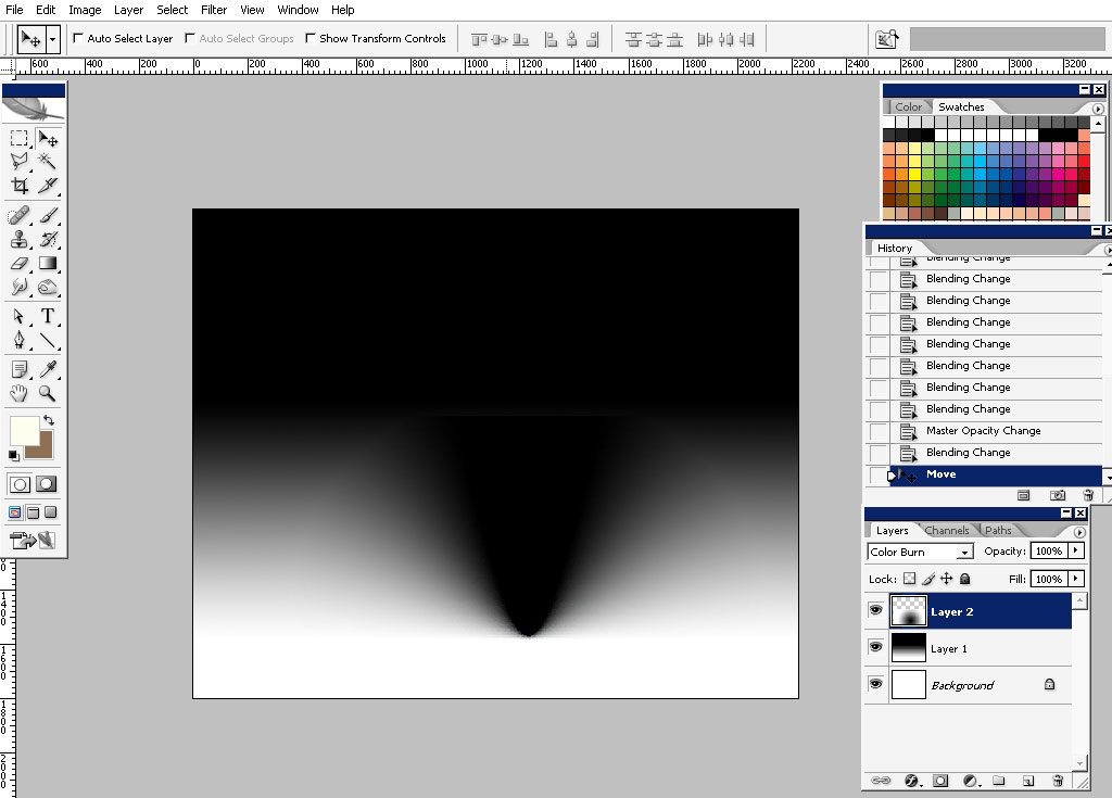
Tnx to layer modes in Photoshop you can create quite interesting effects. For example I’ve created a new layer, overlaid it with black to white gradient, only this time round and set the layer mode to Color Burn.
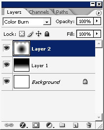
Now I can control certain areas, filling it with smooth gradation of black to white. You should try it.
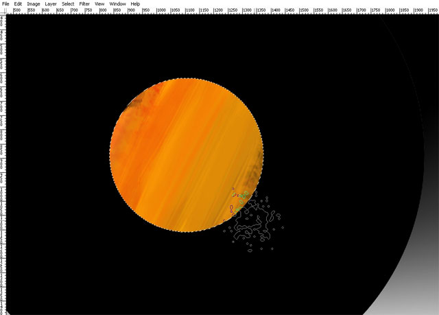
Next step: Vinyl
I did find some final references, mostly to find out the pattern of music lines on the vinyl.
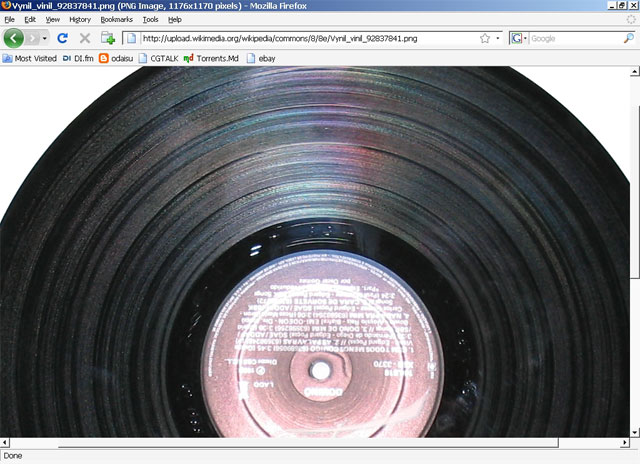
.. And this is how I recreated them in Photoshop:
Take’ a rounded area, create a new layer.
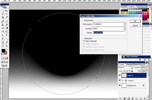
Fill the area with black.
Make a smaller selection right in the center to paint some sort of graphics.
I’m using torn edge brushes for this, very abstract and fast: Basically a color tweak.
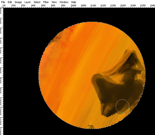
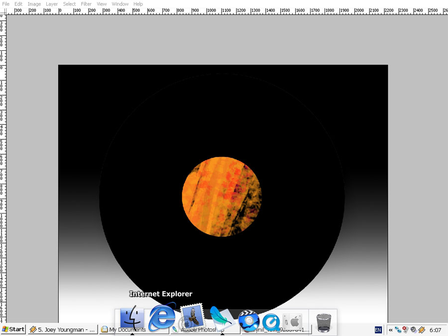
Maybe a face: you can paint there whatever you want.
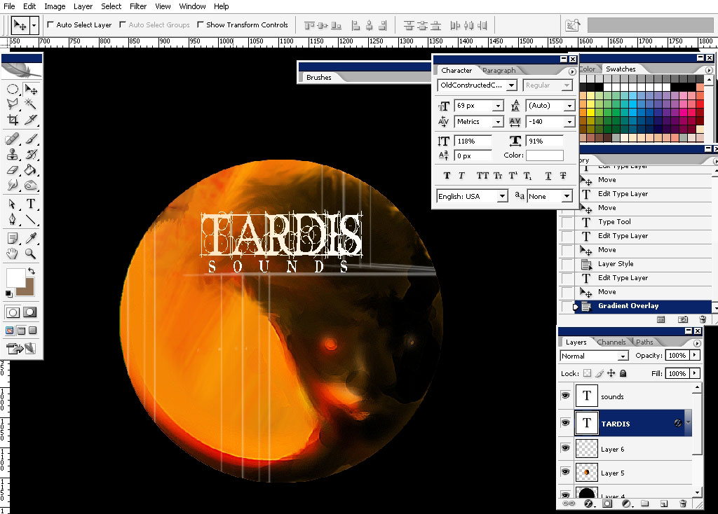
Leave the selection on all the time. Paste some text there.
Next step: vinyl pattern.
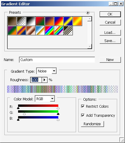
I figured out how to this fast while looking once again on the vinyl.
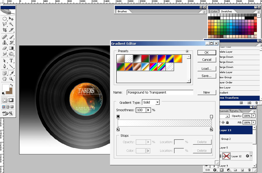
Here are the gradient settings first. Here is the gradient itself – as you can see I’m using noise gradient.

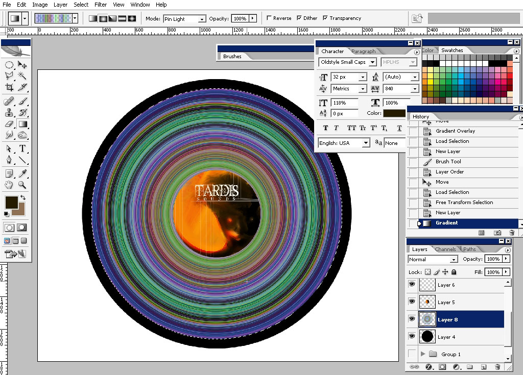
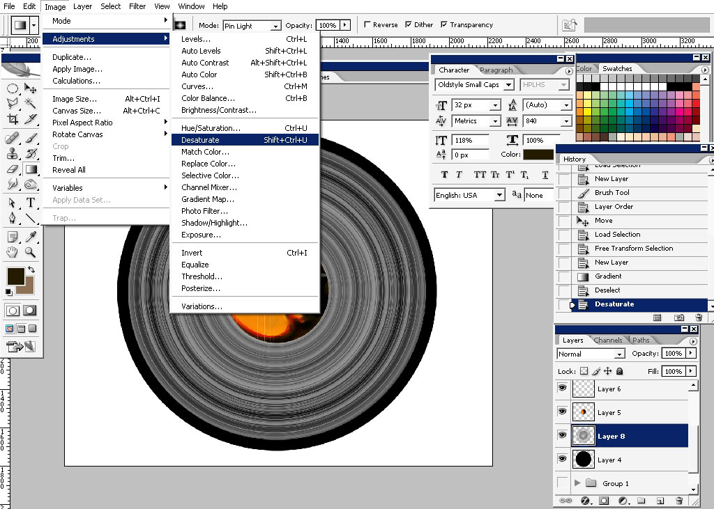
De-saturate the layer leaving it without colors but with pattern that we need.
Lower the opacity.
It really seams painted like – I want to drop some shadows and lighting.
Here is the shadow line- where our shadow will be.
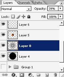
I also made a copy of vinyl pattern – so it is more intensive now.
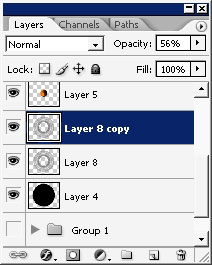
Drop a mask on this layer.
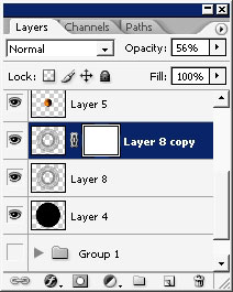
Choose this gradient with settings below.

Use this gradient to hide the part of the pattern making it darker.
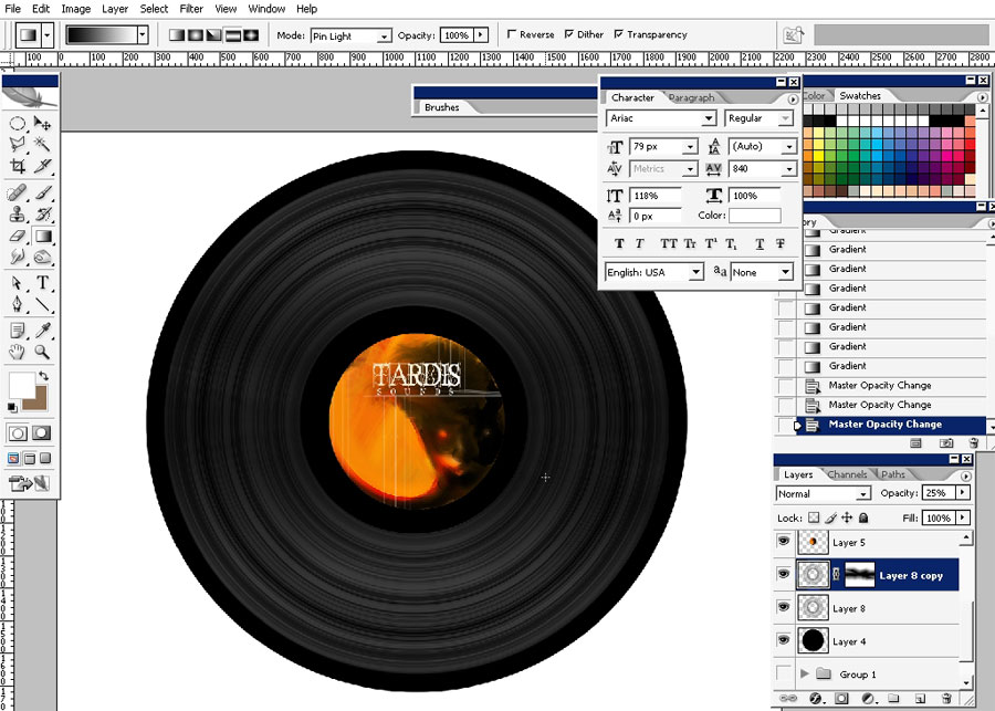
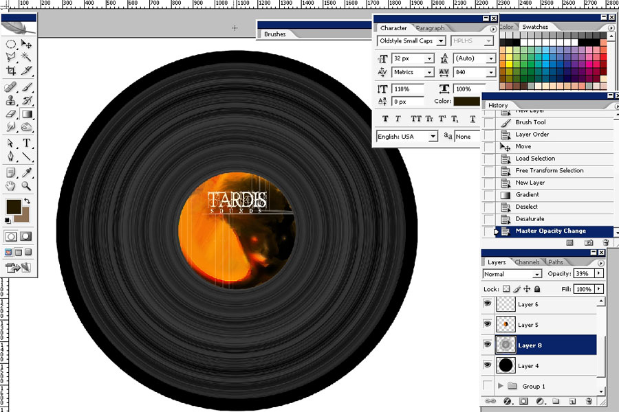
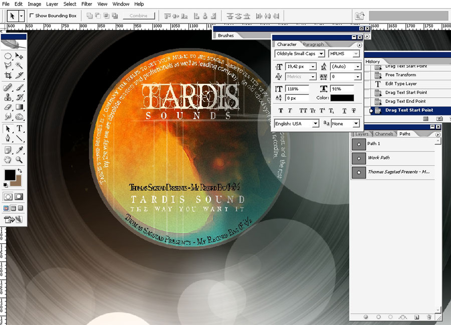
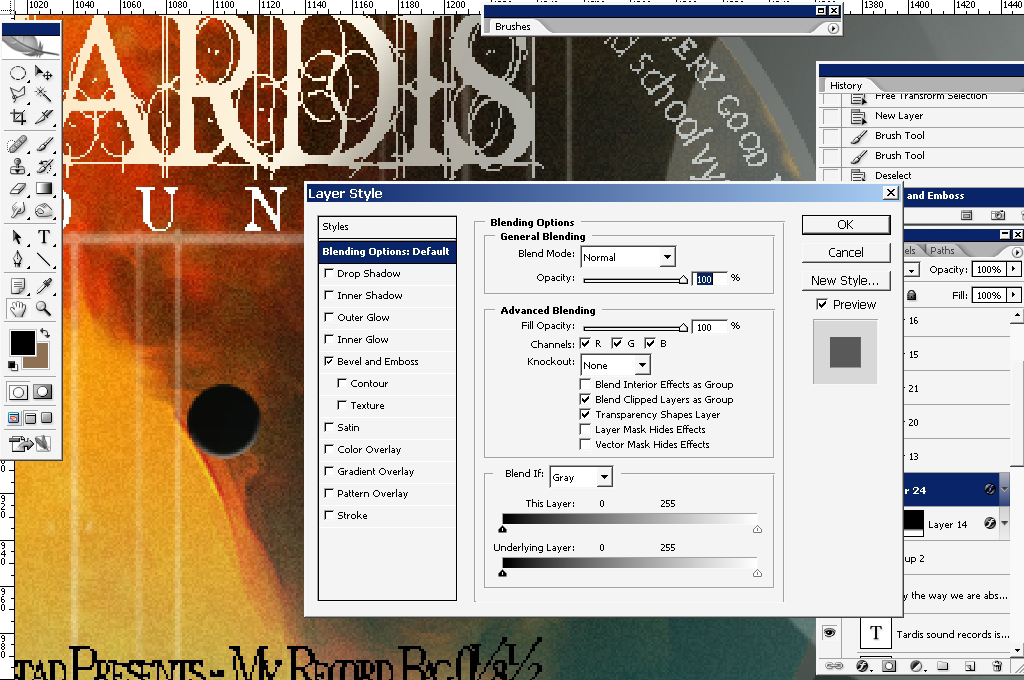
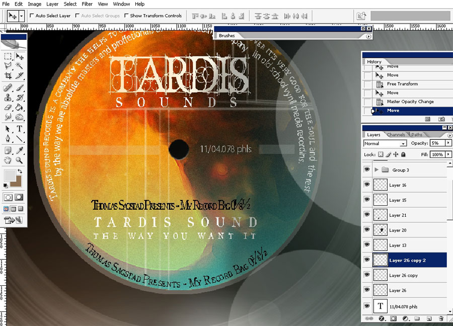
A little tweak – make a selection ( or a path ) – make work patch out of it ( or don’t ) – choose type tool and type the letters on the circle.
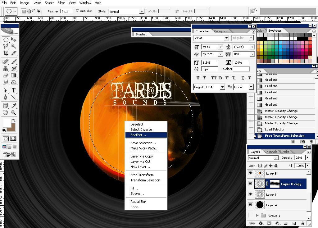
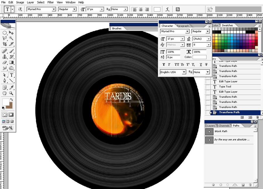
Select the circle ( the one that is in the center ) – and apply a small gradient tweak – for more colors.
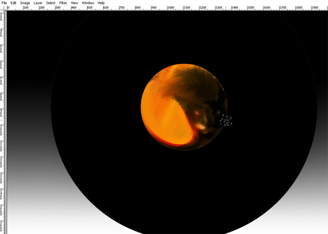
Next step: Complex lighting.
I
have discovered a very good way to lightened up the 2d surfaces. It was
quite easy – I’ve just used lighter ( white this time ) gradients on a
top layer.
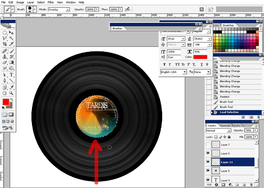
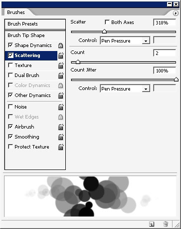
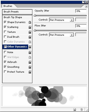
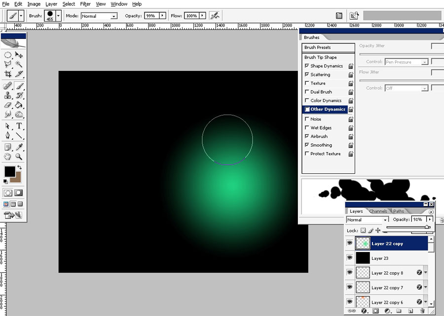
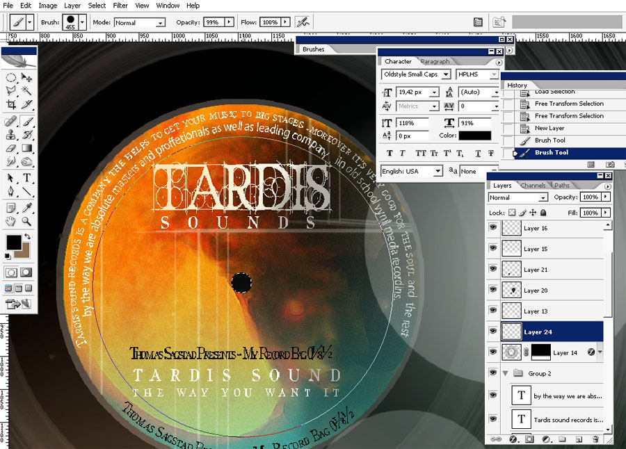
More to that I’m going to decorate my lightened surface with this: I’m using basic round rough brush.
Those who are lucky to have a tablet will get better result I think. Just erase.

I
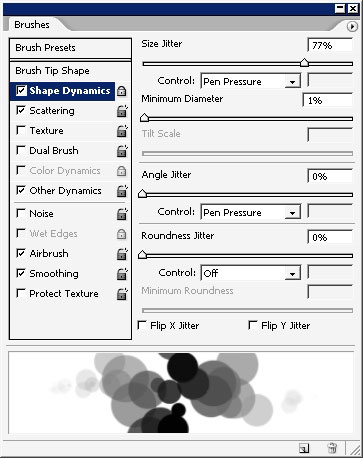
recommend you to save this brush as a New Brush Preset – it will be
saved with settings too. We will also need this brush to paint with.
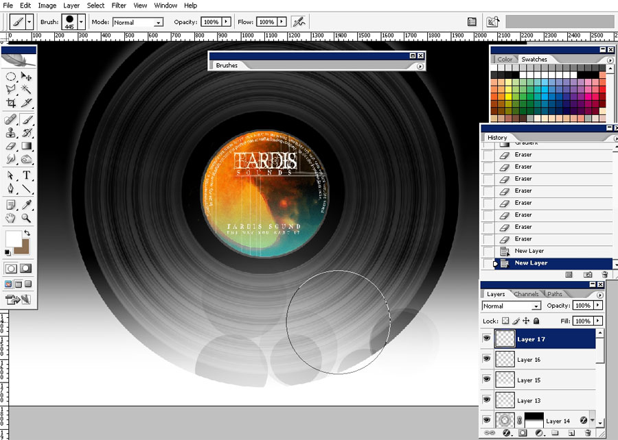
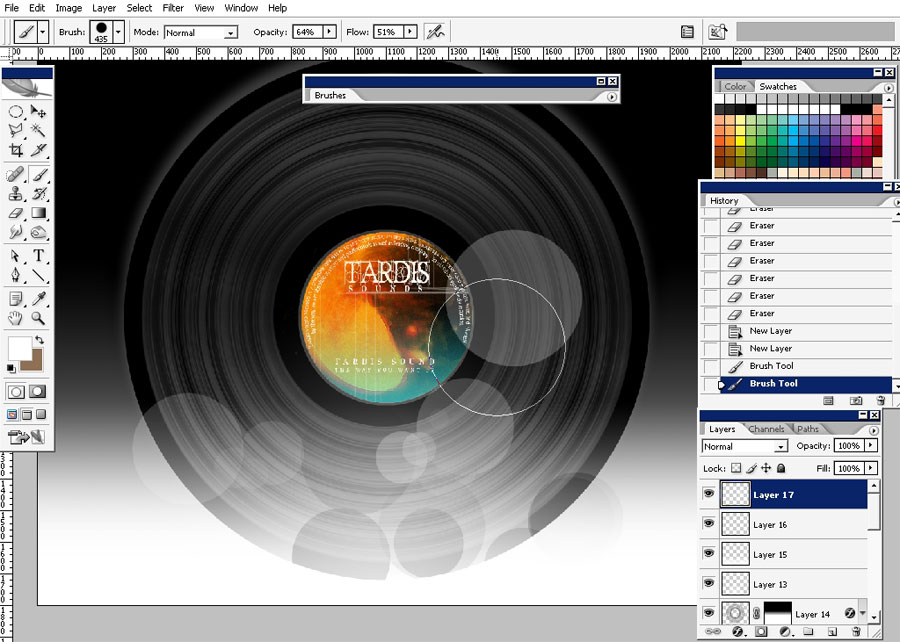
Create
a new layer chose this brush – (your saved brush) – choose white color
– lower that opacity to about 80% and paint some of these dots.
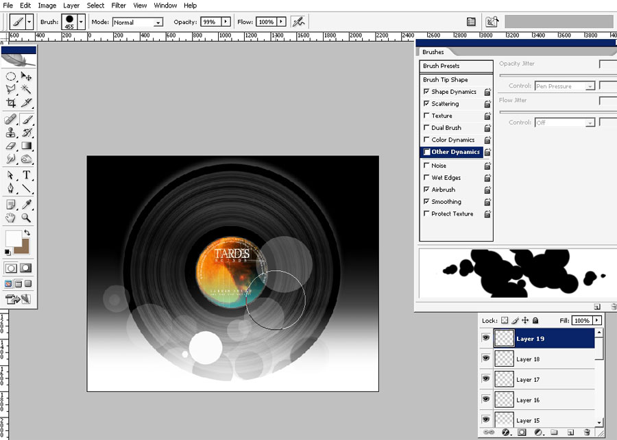
Some black maybe too (on a new layer).
Opacity to the layer that has back spots is very low – represents shadows.
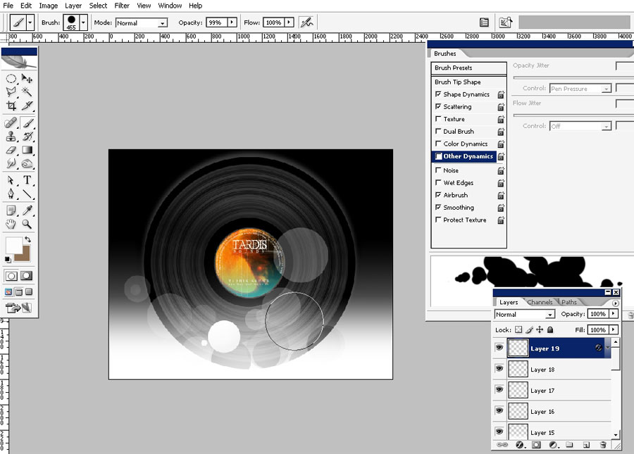
Next step: lighting technique.
This
is the basic principal of 2d soft lighting: it is based on soft edged
gradients or brushes- you can even change the color of the lights. So
just create one.
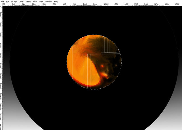
Lightened:
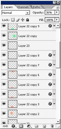
See how many of these lights I have- just copied them.
One good at the top:
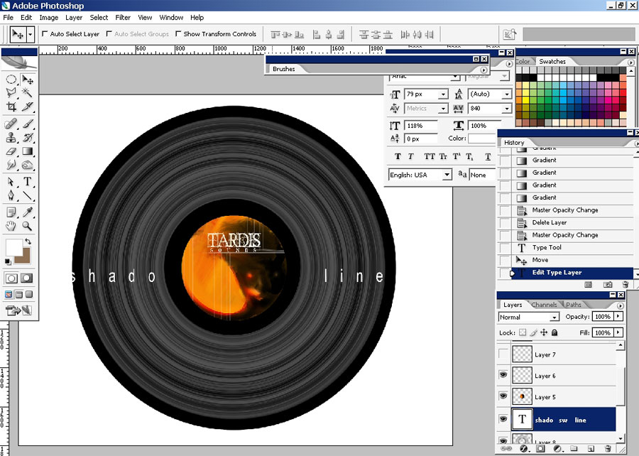
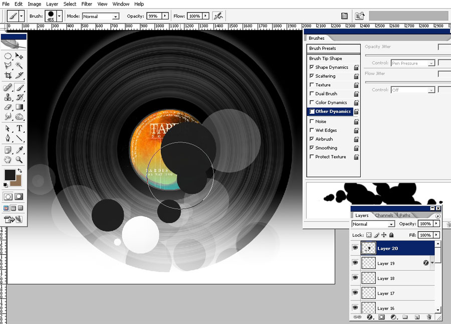
Some text adjustments:
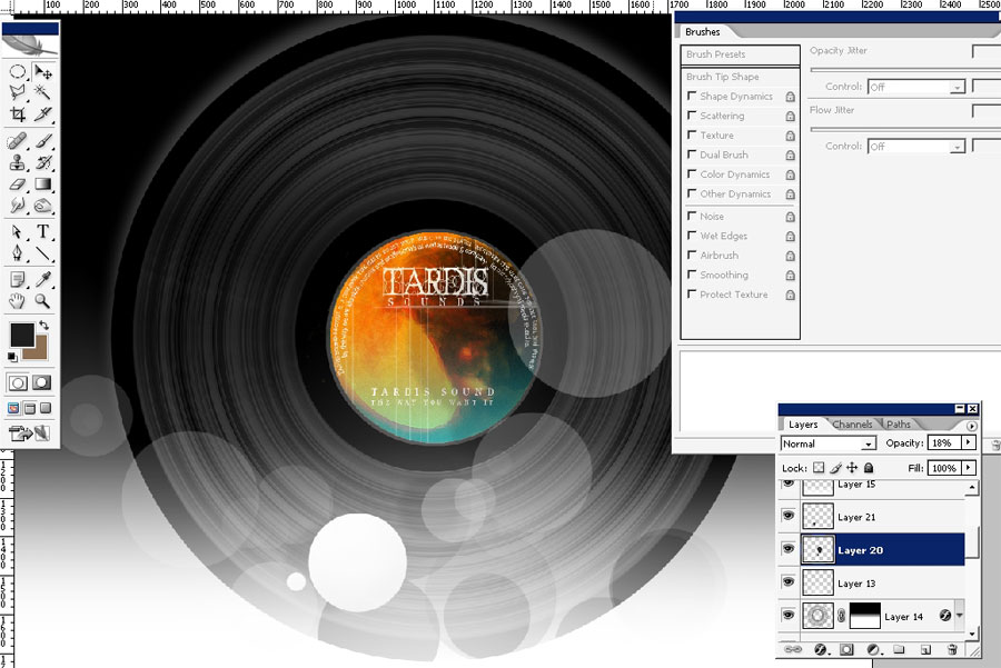
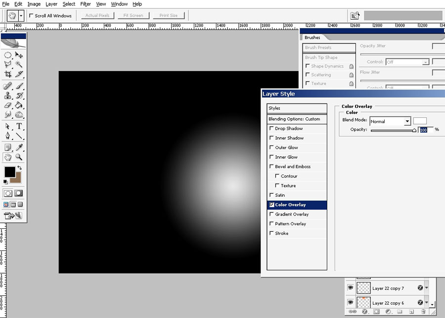
Oh yeah almost forgot about the whole in the center. Make a new layer and tap just once with black color brush.
And
I sake of realism – just apply inner shadow. I’ve also applied noise
filter to the color circle in the center so it might feel real- like
paper.
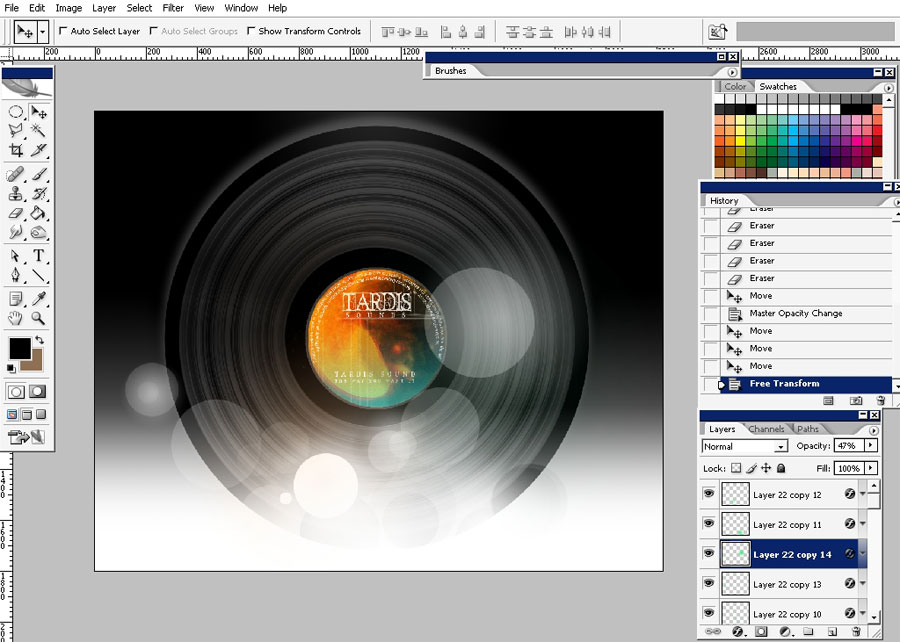
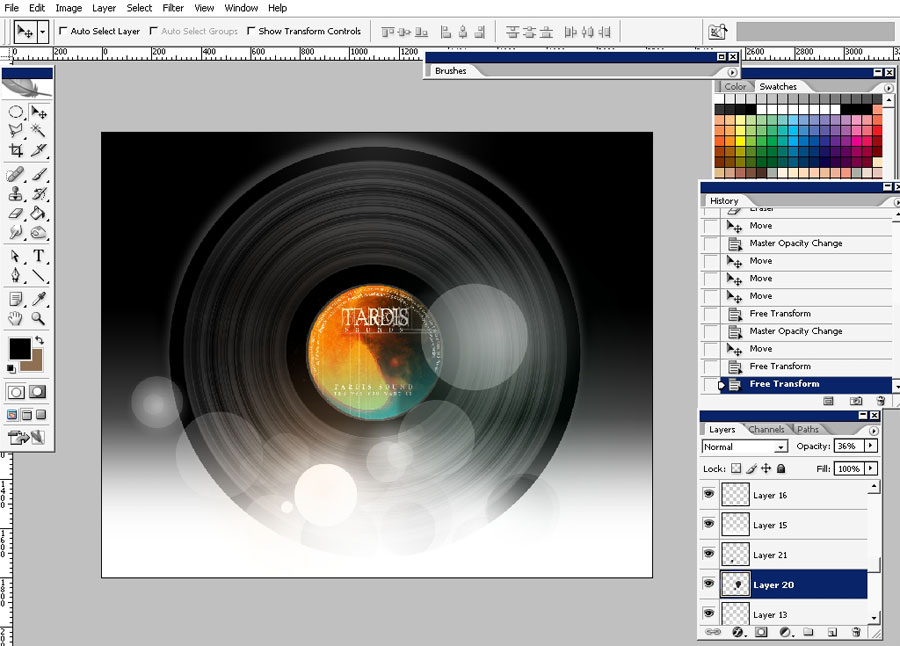
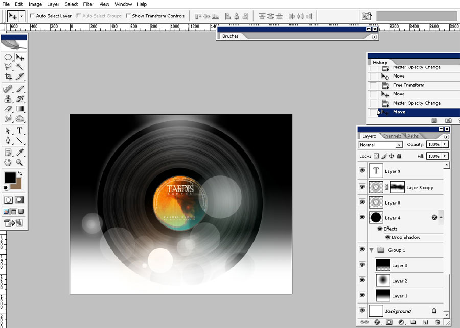
See how lights came out well.
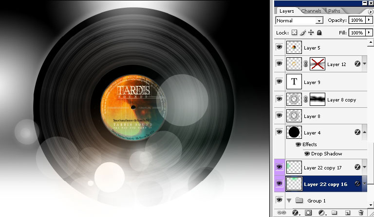
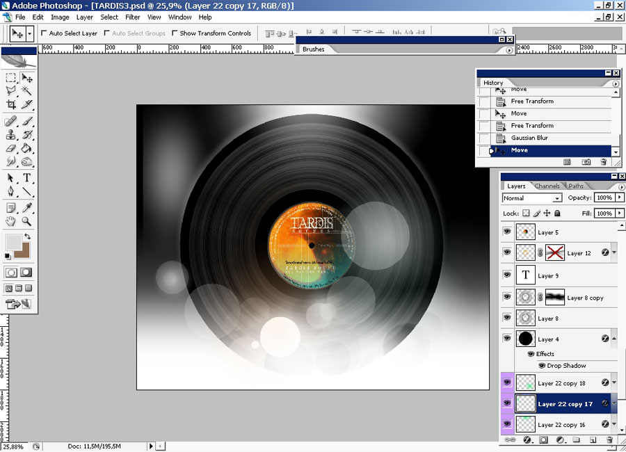
All the purple layers are the foreground (2d) lights.
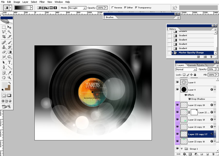
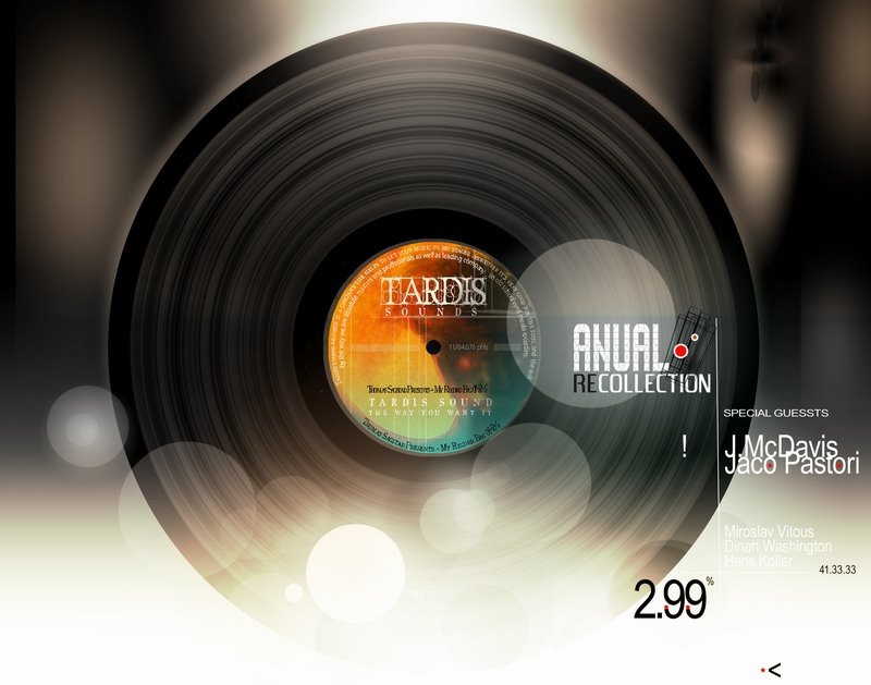
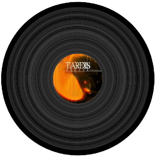
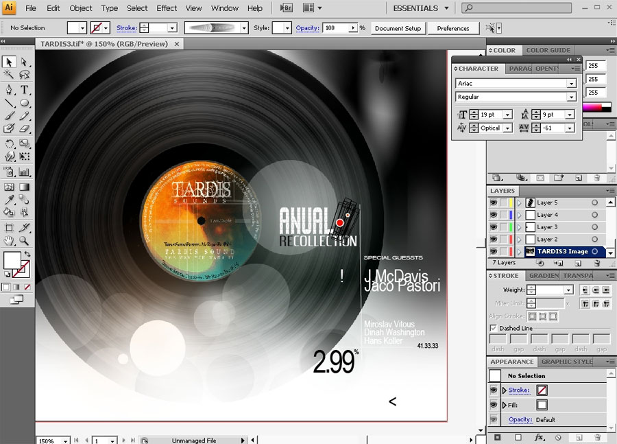
And
this is basically it: oh yeah here is my text part done in illustrator
– if you watch it carefully you can make it. Basically type is involved
here.
So tnx for watching this tutorial and see you next time with more designs or illustrations.
Comments