
Print design techniques
In this tutorial we will learn print design techniques. The reason I do this is that in some time now I’m really beginning to
feel passionate about all the print and advertising design. No real art there, but really strong ideas. So here we go. This
is my first one, so keep it cool.
As usual I will create a document, the size really doesn’t matter. Note: if you are playing in Photoshop and not in a vector
application keep the pixel resolution high.
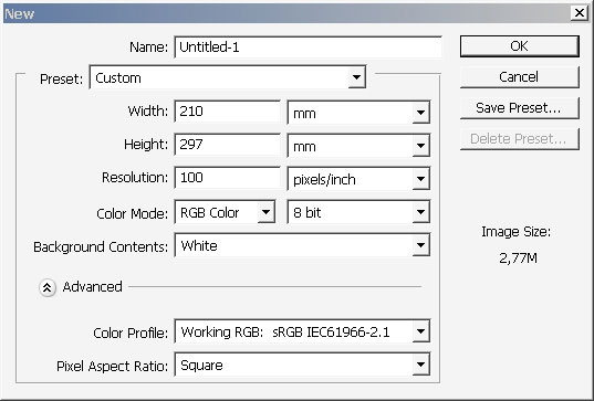

100 dpi is really low, but I need this to operate my machine fast enough. I recommend to set the pixel resolution from 600
dpi to about 1200 dpi.
And here we go:
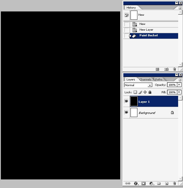
Create a new layer and fill it with black. I will try to create a background, the basic theme.
Tap Q to enter quick mask. Then use black to white gradient with blending mode to define the mask and the exposure edges.
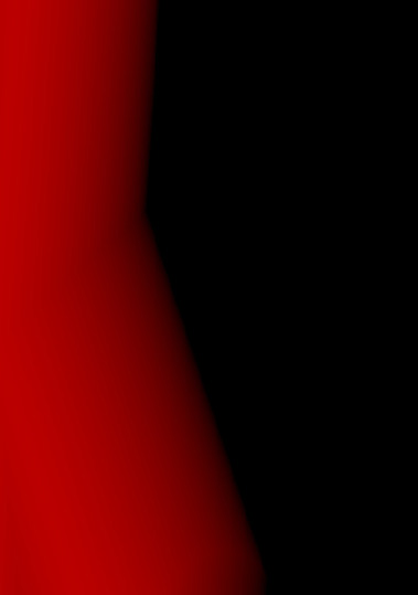
Tap Q again to exit the mask mode leaving you with the selection. As you can see me nest step was the creation of the next
layer and overlaying the top left cornet with orange to transparency gradient.
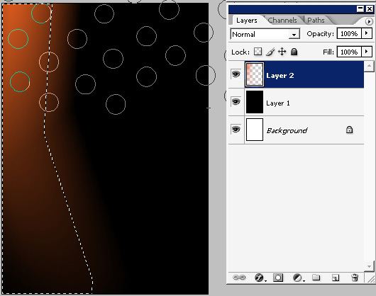
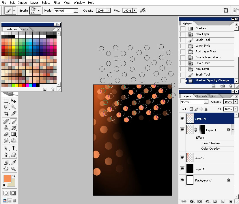
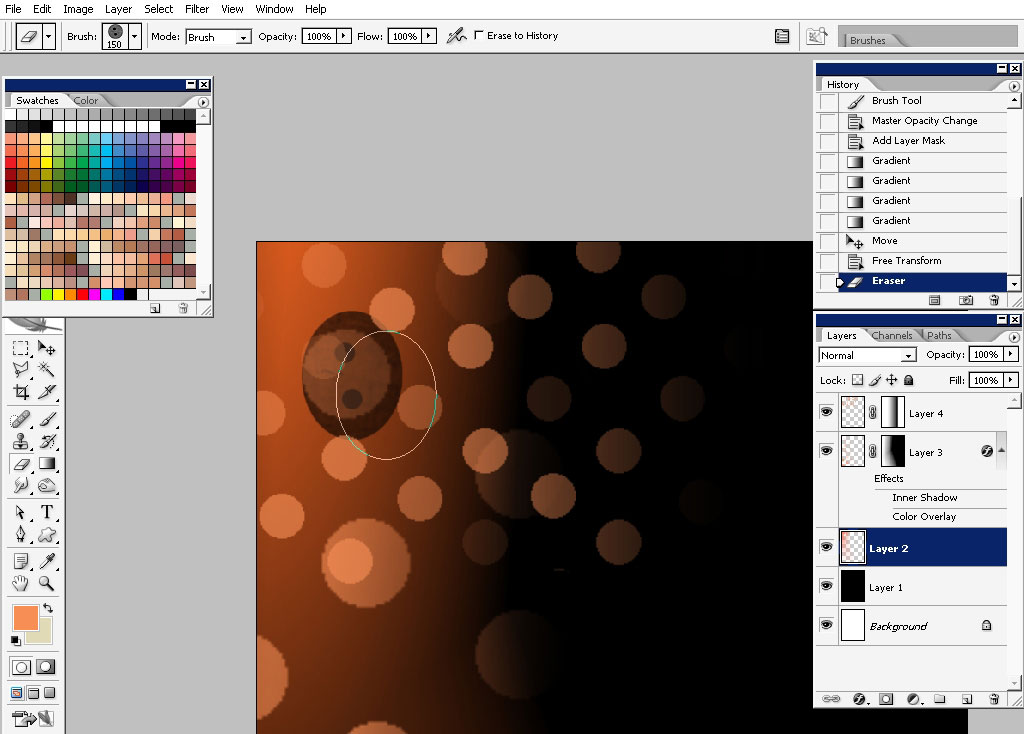
In addition to that I will overlay the layer with my newly downloaded Dot brush (on a new layer). As you can see the right
edge just blends with the dark background. Thanks to my Q mask.
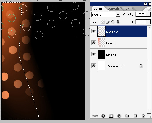
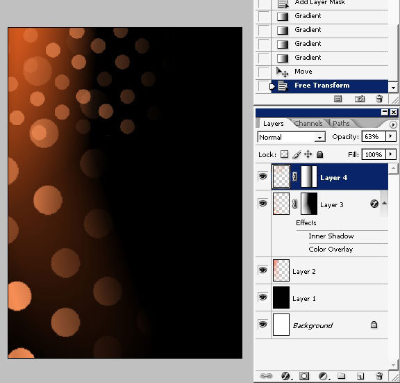
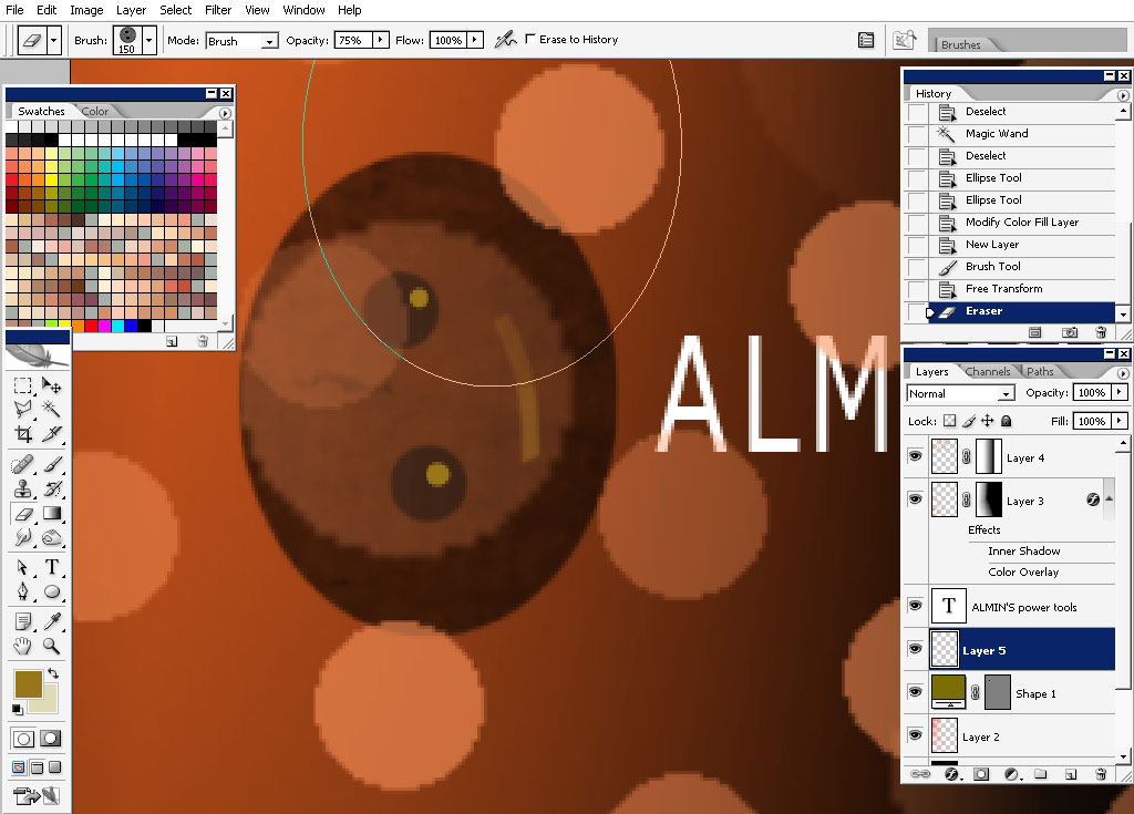
You can deselect the selection. Create another layer and use the same brush on it (only with smaller radius).
Use a mask and black to white gradient (tinting technique) to hide the right part of the effect (dot brush).
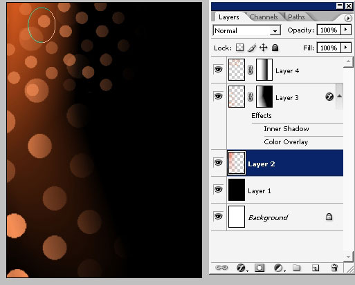
I’ve hidden the part of the effect using the same, mask tinting technique. Take a look at the mask direction in the layer box
on the screenshot.
Now happens what I really like. A Happy accident:
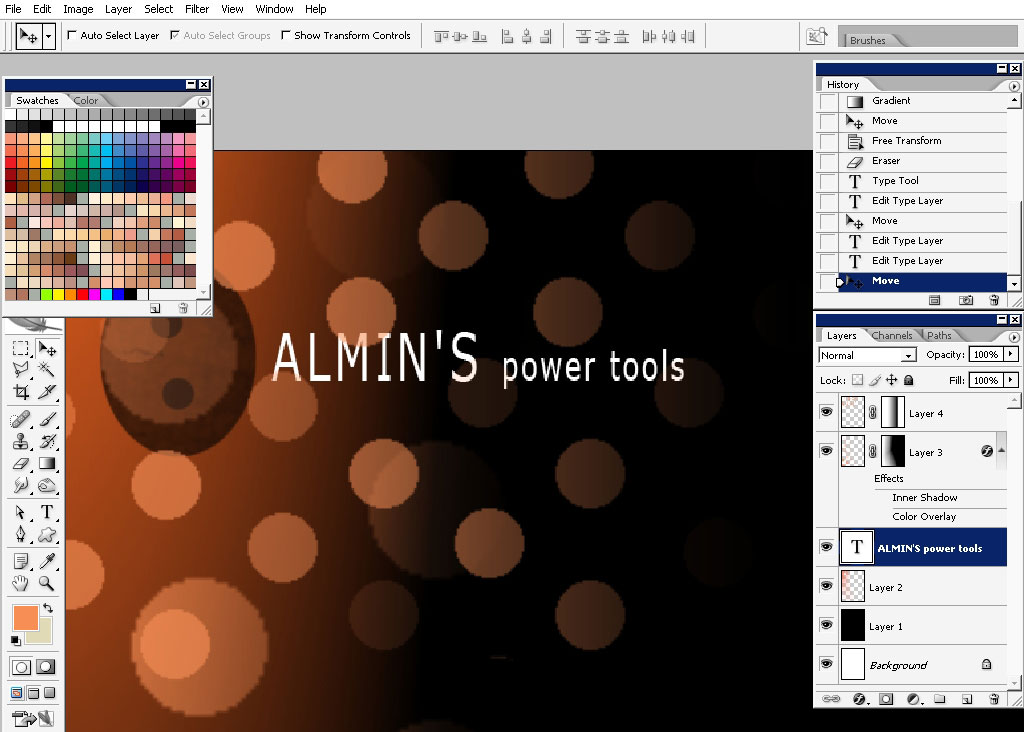
I’ve just switched to the layer we had an orange gradient on and tapped with eraser with my favorite line brush, well
basically I do every line drawing with; and here we have it: it is just a little fellow looking from some king of hole. I
really like this moment.
Now I will give a name to our company. Although the graphic design is all about idea in combination how this idea is
visualized, in our case the idea and the visualization have no direct connection, well you can find another name, and
something maybe connected with toys or whatever.
Now let’s detail out character a little bit.
I will detail his eyes a little bit using round shapes.
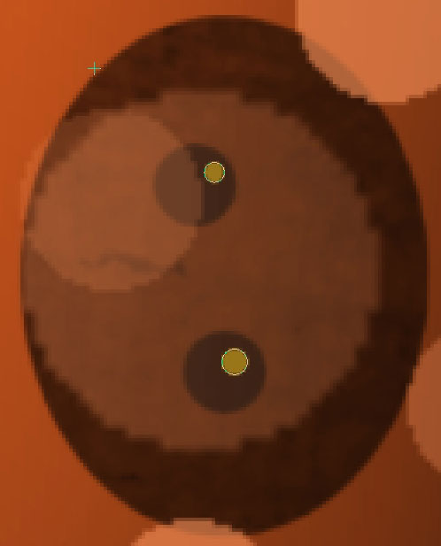
The mouth: just using the brush shaped like tony mouth.
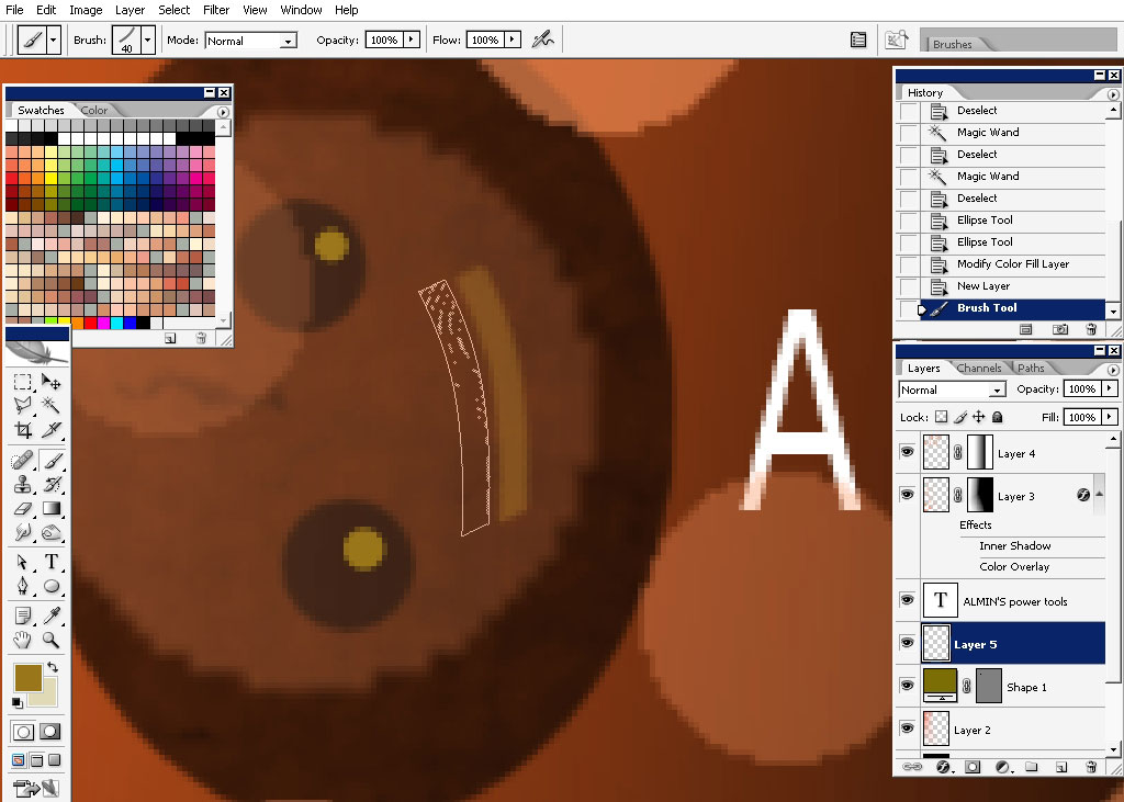
To give depth to the mouth, I’ll erase the left part of it.
Here are the brush settings: as you can see the opacity is lowered down.

Now let’s make some basic design element like this line for example.
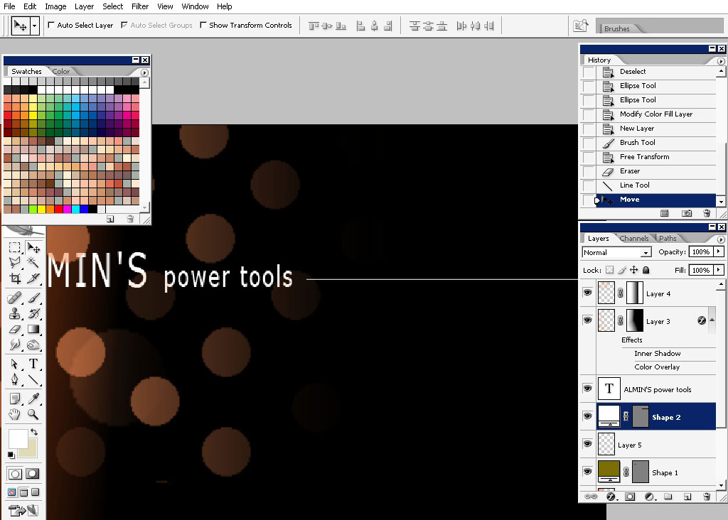
….. And this change of color; for just one little symbol. These tiny details can help you define the good look.
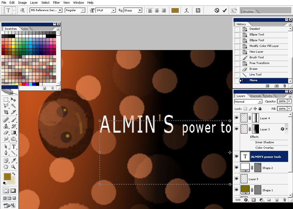
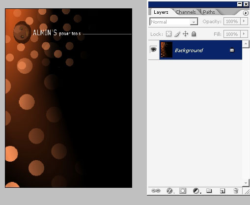
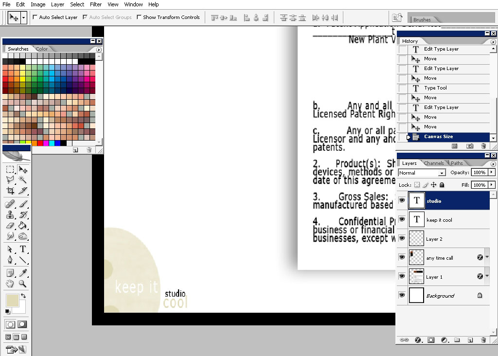
When you think you are done with that, flatten the image.
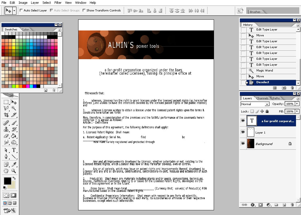
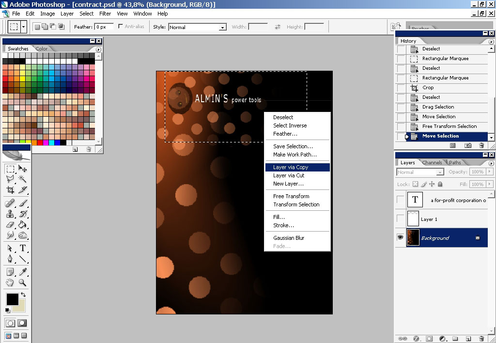
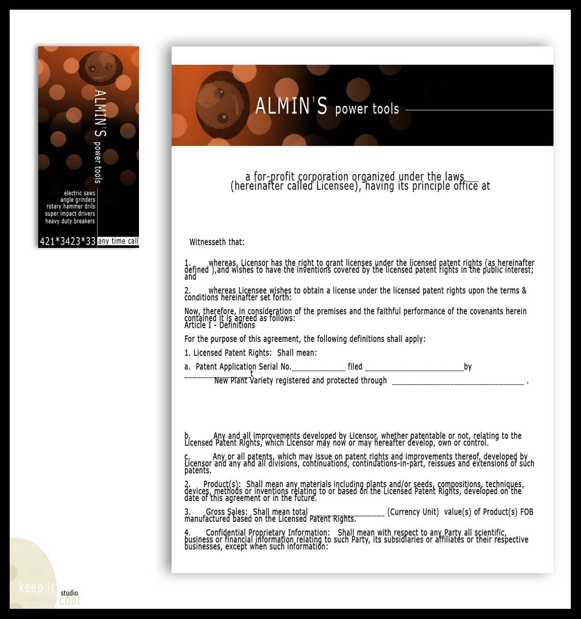
Let’s define the contract or any other document of the company should look.
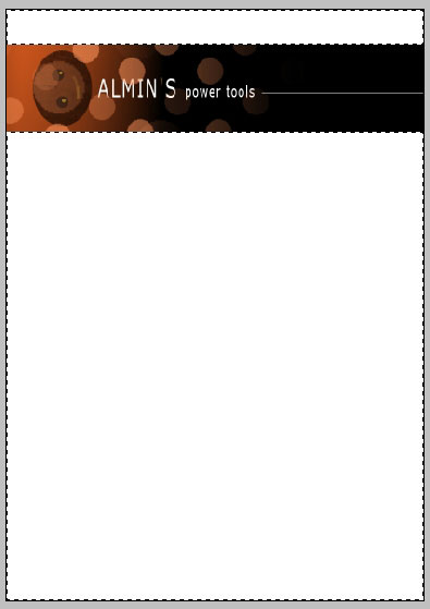
I’ve just made 2 selections and filled them with pure white color on a new layer.
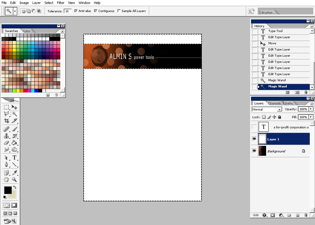
I’ve pasted some text lines there for you to see how the document will look when it’s filled with information.
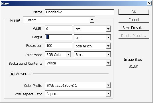
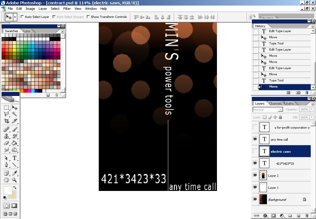
Now let’s make a visiting card.
Here are the exact dimensions of the visiting cards. These are standard dimensions every visiting card has in every country
of the world. If you are a designer you should now this.
So I’ve made a selection and let’s try to make a visiting card having what we already have.
And so here it is my composition, let’s copy this selection into a new layer. Moreover as you’ve noticed i like to make
vertical type card.
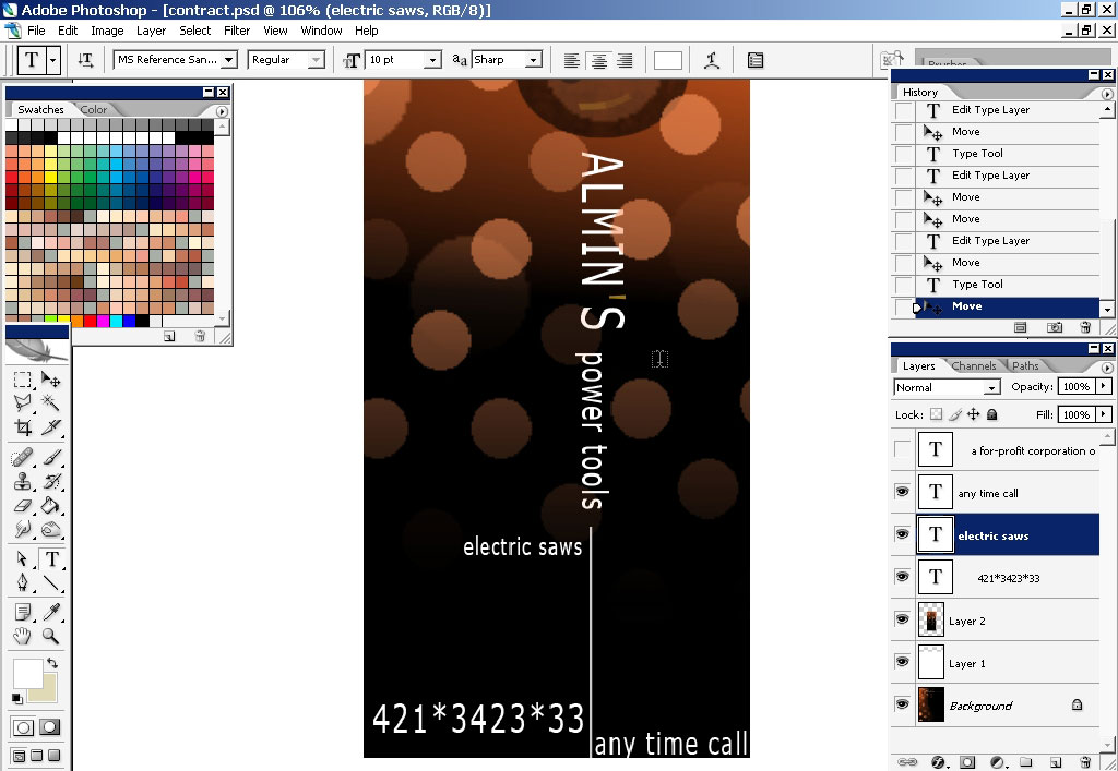
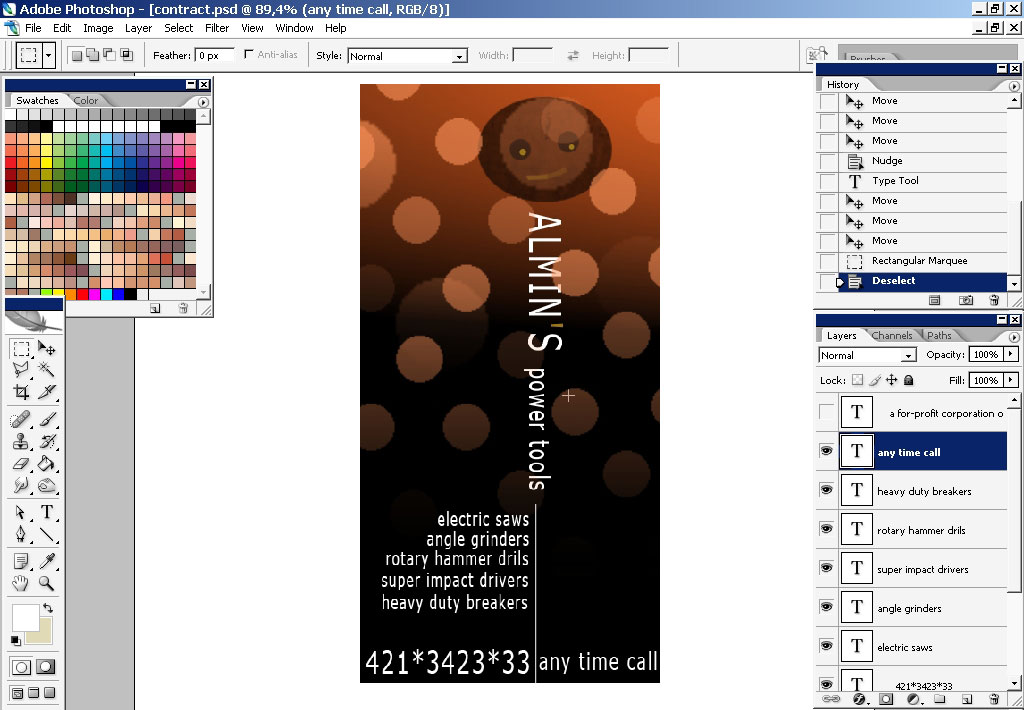
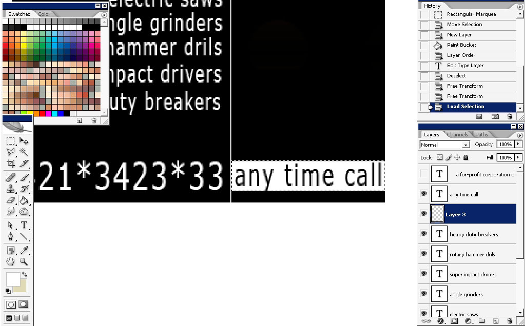
Now let’s fill the card with some information. I’ve visited Fujitsu heavy industry site to copy the names o all these power
tools.
Inverse the color palette:
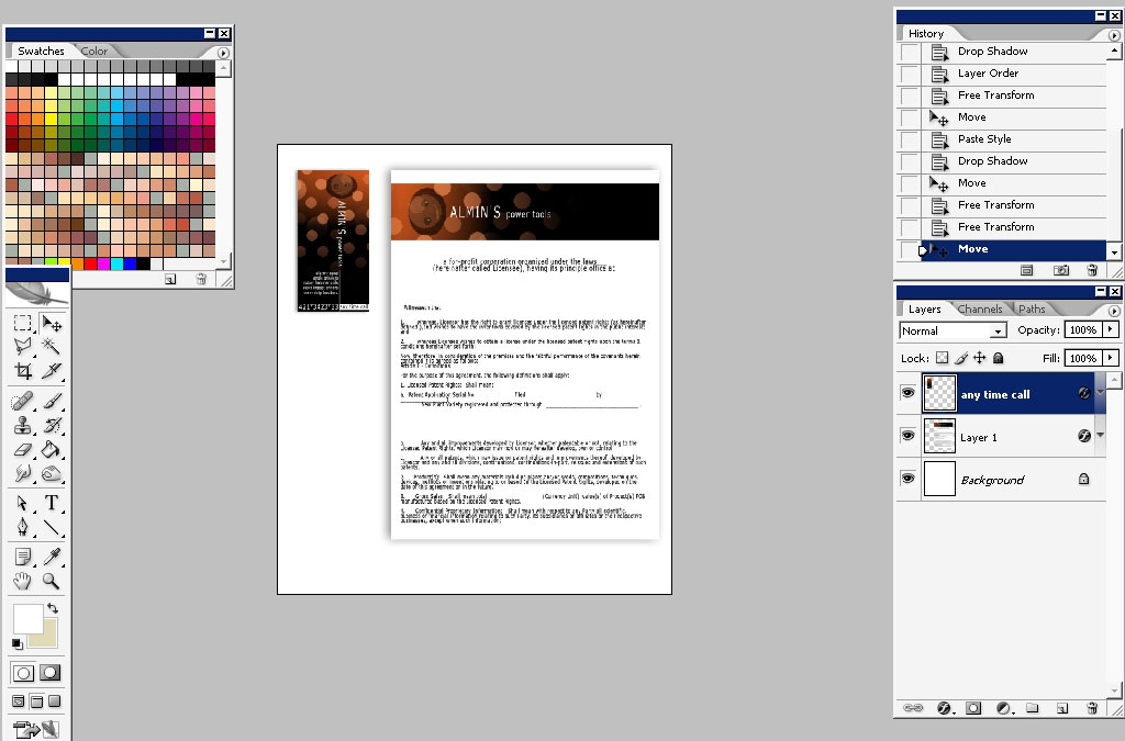
And here we have the document and the visiting card ready to use. In a corporate style design the designer should present 3
basic elements: how the document should look, how the visiting cad should look and how the envelope should look. We made 2 of
3 elements. I think you got the idea of all this. The thing left to do is to practice a lot and believe me: you will make
something interesting.
I can’t stop :)!
Comments